Page 1 of 1
Alps as a doubleshot manufacturer?
Posted: 21 Jan 2014, 23:35
by Daniel Beardsmore
I've been seeing these very distinctive doubleshots a lot over the last year:
http://www.flickr.com/photos/349667-ta4 ... 7701310479
They all seem to turn up on keyboards made by Alps. (That one is from a NeXT keyboard with pine black Alps. The early Dell AT101 keyboards were Alps-made, using an existing design that previously had these same doubleshots. Alps-made Toshiba portable keyboards also used them.)
Does anyone know whether Alps ever made their own keycaps? I don't know whether these keycaps are from Alps, or whether Alps always picked a specific keycap vendor.
I don't actually know how many doubleshot manufacturers there have been over time. The ones I know of to date:
- Cherry/GMK
- Tai-Hao
- Signature Plastics
- Rows-of-squares mystery manufacturer
The type pictured is particularly distinct, which is why it's obvious that it's not from any of the usual suspects. I don't honestly know who else made Cherry and Alps mount keycaps of the same "stripy" design as Tai-Hao and Cherry.
(Of course, there are all the specific switch keycaps like RAFI, Micro Switch etc.)
Posted: 22 Jan 2014, 17:46
by kilogeek
I have one of these old AT101-like keyboard with such keycaps, the keyboard is made in Japan, 1988, the only difference with your picture is that I dont have these small cubes around the central ALPS male plug. Someone from Geekhack told me they have been made by Tai-Hao, this is the only source I have ATM.
Re: Alps as a doubleshot manufacturer?
Posted: 22 Jan 2014, 21:16
by bhtooefr
The datasheet for the Alps SKCM switches actually lists some 18 mm pitch caps as being available, too. Then again, they may well have outsourced that...
Posted: 24 Jan 2014, 00:04
by Daniel Beardsmore
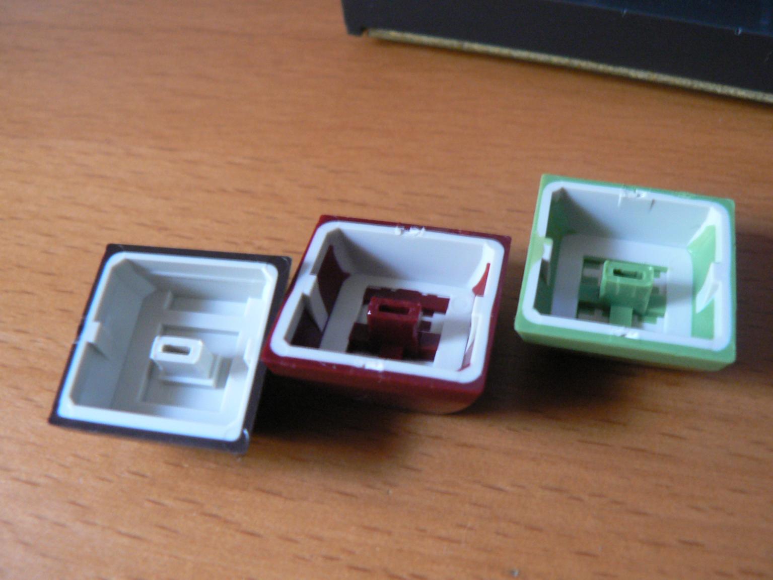
Photos from Daemon Raccoon — apparent Alps doubleshot keycaps, without the characteristic squares in the mould:
http://imgur.com/a/peni7#nuYxK
It's still got the second colour down one inner face, though some of those caps have the second colour all the way around.
Posted: 24 Jan 2014, 04:16
by Daemon Raccoon
Those are Parak's but I have the same keyboard.
Posted: 24 Jan 2014, 20:44
by Daniel
Posted: 24 Jan 2014, 21:48
by Daniel Beardsmore
Something that fascinates me is the huge variety of the stripes in doubleshots from the same manufacturer. They can be wide or narrow, and horizontal, vertical or diagonal.
The "Alps" doubleshots (which we know they sold under their own name, even if they didn't manufacture them in-house: I have the data sheet for some) also show a similar variety of manufacturing detail.
The little cubes that kilogeek mentioned may be significant, as they're actually drawn in the data sheet! However, they are indeed frequently missing.
Posted: 24 Jan 2014, 23:06
by Ascaii
Adding my pics, so you have them in here as well:
- DS_Alps.jpg (175.54 KiB) Viewed 7015 times
- DS_Alps_bot.jpg (113.77 KiB) Viewed 7015 times
The machine is called a "One per Desk" or Computerphone
They were made in 1981-1984, more info on the machine can be found here:
http://www.classic-computers.org.nz/col ... rphone.htm
http://en.wikipedia.org/wiki/One_Per_Desk
Posted: 24 Jan 2014, 23:30
by Daniel Beardsmore
Danke.
The weird thing is that the DSA Retro Set group buy was allegedly inspired by the Commodore 64, but I've never seen a C64 with those three colours.
However, the DSA Retro Set bears a striking resemblance to that Alps keyboard.
(That One Per Desk photo is funny — it's a colour screen showing a menu that's mostly the exact shade of green of a green screen, with a single line of red that looks Photoshopped as a result!)
Posted: 24 Jan 2014, 23:36
by Muirium
Daniel Beardsmore wrote:The weird thing is that the DSA Retro Set group buy was allegedly inspired by the Commodore 64, but I've never seen a C64 with those three colours.
However, the DSA Retro Set bears a striking resemblance to that Alps keyboard.
Exactly. No C=64 looked like that. But this obscure Kiwi board truly does. I wonder what Matt3o was up to when he picked those colours!
Posted: 24 Jan 2014, 23:40
by Ascaii
Perhaps he was the one that bought the only other one of these that Ive ever seen:
http://deskthority.net/marketplace-f11/ ... t1274.html
Posted: 25 Jan 2014, 00:18
by Daniel Beardsmore
"ALPS keys...the best keys Ive EVER had. Super high quality and great feel."
Now I'm really curious, as today you wrote "The switches were just rubber sliders over domes."
What is a "rubber slider"? That would be a bizarre feat of engineering. I presume you meant sliders over rubber domes, so maybe one of the Alps-mount [wiki]Alps integrated dome[/wiki] switches. Those switches do feel really good, and mine had a nice metallic sound to them. I was really surprised to open one up and find a dome inside. My only concern with the design is the risk of wear to the conductive coating.
Posted: 25 Jan 2014, 08:47
by Ascaii
I am referring to the caps themselves. Their texture is exactly right, they have weight and no wobble. To me, these are the best key caps Ive ever had.
As for the slider over dome thing...i must mave mistyped somewhere. They were these switches:
http://deskthority.net/w/images/f/fd/Al ... embled.jpg
They did not feel great...the unit was NOS. The white stem felt like it was an unfinished design, as the keys had some wobble...at first I thought it was the caps, but i was able to try them on alps mechanical switches and found it was indeed these integrated dome switches.
Posted: 25 Jan 2014, 09:56
by mr_a500
Ascaii wrote:Adding my pics, so you have them in here as well:

That keycap shape (shallow, flat top) and font is nearly identical to the ALPS version of the Atari 800XL.
800XL ALPS.JPG
800XL ALPS2.JPG
The TRS-80 Model 100 has the same switch, same shallow flat keycaps and same font.

Posted: 25 Jan 2014, 10:55
by Muirium
Not quite. Or, well, maybe…
The TRS-80 Model 100 and Atari 800XL do indeed have the same font (the Arial-like R and the Helvetica-like G are quite unusual) and the One Per Desk is close (including those two glyphs) but look at the kerning on SHIFT. The One Per Desk has Signature Plastics style SHIF T (i.e. crap) kerning, while the other two are better, but not perfect. In fact, it looks like the One Per Desk is just a heavier weight (thicker lines) of the same font. The others look better to me as the lighter weight works well. Add more bulk to the shapes, though, and style degrades a bit.
Oddly enough, the Trash 80 portable had fantastic looking legends! Argh…
Posted: 25 Jan 2014, 11:27
by mr_a500
The One Per Desk (odd name... what if you want two on your desk?) keycap font might just appear to be thicker because it's a bit out of focus.
I was mainly talking about alpha-numeric keys for similarity. There are variations in the symbols. (and TRS-80 has slash through zero)
Posted: 29 Jan 2014, 01:19
by Daniel Beardsmore
I added some photos to the Alps Electric page the other day, from Sandy, MouseFan and Wang Yueh-Lin, Simon:
[wiki]Alps Electric[/wiki]
I've also arranged the [wiki]double-shot molding[/wiki] page's gallery by manufacturer.
Posted: 29 Jan 2014, 15:21
by lowpoly
Here's the box for the localization key caps for a Toshiba T5200. Says Toshiba on it which probably doesn't mean anything:

And the pic that contains the assembly numers etc. for the T5200 keyboard:
http://img293.imageshack.us/img293/5767/t5200_08.jpg
Posted: 29 Jan 2014, 22:27
by Daniel Beardsmore
The keyboard is made by Alps, with Alps switches, and that's the consistent thing: these keycaps only appear to be found on Alps-made keyboards.