Trends in keyboard design: Who started what?

User avatar
Peter

26 Jul 2013, 20:28

7bit wrote:
kps wrote:
webwit wrote:Cylindrical better.
[KEYBOARD WITH CYLINDRICAL KEY CAPS]
I was not quick enough to find one of these.
:-)

The key shape is an interesting evolution:
Image
Early attempt of an ergonomic keyboard from Peter's grand-grand-pa.
Why did you have to remind me of that..
It's not just an early attempt at a ergonomic keyboard, it's the Worlds first commercially manufactured typewriter !
Now I'll have to buy one of those for about 200.000DKR and join The International Rasmus Malling-Hansen Society :
http://www.malling-hansen.org/

User avatar
7bit

26 Jul 2013, 20:30

webwit wrote:Cylindrical is still better, ... We don't need spherical any longer.
:mad: <---- 7bit.

I guess we will have a little fight at the DT party!
:evilgeek:

User avatar
kps

26 Jul 2013, 20:36

webwit wrote:Cylindrical is still better, despite the nonsense in this thread, such as, it was a cheapening. No, it was an evolution. Spherical caps are inherited from typewriters and shitty 70ties switches, where you need to hit the key in the center. The spherical cap forces you as such.
None of the typewriters I have (admittedly only half a dozen) have keys that need to be hit exactly in the center. In fact manual typewriters, with the keys on bars, are completely inensitive to vertical position, while horizontal displacement applies torsion to the bar, so if this were actually the reason, cylindrical caps would have been a perfectly adequate solution.

The utility of spherical keycap indentations is that they provide two axes of positional feedback, helping the user avoid drift.
Cylindrical is better for the fingers, it's shaped for your fingers,
I don't have a camera here, so I ask you to take my word for it that my fingertips have two axes of curvature. Perhaps this is a genetic difference, like the four-inch pinky fingers of those who prefer the ‘ISO’ RETURN.

User avatar
Muirium
µ

26 Jul 2013, 20:38

Perhaps ISO guys just type with their wrists crossed and need something out there for their thumbs.

User avatar
7bit

26 Jul 2013, 20:46

He's a duck!

Spherical key caps hurt their feet:
Attachments
ducks_require_cylindrical_keys.jpg
ducks_require_cylindrical_keys.jpg (140.18 KiB) Viewed 5583 times

hoggy

26 Jul 2013, 20:55

Meanwhile in the 70's:
Image

User avatar
7bit

26 Jul 2013, 21:01

We should have this at the DT party to honor the Rasmus Malling-Hansen typewriter.

User avatar
webwit
Wild Duck

26 Jul 2013, 21:13

Blah blah blah, it's just some kind of keyboard hipster thing. Like gold cables and audio nuts. :twisted:

User avatar
Halvar

26 Jul 2013, 21:18

webwit wrote:Cylindrical is still better, despite the nonsense in this thread, such as, it was a cheapening. No, it was an evolution. Spherical caps are inherited from typewriters and shitty 70ties switches, where you need to hit the key in the center. The spherical cap forces you as such. Cylindrical is better for the fingers, it's shaped for your fingers, for the user, where spherical is shaped for the limited machine. We don't need spherical any longer.
We dont need cylindrical any longer -- everybody loves chiclet keyboards with flat caps nowadays!

The historic trend irrefutably goes to less dimensions of cap height dependency!

1970s: sphericals: h(cap) = f(x,y)
1990s: cylindricals: h(cap) = f(x)
2000s: chiclet: h(cap) = h
2010s: tablet: h(cap) = 0
Last edited by Halvar on 26 Jul 2013, 21:21, edited 1 time in total.

User avatar
7bit

26 Jul 2013, 21:19

Halvar wrote:...
1970s: h(cap) = f(x,y)
1990s: h(cap) = f(x)
2010s: h(cap) = c
2020s: h(cap) = 0
Fixed that for you!*

-------------------------------------------
*) Hint: Touchy, touchy ...

User avatar
Halvar

26 Jul 2013, 21:22

Fixed it myself, but you were faster ... :)

User avatar
Muirium
µ

26 Jul 2013, 21:23

Exactly! And you-know-who led the way. As usual.
webwit wrote:Blah blah blah, it's just some kind of keyboard hipster thing. Like gold cables and audio nuts. :twisted:
Suddenly I have a vision: what every topic on DT must look like to the uninterested. We got derped!
Image

User avatar
Daniel Beardsmore

26 Jul 2013, 21:36

Muirium wrote:(Paging Daniel Beardsmore…)
Not I. I prefer black, cylindrical keycaps anyway, so I'm a heathen. You picked up on my mention on the wiki of Apple having cylindrical keycaps in the early 80s (which was a funny transition period) but I haven't studied keycaps especially. I did start this page on switches, but it didn't have much of a life:

[wiki]Keyswitch timeline[/wiki]

Semantic MediaWiki would lead to all this information being "naturally" (with a lot of work) gathered in a way that makes it easy to review trends (and you'd need to go back and add the keycap shape to all the existing keyboard pages), but there is so much knowledge still absent from the wiki. That is unlikely to change.

User avatar
Muirium
µ

26 Jul 2013, 21:40

This sounds like a job for KBDB!

(Which, because it doesn't yet exist, can still be flawless and magical. Ah! So this is what utopians, libertarians and communists feel like! I get it now…)

User avatar
webwit
Wild Duck

26 Jul 2013, 21:43

All of this would have been better if there was some worthy counter argument why cylindrical keycaps aren't better for fingers. This is of course because I'm right. :twisted: There is no magic to spherical keycaps and they are inferior for quick, user friendly typing. Costs, flat caps or tablets are not relevant to this discussion. What might be is that the random-ass linear 70ties keyboards these sphericals were mounted on were crap as well!

User avatar
Muirium
µ

26 Jul 2013, 21:48

The sphericals on a beam spring were jolly nice. Real switches too!

But weren't we meant to be debating when legends went to shit? I raise the topic of fonts:
Image
Image
Image

User avatar
Halvar

26 Jul 2013, 21:53

@webwit: Well I haven't seen your argument either -- so why a counter argument?

My point with the chiclets was that newer and more popular doesn't equate better -- which was something I felt you were insinuating.

Your point that cylindricals are a better fit to fingertips is absurd as kps pointed out.

So pretty much everything you said has been duely addressed ... :ugeek:

User avatar
Muirium
µ

26 Jul 2013, 22:00

Actually, I'm perfectly willing to accept that both sides have an argument re: fingertips. Cylindricals may well feel better when lifting and moving quickly between keys, while sphericals feel better when pressing down. It's well within the bounds of pure subjectivity.

But the cylindrical monoculture (beyond the chiclet and virtual keyboard mainstream) just pisses me off. This is just the boutique kind of stuff we ought to be able to choose while the world gives up on keyboards entirely and we are all that's left!

mr_a500

26 Jul 2013, 22:02

webwit wrote:Cylindrical is still better, despite the nonsense in this thread, such as, it was a cheapening.
Was I speaking nonsense? Hmmm, I do that occasionally.... but I assumed, (while looking at a Model F and a beam spring beside me), that it would be cheaper to produce millions of identically shaped keys and label them with whatever label - rather than producing keys with 4 different profiles and have to make sure that only certain labels went on certain profiles.

User avatar
Daniel Beardsmore

26 Jul 2013, 22:06

Ho ho ho ...

See Topre's prototype keyboard under [wiki]Topre Corporation[/wiki] …

Topre pre-anticipated silly fonts long before the rest of the world!

User avatar
Muirium
µ

26 Jul 2013, 22:09

Gak!

Augh. There goes a whole point of my esteem for Topre. Their legends still aren't that great, but at least they improved…

mr_a500

26 Jul 2013, 22:09

Muirium wrote:Actually, I'm perfectly willing to accept that both sides have an argument re: fingertips. Cylindricals may well feel better when lifting and moving quickly between keys, while sphericals feel better when pressing down. It's well within the bounds of pure subjectivity.
I agree that cylindrical keycaps feel better when sliding over keys, but sphericals are more "grippy" when pushing down. I really don't care which one is certified as the bestest of the best. As I already mentioned, it's up to a user's opinion which is best. I prefer spherical keycaps and I don't give a flying shit what anybody thinks of that. :evilgeek:

User avatar
Muirium
µ

26 Jul 2013, 22:11

That's the spirit!

Anyone up for championing inferior legend technologies vs. doubleshot and dyesub?

User avatar
webwit
Wild Duck

26 Jul 2013, 22:13

Your point that cylindricals are a better fit to fingertips is absurd as kps pointed out
KPS' argument is not even correct or informed. It is heritage from old non-electronic typewriters. We're talking the same typewriters here where your silly QWERTY layout came from because otherwise the key hammers might get each other in the way. If you hit a key on the side, you would get a lighter letter because less force went into the hammer. Btw, why didn't Topre make spherical keycaps if they are better? It's just a shape of a mold.

User avatar
webwit
Wild Duck

26 Jul 2013, 22:15

mr_a500 wrote:
webwit wrote:Cylindrical is still better, despite the nonsense in this thread, such as, it was a cheapening.
Was I speaking nonsense? Hmmm, I do that occasionally.... but I assumed, (while looking at a Model F and a beam spring beside me), that it would be cheaper to produce millions of identically shaped keys and label them with whatever label - rather than producing keys with 4 different profiles and have to make sure that only certain labels went on certain profiles.
This is not relevant, the Model F needs only one profile because of the curved back plate.

User avatar
Halvar

26 Jul 2013, 22:26

webwit wrote:If you hit a key on the side, you would get a lighter letter because less force went into the hammer.
That is actually a great argument why mechanical typewriter caps could have been cylindrical as well. And kps even mentioned that!
Muirium wrote:But the cylindrical monoculture (beyond the chiclet and virtual keyboard mainstream) just pisses me off. This is just the boutique kind of stuff we ought to be able to choose while the world gives up on keyboards entirely and we are all that's left!
You noyled it! Right in the middle of the keycap.

User avatar
webwit
Wild Duck

26 Jul 2013, 22:41

Yeah he noyled it. It's about boutique faggotry whether it's better or worse. Mechanical keyboards are better than modern non-mechanicals. Old keycaps are not. Are you using a vintage mouse with mouse ball? Vintage is not by definition better, in fact that is an exception in electronics and machines.

User avatar
Muirium
µ

26 Jul 2013, 22:51

An exception which, oddly enough, seems to be the rule; for keyboards.

Keyboards were "good enough" (to use Clay Christensen's terminology) long ago. They served the job to be done. So innovation didn't continue to make them better. It was turned to make them cheaper instead. (NOT the case for cylindricals, but definitely for pad printing and rubber domes.) Even the cable, packaging and enclosure of a modern keyboard is all too often junk compared to its ancestor. Cost cost cost!

Mice, meanwhile, truly were inadequate. Lasers improved matters greatly. But make no mistake: the same market forces apply there too. Or would, if we weren't headed to a world without them long before their ruthless commoditisation was as complete as it is for keyboards.

Keyboards had a head start and suffered for it.

User avatar
Daniel Beardsmore

26 Jul 2013, 23:24

Muirium wrote:Anyone up for championing inferior legend technologies vs. doubleshot and dyesub?
There's no way to win. You cannot pull of Diatec's exquisite typography with either doubleshot or dye sub: the former is too coarse, and the latter doesn't support black keycaps. Doubleshot legends are durable, but they lack finesse. (Acer knew how to do dye sub, but Apple's attempts sucked, with horribly blurry writing.)

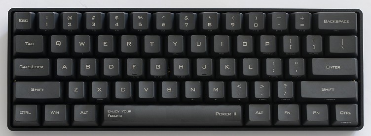
Also, those old Nan Tan pad-printed boards never wear — I tried to scratch off some of the printing and it was really hard to shift the rock solid ink. Lovely jet black ink that looks every bit as good as doubleshot, if not better, as you have freedom of typography. You can get robust pad printed legends with UV cured ink or some such¹ and avoid that horrible decal look. Dell currently use non-decal printing on their Latitude notebooks.

However, the nonsense about doubleshot needing to be ABS needs to come to an end. There are plastics that support doubleshot fantastically, retaining their texture forever.

The labelling method that needs to die in a fire, is lasering. Nothing is worse than singed plastic lettering that looks like a dot matrix printer with a fading ribbon. Shoving hardened spooge into holes in the keycap sucks, too, and while Matias do a reasonable job, they've introduced jaggies into the lettering!

¹ Pad printing suffers from being demonised due to poor implementation, so no-one documents the specifics, and why many keyboards don't have the decal look.

User avatar
Peter

27 Jul 2013, 00:47

legends,fonts and typography went to shit about the same time these people were made 'redundant' :
Typograf-på-Skagens-Avis-Aksel-Brink.jpg
Typograf-på-Skagens-Avis-Aksel-Brink.jpg (49.74 KiB) Viewed 5533 times
Late 1970's, early '80's ..
It wasn't the 1990's that destroyed everything, it was Thatcher/Reaganomics .

Post Reply

Return to “Keyboards”