Page 49 of 53
Posted: 25 Mar 2014, 18:48
by jdeblese
Don't want to burst anyone's bubble, but would this be as an additional set, an alternative for the common kit? I have no particular interest in Cyrillic keys, and I really like the minimalist, centered legends we have now.
Posted: 25 Mar 2014, 18:49
by matt3o
jdeblese wrote:Don't want to burst anyone's bubble, but would this be as an additional set, an alternative for the common kit? I have no particular interest in Cyrillic keys, and I really like the minimalist, centered legends we have now.
additional set of course
Posted: 25 Mar 2014, 18:50
by Muirium
Of course. I like both. And want both. But can't afford both…
I also support the idea of contrasting fonts by the way. It might look quite something.
7bit wrote:
BTW:
Does Gotham not include Cyrillic and Greek?

Oddly enough: apparently not.
http://www.typography.com/collections/cyrillic/
Ditto for Greek. H&FJ's only font for either of them is Whitney. I'd complain that things have gone down hill since Frere-Jones left but not really. None of this is new. Needs moar alphabets!
Posted: 25 Mar 2014, 19:29
by matt3o
play your russian chorus of choice and...

legend positioning is not final, but all characters should be there. please confirm. note that you also need the common kit!
Posted: 25 Mar 2014, 19:35
by Muirium
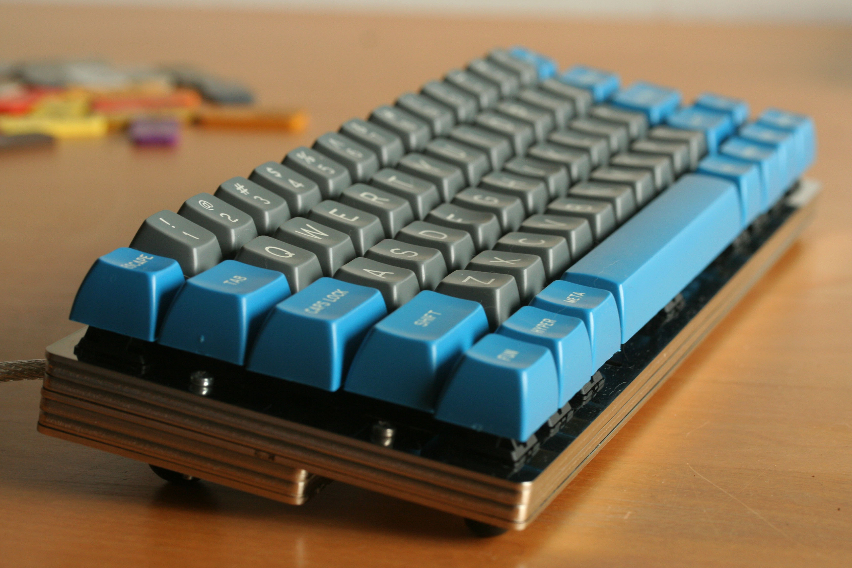
Does dye subbing right over the crater's edge on deep dish caps pose a problem? How deep are those on DSA?
Posted: 25 Mar 2014, 19:49
by matt3o
Muirium wrote:Does dye subbing right over the crater's edge on deep dish caps pose a problem? How deep are those on DSA?
it shouldn't be a problem, it's not really a "crater" just a heavenly slope
Posted: 25 Mar 2014, 19:52
by drrtyrokka
holy... this looks pretty nice!
It just looks so cool with the red legends, no matter if you need it, you have to buy it.

Posted: 25 Mar 2014, 19:55
by matt3o
now I also want Aurebesh, Kinglon, japanese and greek...
Posted: 25 Mar 2014, 19:56
by Muirium
Greek FIRST!
Posted: 25 Mar 2014, 20:16
by Acanthophis
How about a keycap for Canada?
Would love a simpler version of this:

Posted: 25 Mar 2014, 20:20
by matt3o
OMG! That is... Pantagruelic!
Posted: 25 Mar 2014, 20:23
by Muirium
What, no dogsled? No canoe? No booze? No hockey!
Posted: 25 Mar 2014, 20:30
by Acanthophis
Aww man, I need Tim Hortons now :/
Posted: 25 Mar 2014, 20:33
by Omikron
matt3o wrote:play your russian chorus of choice and...
legend positioning is not final, but all characters should be there. please confirm. note that you also need the common kit!
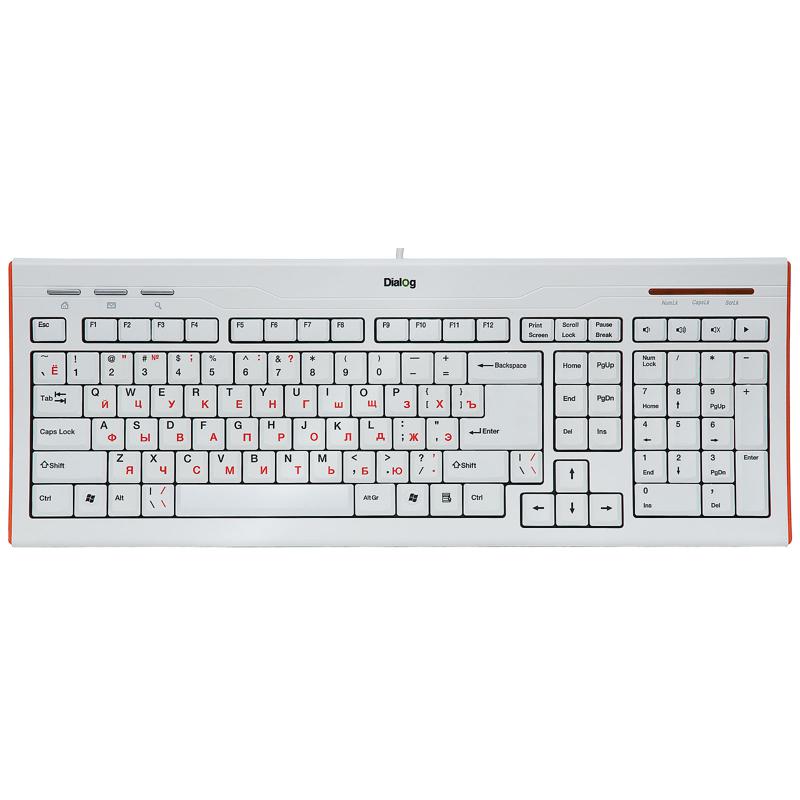
Looks good but may I add something? Keys on your picture are for ANSI.
This is ANSI

This is ISO

Would you please make full ISO mockup with several different Cyrillic legend colors? Red is most common but can we see and discuss more rare options like blue/green/orange/yellow please

?
Posted: 25 Mar 2014, 21:13
by matt3o
Omikron wrote:matt3o wrote:play your russian chorus of choice and...
legend positioning is not final, but all characters should be there. please confirm. note that you also need the common kit!
Looks good but may I add something? Keys on your picture are for ANSI.
This is ANSI
This is ISO
you mean 2 identical keys?
Omikron wrote:Would you please make full ISO mockup with several different Cyrillic legend colors? Red is most common but can we see and discuss more rare options like blue/green/orange/yellow please
?
color options, sure

Posted: 25 Mar 2014, 21:18
by woody
And a friendly advice - rename that to "Russian kit".
Because to almost every other Cyrillic user it is useless.
Offtopic - does anybody in Russia use phonetic keyboard layout?
Posted: 25 Mar 2014, 21:24
by MOSFET
@matt3o: Would it be possible to add a SPH Blue modifier kit to compliment the granite layout? Many people either missed or could not afford 7bit's Round 4 Groupbuy. Having a Round 4 SPH kit with a DSA profile would be really neat.
/edit: And selfishly, would it be possible to add either a granite or SPH blue 3u key? SP stocks only white or black 3u keys.
Posted: 25 Mar 2014, 21:48
by Muirium
Round 4 SPH is SA profile, and about twice the height of DSA. In fact let me look it up: 0.462 vs 0.291 inches (grumble) according to SP's documentation. Not twice then but still a striking 58% taller:
http://keycapsdirect.com/key-caps.php
So you'd better not be thinking of trying to mix the two on one board. The idea of going for a similar colour is good, though.
Posted: 25 Mar 2014, 21:49
by Omikron
matt3o wrote:
This is ISO
you mean 2 identical keys?
Yes. (Russian) Cyrillic ISO 105 layout has 2 identical keys which is one of the main reasons that ISO 105 is not popular.
Because one of the keys makes left shift shorter. Which most users are not used to. So some companies make "custom" layouts to avoid this. For example:
Posted: 25 Mar 2014, 22:07
by GhostofHarry
my goodness....
russian ones!
im gonna get it for sure:D
Posted: 25 Mar 2014, 22:08
by MOSFET
Muirium wrote:Round 4 SPH is SA profile, and about twice the height of DSA.
So you'd better not be thinking of trying to mix the two on one board. The idea of going for a similar colour is good, though.
My mistake, I thought SPH was shorthand for the Space Cadet color scheme. So yes, I was referring to the blue color of the Space Cadet but with a DSA profile that could be mixed with the granite set.
Posted: 25 Mar 2014, 22:15
by Muirium
SPH is short for spherical. 7bit was crazy enough to run several quite different lines of caps in Round 4 simultaneously! (Retro, Noir and SPH are the ones I can recall.) SPH was the SA profile section of that insane GB. Its colour scheme was indeed based on the Space Cadet keyboard:
 http://en.wikipedia.org/wiki/Space-cadet_keyboard
Posted: 25 Mar 2014, 22:39
by 7bit
How comes you already have the Round 6 key caps?

Posted: 25 Mar 2014, 23:04
by matt3o
Omikron wrote:
Yes. (Russian) Cyrillic ISO 105 layout has 2 identical keys which is one of the main reasons that ISO 105 is not popular.
two identical keys it is, then
Posted: 25 Mar 2014, 23:29
by Muirium
As promised (and after much futzing about) here is the mono-symbolic layout for my 60%:

- Granite Shiny 60%.png (82.93 KiB) Viewed 4811 times
Janky alignment is because I'm still learning how to use Pixelmator. Other than that, I'm pretty chuffed!
Posted: 25 Mar 2014, 23:37
by matt3o
cool! thanks for taking the time Muirium. You may try to put a blue enter, just to spice it up.
that reminds me that I have to remove the purple guides from the mono legends
Posted: 25 Mar 2014, 23:48
by facetsesame
matt3o wrote:that reminds me that I have to remove the purple guides from the mono legends
heh, I wasn't sure if I was imagining those or not - and if they were a feature!
Posted: 25 Mar 2014, 23:50
by Muirium
They're informative when checking the individual cap designs, actually. But guides are distracting when doing whole layouts. Upload an updated zip of the whole lot would you, Matt? I'm working with old versions no doubt.
Posted: 26 Mar 2014, 00:28
by Muirium
Okay, the sixty:

And the ISO TKL:

- Granite ISO TKL.png (125.79 KiB) Viewed 5115 times
My TKLs like to jumble up the media keys, so a good selection of Nerddom is welcome to fill the arbitrary gaps!
Posted: 26 Mar 2014, 00:41
by scottc
matt3o wrote:now I also want Aurebesh, Kinglon, japanese and greek...
KLINGON KEYS! YES! Imagine them in Bird-of-prey green, coppery yellow and a splash of red. This should definitely be a future GB!