Page 1 of 6
Trends in keyboard design: Who started what?
Posted: 26 Jul 2013, 16:48
by mr_a500
I've been thinking of keyboard progress (or degeneration) from the 70's to the present and I've been trying to figure out who is responsible for influencing the trends of changing keyboard design - not the layout or switches used, which has been covered quite a bit - but more of the look of keyboards: keycap shape, keyboard colour, thickness.
I used to think that IBM was responsible for the boring beige of the mid-80's to late 90's and cylindrical keycaps - but one look at a 1977 Apple II and you see that Apple was boring beige years before the PC. The Apple II also had cylindrical keycaps (double-shot*) when IBM at the time still had spherical double-shot keycaps on their terminals. IBM went beige, cylindrical and dyesub with the PC in 1981, PC clones copied this and by the mid-80's TI, Commodore, Atari, Tandy, DEC, nearly everybody else had beige, cylindrical keycaps. Spherical double-shots disappeared completely. IBM was a major influence obviously, but it appears that Apple started the trend. (just as Apple started the annoying trend of totally flat keys)
Anybody else have thoughts about this? I'm interested in any views on keyboard design change, however trivial. What about "the mysterious disappearance of the flat-topped 3"?

*(Apple went dye-sub with the IIc and Macs, then changed to pad printing in the 90's)
Posted: 26 Jul 2013, 17:03
by Muirium
I suspect the same handful of repeat offenders started just about everything. Following is even easier than figuring out how to make a worse keyboard all by yourself.
Even Apple was in the spherical caps game for a while, though:
 Apple I
. Apple didn't make the case, and if I recall they just bought the keyboard wholesale.
 Apple II
. This one was Apple's real first. Spherical. Same too for the
Apple II+
The first cylindrical Apple I can find is the
IIe from 1983:
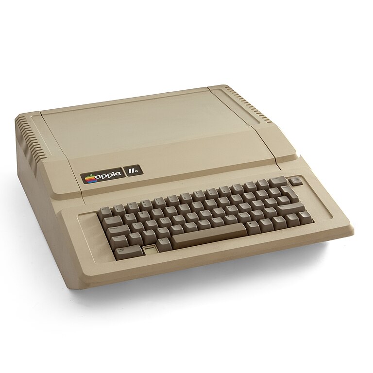
"Finally!"
There were
so many Apple IIs, because for a while (spanning three decades!) that was a platform all to itself.
Posted: 26 Jul 2013, 17:09
by mr_a500
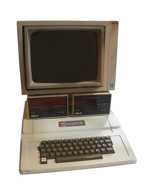
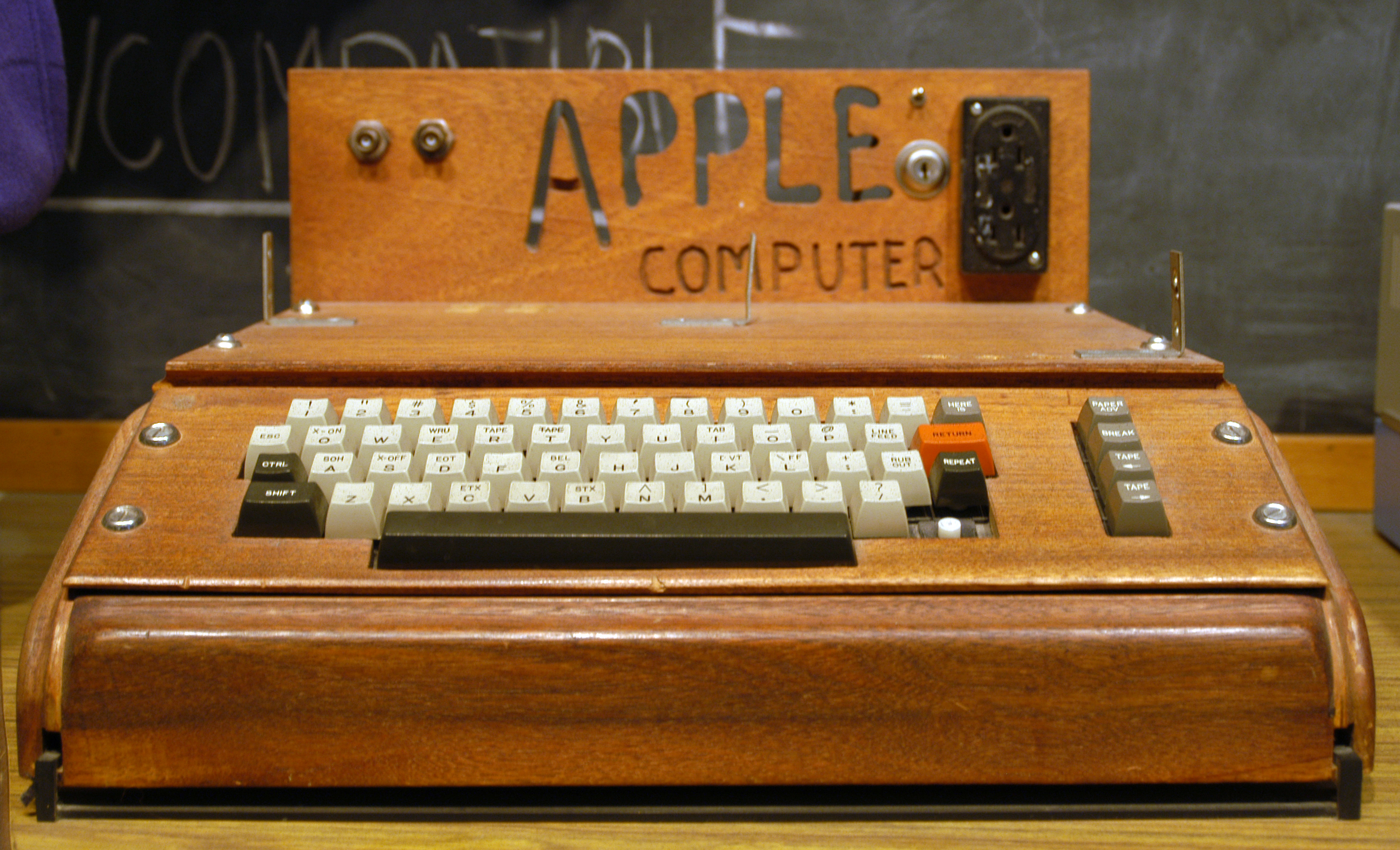
I ignore the Apple 1 because that was sold as just a motherboard without a keyboard, but it's interesting that the Apple II photo you posted shows spherical keycaps. My Apple II+, made in 1979 has cylindrical keycaps.
Posted: 26 Jul 2013, 17:11
by Muirium
Intriguing! Perhaps they were not all alike. I'm just running around at Wikipedia.
So far, I've found sphericals on the II, II+ and the
II J-Plus. Starts to make me want an Apple II…
Posted: 26 Jul 2013, 17:19
by kbdfr
mr_a500 wrote:[…] boring beige […]
I was in fact a revolution. Typewriters (even those with coloured cases) quite consistently had black keys.
And then a genius appeared and found it would be a good idea for keys to have the same pattern as the text to be printed, i.e. black on white, and even thought of reducing the somewhat harsh contrast by replacing white with beige.
In my opinion, caps which are
not black on beige are a return to barbarism

Posted: 26 Jul 2013, 17:19
by kps
ISO 9241-4 §6.1.3 mandates thin keyboards, which killed the beam spring.
ISO 9241-4 §6.1.6 requires matte finish keycaps.
ISO 9995-1 §8 specifies legends squished up in the corners.
Posted: 26 Jul 2013, 17:22
by Muirium
Goddamn ISO. Off centre legends are a crime against humanity…
Posted: 26 Jul 2013, 17:22
by mr_a500
Muirium wrote:Intriguing! Perhaps they were not all alike. I'm just running around at Wikipedia.
So far, I've found sphericals on the II, II+ and the
II J-Plus. Starts to make me want an Apple II…
Here's my Apple II+ with cylindrical keycaps:
AppleII.jpg
Posted: 26 Jul 2013, 17:24
by mr_a500
Muirium wrote:Goddamn ISO. Off centre legends are a crime against humanity…
I agree with that. Can't the Hague do anything?
Posted: 26 Jul 2013, 17:24
by mr_a500
kbdfr wrote:In my opinion, caps which are
not black on beige are a return to barbarism
I fully support a return to barbarism.
Posted: 26 Jul 2013, 17:27
by Muirium
Looks like Apple was using different keyboard suppliers back then, too. I've heard of different switch designs in different markets (Japan) as well as different dates, but not caps until now. Wonder if anyone's documented this?
(Paging Daniel Beardsmore…)
Posted: 26 Jul 2013, 17:41
by kbdfr
Muirium wrote:Goddamn ISO. Off centre legends are a crime against humanity…
On the contrary, they are best ergonomic practice because they allow not having to completely move fingers away to see the legends underneath.
The only thing I would grant is that spherical caps are superior to cylindrical ones because they better deflect finger pressure to a genuine perpendicular force. But still I prefer cylindrical, because a spherical keycap printed off centre looks just silly

Posted: 26 Jul 2013, 17:51
by Peter
kbdfr wrote:... because they allow not having to completely move fingers away to see the legends underneath.
Let the Lowest Common Denominator rule everything !!
Posted: 26 Jul 2013, 17:52
by 7bit
Colorful, thick, high spherical key caps, with centered legends, in only 3 different sizes (1, 1.5 and 2 units) are the future!

Posted: 26 Jul 2013, 17:52
by cookie
Errr what is so nice about shperical caps?
Posted: 26 Jul 2013, 17:56
by Peter
7bit wrote:Colorful, thick, high spherical key caps, with centered legends, in only 3 different sizes (1, 1.5 and 2 units) are the future!
Indeed ..
Let's arrange a Anti-ISO group-buy !!
Posted: 26 Jul 2013, 18:13
by ne0phyte
7bit wrote:Colorful, thick, high spherical key caps, with centered legends, in only 3 different sizes (1, 1.5 and 2 units) are the future!
Time for a HyperMicro!

Posted: 26 Jul 2013, 18:16
by webwit
Cylindrical keycaps are better.
Posted: 26 Jul 2013, 18:16
by mr_a500
kbdfr wrote:On the contrary, they are best ergonomic practice because they allow not having to completely move fingers away to see the legends underneath.
I always suspected that was the thinking behind that change... but in that case, it is utterly failed logic. I do proper typing ("touch typing") so I rarely have to look at the keys, but if I have to move my fingers away to see the legend, I see the top corner
last. I basically have to lift my fingers completely away to see a key and I would see centred text just the same. Far more important than position is the size and clarity of the legend. My double-shot white on black, centred legend, vintage keyboards have text that is far easier to read than small faint pad-printed junk. I have a Mac USB keyboard with legends so faint, I can't read them unless I stick my face right up to the keyboard. A Kaypro II keyboard beside it looks so clear, it almost looks like it's glowing in the dark in comparison.
Posted: 26 Jul 2013, 18:36
by mr_a500
webwit wrote:Cylindrical keycaps are better.
They're better for the manufacturer - cheaper and easier to make - but "better" for the user is a matter of opinion. I consider sphericals (angled by row) to be "better".
Posted: 26 Jul 2013, 18:41
by kps
webwit wrote:Cylindrical keycaps are better.
Only if they have spherical depressions on top.
Posted: 26 Jul 2013, 18:51
by kps
mr_a500 wrote:kbdfr wrote:On the contrary, they are best ergonomic practice because they allow not having to completely move fingers away to see the legends underneath.
I always suspected that was the thinking behind that change...
The reasoning from ISO 9995 is that it provides a standard place for legends for normal, shift, altgr, and altgr+shift states, for countries with too many letters. That's why upper-case letter legends are in the upper left corner, like the shifted number legends. ISO charitably permits that “the capital and the small letter need not be shown together”.
There are final-commitee-draft versions of ISO 9995 around online somewhere, but I can't find them right now. Edit: 2005 drafts in Word format
here, but the 2008 revision is around somwhere.
I am not an ISO 9995 fan.
Posted: 26 Jul 2013, 19:08
by Peter
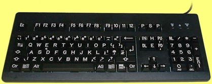
- full_size_high_visibility_keyboard_white_on_black_small.jpg (17.88 KiB) Viewed 9157 times
Posted: 26 Jul 2013, 19:21
by mr_a500
kps wrote:ISO 9241-4 §6.1.3 mandates thin keyboards, which killed the beam spring.
ISO 9241-4 §6.1.6 requires matte finish keycaps.
ISO 9995-1 §8 specifies legends squished up in the corners.
Fascinating. I didn't consider that there were ISO standards preventing various keyboard features. It looks like those standards all started around '93-94 though,
after manufacturers had already basically standardized anyway. (beam spring was killed long before the standard came out)
This works in with my theory that "the 90's ruined everything".

Posted: 26 Jul 2013, 19:22
by 7bit
kps wrote:webwit wrote:Cylindrical better.
[KEYBOARD WITH CYLINDRICAL KEY CAPS]
I was not quick enough to find one of these.

The key shape is an interesting evolution:

Early attempt of an ergonomic keyboard from Peter's grand-grand-pa.
Posted: 26 Jul 2013, 19:33
by kps
mr_a500 wrote:Fascinating. I didn't consider that there were ISO standards preventing various keyboard features. It looks like those standards all started around '93-94 though, after manufacturers had already basically standardized anyway. (beam spring was killed long before the standard came out)
The ISO standards were preceded by equivalent national standards, I think DIN and French, which if I remember correctly, were largely the work of one person. I'll try to find references to the history.
Edit: The ISO 9995 bibliography mentions Bruce Patterson,
Standards for Keyboard Layouts — The Origins and Scope of ISO/IEC 9995, ICL Technical Journal November 1992. I haven't seen it. It also cites four papers from 1985 - 1995 by Yves Neuville, who may be the person I'm thinking of.
Double Edit: The
French Wikipedia entry for computer keyboards says (googulated):
The configuration of most European computers and office keyboard 105 keys is governed by the ISO 9995 standard . This standard was initiated in 1984 by the French Standards Association (AFNOR) under the direction of Bernard Vaucelle, at the request of Alain Souloumiac . The process is carried to completion within the International Organization for Standardization (ISO) under the direction of Yves Neuville which provides a breakdown of the keys, including the alphabet block and areas of Logic Blocks: diacritical letters accents, punctuation, numerical, and computer arithmetic.
The study conducted with funding from the French Ministry of Industry and the National Agency of improving working conditions led to a significant improvement of office and computer keyboards. The recommendations of the report of Yves Neuville were adopted at a meeting of the ISO in Berlin and were immediately taken by all manufacturers of PC compatibles.
Posted: 26 Jul 2013, 19:59
by Halvar
kps wrote:mr_a500 wrote:kbdfr wrote:On the contrary, they are best ergonomic practice because they allow not having to completely move fingers away to see the legends underneath.
I always suspected that was the thinking behind that change...
The reasoning from ISO 9995 is that it provides a standard place for legends for normal, shift, altgr, and altgr+shift states, for countries with too many letters. That's why upper-case letter legends are in the upper left corner, like the shifted number legends. ISO charitably permits that “the capital and the small letter need not be shown together”.
There are final-commitee-draft versions of ISO 9995 around online somewhere, but I can't find them right now.
I am not an ISO 9995 fan.
Really? I think it was a good thing to standardize which position of the legend refers to which modifiers when Shift and AltGr are used. I think the foremost reason as to why so many people in this thread advocate centered legend is that they look so unusual and retro nowadays, which makes them interesting. But that's only true because there is a standard, and that standard is different ...
They made ISO 9995 more general though -- they also defined what happens when there are more than two modifiers, and their solution for that (bigger matrices like 3x3) isn't really used by anyone it seems, and rightly so. Most keycaps that have legends for more than Shift/AltGr characters, for example all the keyboard with an Fn key, seem to use either different colors or the front side of the key (like once upon a time on the C64), instead of a third row or column on top like ISO proposes.
It would make a lot of sense to standardize what Fn key combinations should look like IMO, in order to make that more intuitive, too, But 3x3 is not the best solution.
Posted: 26 Jul 2013, 20:04
by Halvar
7bit wrote:
The key shape is an interesting evolution:
Early attempt of an ergonomic keyboard from Peter's grand-grand-pa.
Meanwhile in Berlin:

Both not the greatest ideas, but I prefer this one, of course.
Posted: 26 Jul 2013, 20:15
by webwit
Cylindrical is still better, despite the nonsense in this thread, such as, it was a cheapening. No, it was an evolution. Spherical caps are inherited from typewriters and shitty 70ties switches, where you need to hit the key in the center. The spherical cap forces you as such. Cylindrical is better for the fingers, it's shaped for your fingers, for the user, where spherical is shaped for the limited machine. We don't need spherical any longer.
Posted: 26 Jul 2013, 20:26
by Muirium
But it feels so much nicer!
I didn't mean to imply that cylindrical was cheaper. No doubt it cost more at first, with the need to replace tooling. But the fact we're all banging on about cap profile and legend geometry, instead of the loss of doubleshot and dyesub (true cost saving), is quite something in itself.
You and Halvar might have a good point about bias. We centre legend spherical fans can't rerun history to test if we would have the same opinions if the tables were turned.