Page 4 of 15
Posted: 15 Aug 2015, 19:45
by matt3o
not sure about side legends, but probably there's not problem with multi colored top legends.
Posted: 15 Aug 2015, 19:51
by Muirium
Ah, music to my ears. I'd love to see an embedded 87U numpad as secondary top legends on a mockup. Something tells me they'd be awesome in a second colour. Or even a second colour on the front.
The way Topre does it now with black on top and black on the front is a touch dull compared to some of the classics.
Posted: 15 Aug 2015, 20:33
by Hypersphere
Here is an image of dye-sub PBT caps from an IBM 5140 "portable" computer sitting on my V60 Matias Click keyboard. The IBM computer had an embedded numeric keypad, which shows up as front-printed legends in blue. The top legends are black on a cream-white background. Font appears to be true Helvetica.
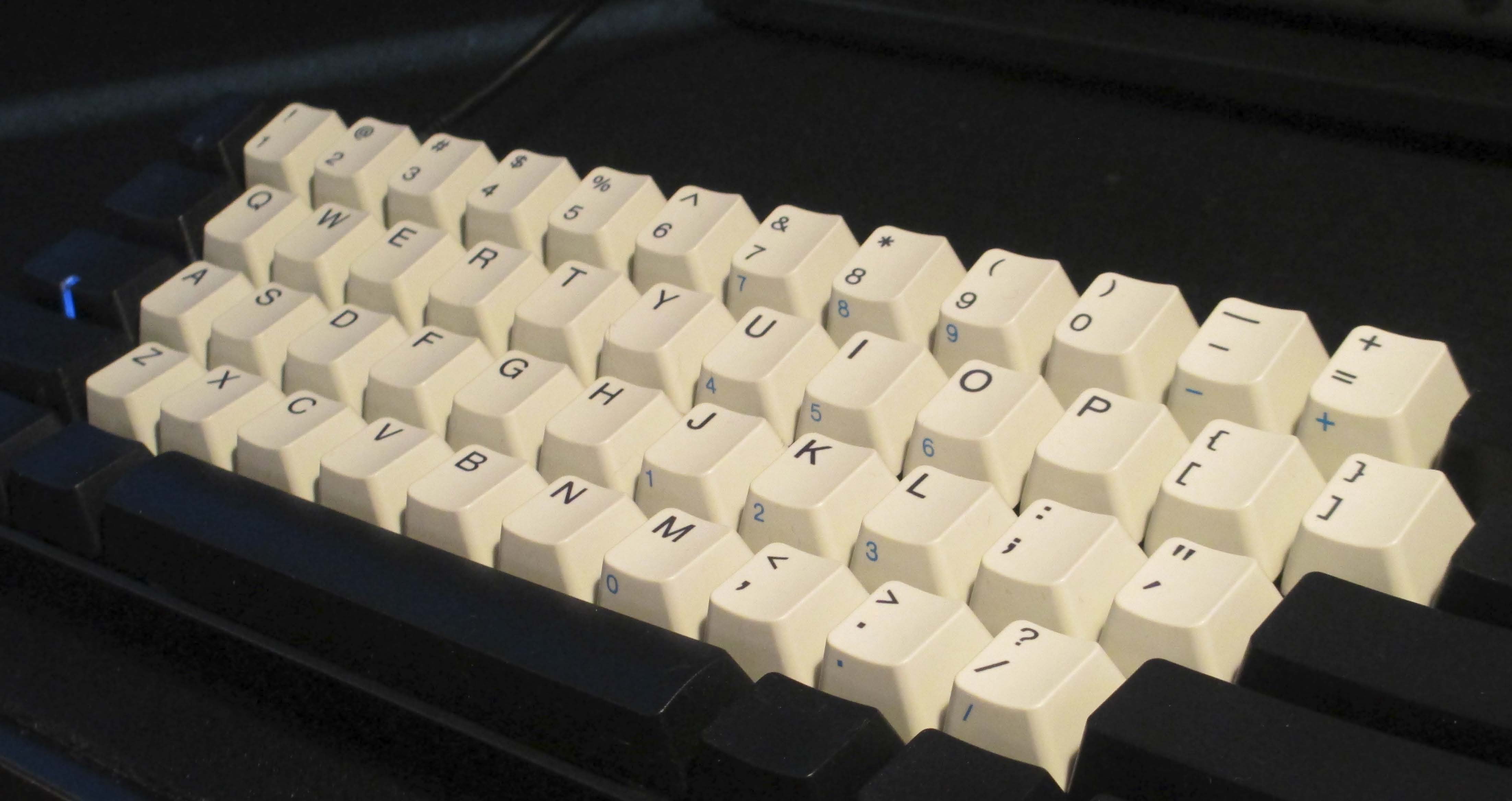
- DyeSubPBT_IBM_5140c.jpg (322.42 KiB) Viewed 7395 times
I like the clean uncluttered look of this keycap set. As much as I like the HHKB Pro 2, its keycaps are too cluttered, especially with the way they have done the front legends. IBM did it better, IMO.
Posted: 17 Aug 2015, 22:09
by cswanic
+1 on the red mods with white keys

+1 on blue mods with white alphas. Go with the sharpest clean white if possible

+1 if you mashup your Topre spacebar color wheel with a clean crisp alpha set and some CMYK mods

+1 on the 4th in your OP (you can always give them what they wanted ahem with a teal blue and a greyish alpha)

-1 on black alphas, there's no need for what is already on the board

Dull blue and dull gray didn't really work with the Novatouch drop response. Go for crisp clean suit and tie look, think brand new shirt and collar look would be sharp

Posted: 17 Aug 2015, 23:45
by matt3o
I'll be working on more designs tomorrow!
Posted: 18 Aug 2015, 00:29
by cswanic
Thanks Matt3o! Murium's aheam ideas (suggestions) have never touched a topre board. Are you thinking DSA or SA? We can hold back on retro ideas until this one takes off, but a good polished keycap that doesn't shine after I eat a donut, would definitely make my 87U feel like Christmas came early this year.
Black letters stand out clean on white caps and give a total edge to a red alpha set with black or blue mods.
+1 on orange mods with white alphas. Would go real well with a topre pumpkin cap

Posted: 18 Aug 2015, 00:58
by Hypersphere
It would be good to have at least one design that is based on a classic, such as the Classic Beige from BSP featured by Originative.
Suggested colors:
Olivetti blue or dark green legends on creamy white alphas with beige modifiers.
Suggested font:
Helvetica
Posted: 18 Aug 2015, 02:35
by Muirium
cswanic wrote: Are you thinking DSA or SA?
Neither! This is Topre we're talking about. So no need to worry about ABS or shine, either. They will be cylindricals, just like what you'll find on any HHKB or Realforce today, besides the HiPro.
We'll get to that one later…
And yes I nominated those colours because they clearly work, but have never come to Topre.
Posted: 18 Aug 2015, 23:43
by cookie
I vote for blank caps
Posted: 19 Aug 2015, 00:16
by Hypersphere
+1 for cookie's suggestion for blanks.
I should think that blanks might be an easy option for any of the colorways that are chosen (?).
Note that it is still possible to get black blanks or white/gray blanks for the HHKB from EK.
However, although it is possible to buy a black-on-dark-gray RF87UB from EK, this is only "pseudo-blank", and blank white/gray sets for the RF do not exist.
EDIT: I just finished installing silencing rings on another HHKB. I put my last set of Topre blue alphas (no longer available!) on it, with some red accents and gray HHKB modifiers.
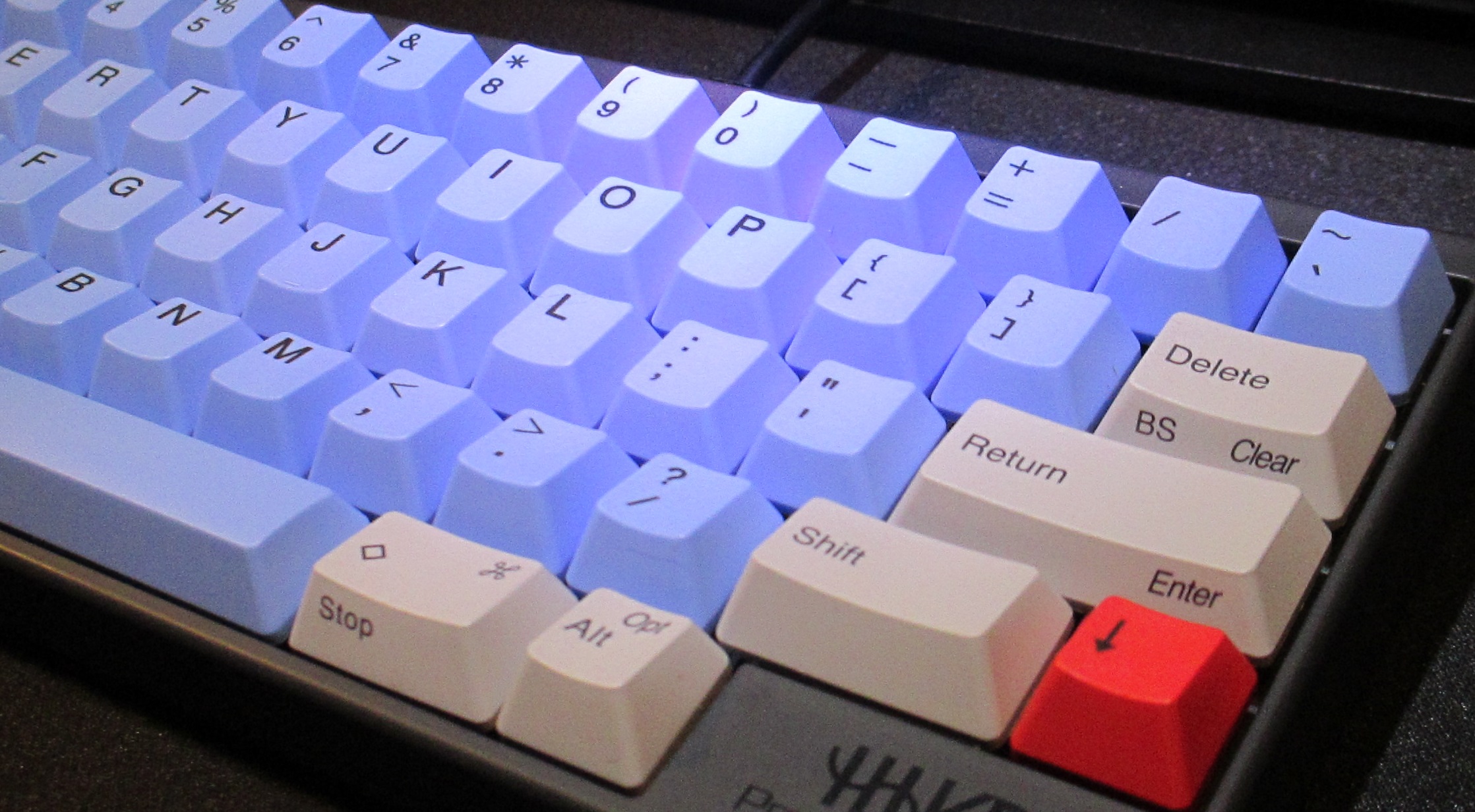
- Topre_Blue_Gray.jpg (659.55 KiB) Viewed 7247 times
Pardon the lousy image -- my study is dimly lit with low-wattage incandescent task lamps; I had to hold an LED flashlight in one hand and snap the shutter on the potato cam in the other hand to get the gray caps to show up gray instead of beige. Either way, I really like the Topre blues. Although this color has existed before in Topre sets, apparently they are no longer being made, and I would like to cast a vote for this color.
Posted: 19 Aug 2015, 01:47
by Muirium
Dyesub eats blanks for breakfast. Pretty literally! All these caps are manufactured blank first, then printed later. So blanks are definitely technically feasible.
Up to Topre, of course, whether they want to sell them. In theory, blanks cost less as they avoid the expensive dyesub oven process entirely.
And yes, blanks are a smart way to support the HHKB on the sly. But you'll still need all the right sizes and rows. Some of them are tricky.
Posted: 19 Aug 2015, 08:21
by Khers
Muirium wrote: Dyesub eats blanks for breakfast. Pretty literally! All these caps are manufactured blank first, then printed later. So blanks are definitely technically feasible.
Up to Topre, of course, whether they want to sell them. In theory, blanks cost less as they avoid the expensive dyesub oven process entirely.
And yes, blanks are a smart way to support the HHKB on the sly. But you'll still need all the right sizes and rows. Some of them are tricky.
The only tricky key is the 1.75u R4 right shift, every other key needed for an HHKB should be in a set covering an RF. Because of this, I also vote in favour of blank sets in addition to dye subbed.
Posted: 19 Aug 2015, 08:34
by matt3o
Posted: 19 Aug 2015, 08:49
by 002
Nice!
I really would love to see the blue or red sets done

Posted: 19 Aug 2015, 08:58
by Khers
All of them are nice, but I prefer the gray/white one. And I've always been a sucker for pink.
Posted: 19 Aug 2015, 09:03
by matt3o
one last...

Posted: 19 Aug 2015, 10:08
by Khers
That's the one! Low key, with a dash of red.
Posted: 19 Aug 2015, 10:14
by 002
That one looks great too, looks like the JUST Systems board...but I would actually be upset if Topre picked that one because it would be too easy for them

Posted: 19 Aug 2015, 10:49
by cookie
I absolutely love the gray with pink modifyers! My two favorites are definately the Gray/Yellow and Gray/Pink!
I prefere the modifyers with only symbols!
Posted: 19 Aug 2015, 13:04
by cswanic
Is there any option to add side printed legends for the shortcuts that come standard on the 87U?
Posted: 19 Aug 2015, 14:56
by Hypersphere
Thanks for showing us some additional designs. My impressions:
Dark gray alpha/Pink mods: Alphas are too dark. I do not like pink at all.
Light gray alpha/White mods: Getting better, but a bit blah. The gray is still too dark for me. I prefer the first of the two designs with the standard legends.
Blue on white alpha/Blue mods: I like the alphas; the mods would look better in light gray. I prefer the first of the two designs with the standard legends.
Red on white alpha/Red mods: Not too bad; I prefer the first of the two designs with the standard legends.
The one last (White alphas/dark gray mods/red accents). Not bad, but would prefer lighter gray or black blanks for mods. Prefer the first of the two designs with the standard legends. Red accents are nice; would prefer red blank for Right Control.
Posted: 19 Aug 2015, 18:04
by potatowire
matt3o wrote: one last...
My unequivocal favorite.
Posted: 19 Aug 2015, 18:07
by andrewjoy
agreed thats the best one
Posted: 19 Aug 2015, 20:12
by Muirium
Very nice. I do, of course, like me a spot of Honey!
The red, white and blue colourways are spectacular too. The top left justified, text modifier one is a solid improvement on Topre's current design. (But remember the little LED window in left Control!) The centred, icon legend design really speaks to me though. I advise making the alpha legends a good bit bigger, perhaps the same size as on the text mod alphas, while remaining centred. Granite was a class act that way…
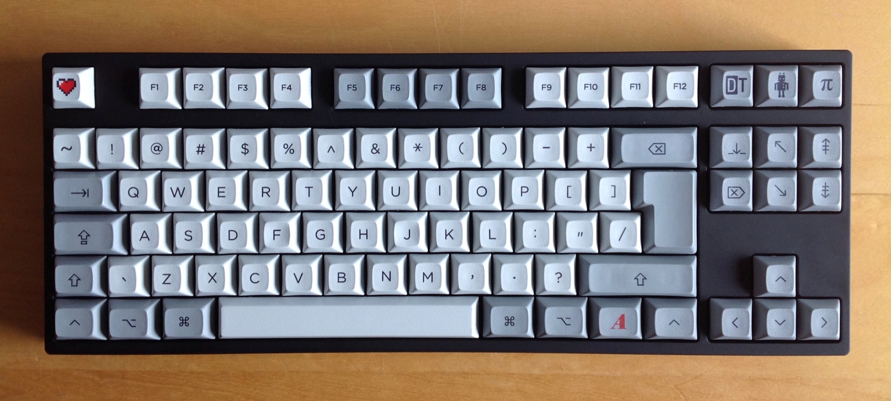
Note my Command and Option keys on the bottom row. Mac users are going to want something like that for this set. Or perhaps dual legends like they are on the HHKB?
Posted: 19 Aug 2015, 21:16
by cookie
This MX keycap wankery on topre boards, it's disgusting!
Yes I am jealous!
Posted: 19 Aug 2015, 21:26
by Madhias
Hmm, hard to decide! The last one is nice of course, Round 5 flavor on Topre, but maybe with some darker alphas? Grey?
Posted: 19 Aug 2015, 21:55
by Khers
Muirium wrote: [...]
I advise making the alpha legends a good bit bigger, perhaps the same size as on the text mod alphas, while remaining centred.
[...]
Note my Command and Option keys on the bottom row. Mac users are going to want something like that for this set. Or perhaps dual legends like they are on the HHKB?
Agree on both, but I guess the second is not up to you, matt3o

Posted: 19 Aug 2015, 23:05
by Muirium
Now that I've got Granite back on my NovaTouch, I'm falling for these colours again too. They're pale enough to have superb contrast with dyesub. That's the way to do it! None of the invisible dark-on-dark stuff.
cookie wrote: Yes I am jealous!
No need to be, these will be legit Topre.
Posted: 20 Aug 2015, 00:14
by matt3o
it is very unlikely that we will have options. Not that I won't try but this set will 99% be a RF exclusive.
I believe side printed can be done but I have to ask for confirmation, last time my contact was sick.
Regarding the left-control window, I'll fight for not having it
Same as the domed wincrap key
Posted: 20 Aug 2015, 00:43
by Hypersphere
matt3o wrote: it is very unlikely that we will have options. Not that I won't try but this set will 99% be a RF exclusive.
I believe side printed can be done but I have to ask for confirmation, last time my contact was sick.
Regarding the left-control window, I'll fight for not having it
Same as the domed wincrap key
Let's change "domed" to "doomed".