Page 21 of 53
Posted: 05 Mar 2014, 17:18
by Muirium
The good thing about a neutral shade is that if it winds up too close to the primary legend colour, we don't lose anything. It's a safer bet.
Posted: 05 Mar 2014, 17:29
by matt3o
okay... I must say it. it's very nice.

but still, I'm not completely sold.
Posted: 05 Mar 2014, 17:30
by Muirium
Drool…
Posted: 05 Mar 2014, 17:37
by imbattable
Have you tried a few different colors? Maybe a cool blue would fit better with the colder base color scheme.
Posted: 05 Mar 2014, 17:40
by ماء
matt3o wrote:okay... I must say it. it's very nice.
but still, I'm not completely sold.
you steal....
my old idea 
different colors on shift but i not sure SP can do quite diffilicult,usually different colors on some languange
and the shift/capslock LED
Posted: 05 Mar 2014, 17:42
by Muirium
A steely blue-grey would be my pick, I think. Or the golden brown of the SSK's integrated numpad.
Posted: 05 Mar 2014, 17:49
by matt3o

here I also used a more neutral gray for the modifiers
Posted: 05 Mar 2014, 17:50
by Muirium
Yes, I like it!
Posted: 05 Mar 2014, 17:58
by Ichigo87
I love it too. Third color when there is a third symbol ?
Posted: 05 Mar 2014, 18:05
by matt3o
medium gray I'd say.
Posted: 05 Mar 2014, 18:53
by scottc
You should definitely add a matt3o robot into the Nerdom set.

Posted: 05 Mar 2014, 18:58
by Muirium
Yes! Matt3o bot + Webwit duck and how about a DT logo cap? All in matching colours for this set. You even did the vector graphic already.
Posted: 05 Mar 2014, 19:05
by Broadmonkey
Curses Muirium, I was just about to post about the DT cap now that my horrible mock up was done!

- DT keycap.png (1.92 KiB) Viewed 4984 times
Posted: 05 Mar 2014, 19:09
by scottc
DO IT!
Then of course we'd have to have a Mu cap...
Posted: 05 Mar 2014, 19:10
by Muirium
I'm still after the whole Greek alphabet, naturally.
Broadmonkey wrote:Curses Muirium, I was just about to post about the DT cap now that my horrible mock up was done!
DT keycap.png
Well, it's an improvement on Caps Lock!
By the way, we want to clone your A…
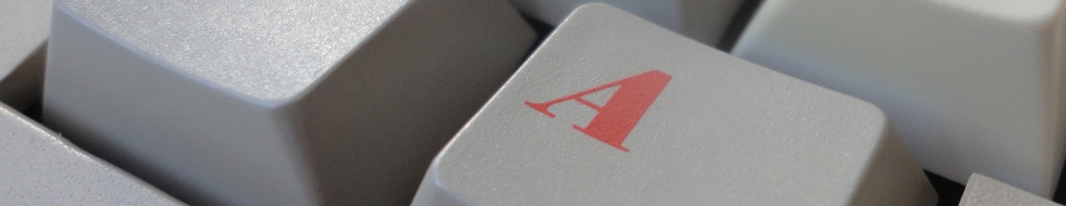
Posted: 05 Mar 2014, 19:14
by matt3o
I'm not so interested in DT or GH keys, unless I get official website requests

And I totally need a really high def image of the Amiga A!
Posted: 05 Mar 2014, 19:16
by Broadmonkey
I can send you a higher resolution pic of that Amiga A if you like?
The DT key is because it would cover any function you might give it apart from caps lock... which everybody should do
I really like the green "second" layer or shift characters, makes it worthwhile to have it dye sub instead of double shot.
What I don't understand however is why the sets must be so large. Do we know price tiers?
Posted: 05 Mar 2014, 19:17
by Muirium
The best picture would be a straight down shot. But I can try correcting the perspective in your angled picture, if you've got a nice high res one.
Posted: 05 Mar 2014, 19:21
by Broadmonkey
I have to take a picture for the wiki of it anyway, along with the hollow A (which is actually in a different font). I just haven't gotten around to do it yet.
Posted: 05 Mar 2014, 19:22
by squarefrog
matt3o wrote:you sure about that? seems quite different. It seems more a revised version of Times New Roman.
Anyway attached a version with Bodoni XT.

I've been able to fix the thundercats logo, so we can probably keep it. The only problematic one is probably DOS, time for a duck?

That pi key will come in handy!

Also I second the vote for a Vim key!
Posted: 05 Mar 2014, 19:25
by matt3o
Broadmonkey wrote:I can send you a higher resolution pic of that Amiga A if you like?
The DT key is because it would cover any function you might give it apart from caps lock... which everybody should do
yes please, take a picture of both the filled and outlined A. Straight from above if possible.
Broadmonkey wrote:I really like the green "second" layer or shift characters, makes it worthwhile to have it dye sub instead of double shot.
What I don't understand however is why the sets must be so large. Do we know price tiers?
How so? You mean so many kits? Well it's dye sub so we have no restrictions on legends.
Personally I would gladly get rid of the Icon kit... but if there's really interest in it...
Posted: 05 Mar 2014, 19:30
by scottc
matt3o wrote:I've been able to fix the thundercats logo, so we can probably keep it. The only problematic one is probably DOS, time for a duck?
So what you're saying is... THUNDERCATS GO?
Posted: 05 Mar 2014, 19:35
by matt3o
scottc wrote:matt3o wrote:I've been able to fix the thundercats logo, so we can probably keep it. The only problematic one is probably DOS, time for a duck?
So what you're saying is... THUNDERCATS GO?
LOL! Cheetara, FTW!
Posted: 05 Mar 2014, 20:01
by matt3o
Updated kits. Please review (note: I placed a couple of errors in the legends to see if you are alert)
Please review carefully the Ergodox and give feedback (it will be available in blank with more colors)


The colors are GKK + GDE (= NEUTRAL GRAY)
Colored second legend to be evaluated.
Posted: 05 Mar 2014, 20:06
by Muirium
Nice work.
"Shift" in the Pro Kit is the error I can see.
Perhaps the Pear Kit is the place for my beloved symbolic chevron Controls? They're a clash right now.
Posted: 05 Mar 2014, 20:15
by matt3o
yep the shift is the first error.
I'll work on a second set of symbols later and we will pick the best one.
Posted: 05 Mar 2014, 20:20
by squarefrog
the /? key in ergodox shouldn't be there. That's right shift. The {[ is odd to be a 1.5x too?
Posted: 05 Mar 2014, 20:24
by matt3o
squarefrog wrote:the /? key in ergodox shouldn't be there. That's right shift. The {[ is odd to be a 1.5x too?
position of the keys is irrelevant. Look at the legends.
Posted: 05 Mar 2014, 20:25
by squarefrog
Yes, but look at the massdrop configurator, I imagine this is probably a popular layout.
https://www.massdrop.com/ext/ergodox/?r ... a6f41e20e6
Also might be worth a layer push/pop or toggle for the inner vertical 1.5x?
Posted: 05 Mar 2014, 20:28
by matt3o
Considering the Pro Kit, isn't that basically covered?