Page 14 of 53
Posted: 26 Feb 2014, 03:00
by zhh824
1) DSA PBT Dye-Sub from SP I'll choose this option
Posted: 26 Feb 2014, 06:15
by Vierax
zhh824 wrote:1) DSA PBT Dye-Sub from SP I'll choose this option
It will be, it's an imperative from Matteo : we're now discussing colour scheme and font.
BTW welcome on DT

Posted: 26 Feb 2014, 07:55
by matt3o
pasph wrote:Everything looks good on black (cases), not so on white but i think it will look great on silver
all the keycaps sold as "beige" that I've found are actually white/gray.
This is one of the few really "beige" sets I've seen (on the right)

and I find that black is too cold as a contrast color. Anyway I don't really care since I'm putting them on custom keyboards

Posted: 26 Feb 2014, 08:20
by matt3o
Posted: 26 Feb 2014, 17:59
by matt3o
Since it will be dye-sub'd I'm planning on having a kit with some "random" images. If you have ideas for something nice and or retro please let me know.
Consider that:
- no company/product logos (unless the logo is released under some open minded license)
- no full color legends (just line art/clip art with 1/2/3 shades max)
Posted: 26 Feb 2014, 18:08
by 7bit
What about the matt3o-robot?

Posted: 26 Feb 2014, 18:20
by matt3o
7bit wrote:What about the matt3o-robot?
why not?
my wife suggests this

- cats.png (23.3 KiB) Viewed 5681 times
Posted: 26 Feb 2014, 20:14
by matt3o
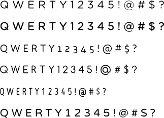
slightly bigger preview with gotham. Later I'll try DIN and others

Posted: 26 Feb 2014, 20:15
by Muirium
Others = Helvetica Neue!
Posted: 26 Feb 2014, 20:22
by matt3o
ok, DIN sucks on keyboard. Gotham is very nice, but too bold but I should have a lighter version somewhere.
Helvetica should be on my mac, I'll port it to linux.
Posted: 26 Feb 2014, 20:26
by Muirium
Copy over Helvetica Neue and Helvetica Rounded too. I think they're all bundled Mac fonts. Neue is the best. Rounded looks more like Gotham.
Posted: 26 Feb 2014, 20:35
by 7bit
There are
TeX Gyre Heros and
URW Nimbus Sans L,
but they are not rounded.

Posted: 26 Feb 2014, 21:21
by Madhias
Posted: 26 Feb 2014, 21:36
by jdeblese
Ooh, pretty
Posted: 26 Feb 2014, 21:39
by Muirium
First and last are the best! A shade heavier Helvetica Neue perhaps. Anyway, Gotham is fantastic.
Posted: 26 Feb 2014, 21:54
by Acanthophis
I would like something between Gotham Light and Medium, that's presumably plain Gotham.
And, did we (you) already discuss the mods? I'm a big fan of symbols only. Makes it also universal for different languages.
Posted: 26 Feb 2014, 22:22
by jdeblese
Acanthophis wrote:I would like something between Gotham Light and Medium, that's presumably plain Gotham.
That would be Gotham Book, the weight that was made for long texts (as the name implies).

Posted: 26 Feb 2014, 22:29
by Muirium
Posted: 26 Feb 2014, 23:45
by matt3o
I agree gotham is too bold. It will probably need to be edited quite a bit.
Posted: 27 Feb 2014, 00:06
by jdeblese
matt3o wrote:I agree gotham is too bold. It will probably need to be edited quite a bit.
You don't have a lighter variant of the font yet?
Posted: 27 Feb 2014, 00:16
by matt3o
- text.png (20.44 KiB) Viewed 5576 times
The first is Gotham the second is Gotham with 1px outline. Outline is sometimes problematic, it requires some work to have it really perfect. I couldn't really find a midway between gotham and gotham book.
I don't like any of the others. CoreHumanist (the third) is nice, but not on a keyboard imho
Posted: 27 Feb 2014, 01:15
by Vierax
matt3o wrote:Since it will be dye-sub'd I'm planning on having a kit with some "random" images. If you have ideas for something nice and or retro please let me know.
Consider that:
- no company/product logos (unless the logo is released under some open minded license)
- no full color legends (just line art/clip art with 1/2/3 shades max)
some suggestions :
Tux (the Linux mascot)
the pirate flag from you Macross Set
a
glider from the Conway's game of life
a DT logo (obviously) and GH logo (no jealous
)
the keyboard in unicode
⌨ (U+2328)
I'm not original, sorry

Something about spacebra in retro SF style will make this GB very unique

Did you plan to add multiple colours or images will be monochromatic ?
Posted: 27 Feb 2014, 02:26
by webwit
A duck.
Posted: 27 Feb 2014, 02:56
by strafe
7bit wrote:What about the matt3o-robot?

Posted: 27 Feb 2014, 09:08
by matt3o
webwit wrote:A duck.
give me the best duck you can find and I'll try to include that
Posted: 27 Feb 2014, 09:10
by Muirium
I, too, want the Duck. Or ten. You know, if that's the only way to get a single legend numrow…
Posted: 27 Feb 2014, 09:14
by matt3o
Muirium wrote:I, too, want the Duck. Or ten. You know, if that's the only way to get a single legend numrow…
I'd suggest blanks...
Posted: 27 Feb 2014, 09:19
by Muirium
A keyboard's got to be all blank to pull that off. A missing key here and there just looks daft. Better off with a gallery of symbolic ducks.
Posted: 27 Feb 2014, 09:30
by matt3o
keyboards bring the worst out of all of us
Posted: 27 Feb 2014, 09:36
by Muirium
But ducks!
Anyway, I'd really like single full size legends on the numrow (and indeed everywhere) for a truly uniform look, without the traditional cramped double deck legends we've gotten used to by mere conditioning. I can live with a standard set, of course, but as we have more freedom in dyesub it feels like the ideal time to try. It's not like I'm hunting around for the numbers down there anyway…
(Yes this is DSA. I'll can go all numeric with a numpad kit. (As long as you include a single unit 0. Can't even remember if that's standard or not. Where's a numpad around here?) But I'd like to take out all the double legend keys…)