Page 57 of 76
Posted: 12 Feb 2016, 23:01
by seebart
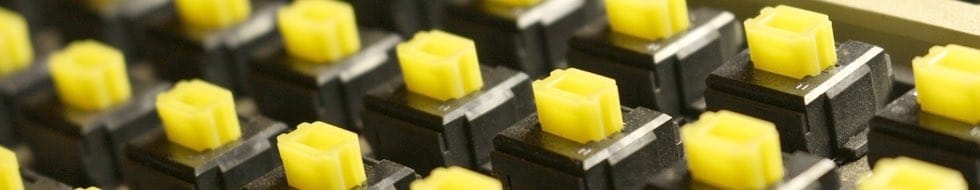
Nice Redmaus, nice color.
Posted: 12 Feb 2016, 23:03
by Madhias
Great color, that yellow! I like it.
Posted: 12 Feb 2016, 23:17
by webwit
I agree, makes it stand out from the other headers. We should have more exotic (Alps) colors.
Posted: 12 Feb 2016, 23:19
by seebart
webwit wrote: I agree, makes it stand out from the other headers. We should have more exotic (Alps) colors.
Some of those orange Alps SKCM in the Wang I got from you might look good too, but this yellow just pops out.
Posted: 12 Feb 2016, 23:21
by Redmaus
Definitely would love some amber alps to do this with.
Posted: 13 Feb 2016, 01:04
by Muirium
Great shot. I'll add it.
- IMG_7866_cr.jpg (25.09 KiB) Viewed 5512 times
Okay, I tweaked the levels a bit to bring out the detail. Try clicking this image and Redmaus's original one to see what I mean. My header workflow often involves a bit of this, on other people's pictures as well as my own. It's a good way to force a re-save and reduce the jpeg size, as well as appease my OCD.
Posted: 13 Feb 2016, 07:42
by Madhias
The original with rich black was better, more contrast and less washed out Instagram look

Posted: 13 Feb 2016, 09:40
by Compgeke
I agree, the darker one does look better (on my screen).
Posted: 13 Feb 2016, 10:12
by webwit
I'd like to complain in my capacity of chairman of the Committee Against Re-saving Lossy Digital Images.
Posted: 13 Feb 2016, 10:37
by tigpha
I prefer the original: more geometric, less distracting dust specks, almost abstract and bold. Very suitable as a poster background.
Posted: 13 Feb 2016, 12:26
by Muirium
webwit wrote: I'd like to complain in my capacity of chairman of the Committee Against Re-saving Lossy Digital Images.
I'd consider it if I had the capacity to delete headers once they're uploaded…
As for re-compressing: here's an experiment you can try at home. Put Redmaus's original image through
ImageOptim (or Kraken or whatever godforsaken thing you Linux kids use) and note the output file size. Then compare with mine. Resaving the jpeg got it down from >100k to about 50 as I recall (AFK) while the subsequent run through the optimizer got it from 50 to 30. Without the initial resave, the file would likely still be twice the size.
Posted: 13 Feb 2016, 13:12
by webwit
That's lossless, but if you change it and then save...
Posted: 13 Feb 2016, 13:23
by Muirium
Spot anything wrong with the one I uploaded? I didn't do it blindly.
If you want to be a MOAR BANDWIDTH image quality junkie, I demand 4X resolution headers while we're at it! 980x190 is fine for you proles but those of us at 4K aren't getting the classy, superior experience we inherently deserve!
Posted: 13 Feb 2016, 13:35
by seebart
On very few images a difference may become visible. In this case Redmaus's Alps have less contrast overall after your resave. It doesent kill it though, still looks good IMO.
Posted: 13 Feb 2016, 13:38
by Muirium
I made it brighter on purpose. I tried two versions and liked the brighter one better, so I went with that. The other one was indistinguishable from the original file… besides the freed up bandwidth.
I'll use Webwit's passionate loathing for the bright one as my incentive for him to finally add that delete header button I've been pestering for the last couple of years. Once he implements that, I can safely substitute the dark version of the file!
Posted: 13 Feb 2016, 13:43
by seebart
I like the fact that our mighty duck is quacking up to you scottish header dictator.

- z4o0d.jpg (24.6 KiB) Viewed 5400 times
Posted: 13 Feb 2016, 13:49
by Muirium
Someone add a speech bubble to that picture, quacking on about compression artefacts!
Posted: 13 Feb 2016, 13:56
by seebart
Duck-meme last edited by seebart.
Posted: 13 Feb 2016, 13:58
by Madhias
The compression is OK, but the contrast is gone - and that was the nice thing about that picture. Bold colors!
Posted: 13 Feb 2016, 14:15
by Muirium
I tweaked the shadows, not the contrast, damnit Jim!

Posted: 13 Feb 2016, 14:18
by Madhias
And therefor the contrast is gone!
But if you are viewing it only on a Retina screen, like on a MacBook or iMac, it could be the reason why the original image is too dark or contrast too high or dark tones are too dark. I have this problem with my MacBook, that if I only edit images there, all images are more or less too bright in the end. I hate the screen for that. The old matte screens were much better. So I check images also on the PC, the tablet and the smartphone. Also: I think whoever is responsible for going glossy everywhere (the-screens-are-NOT-'semi'-glossy) works only at night and should be doomed.
Posted: 13 Feb 2016, 14:23
by seebart
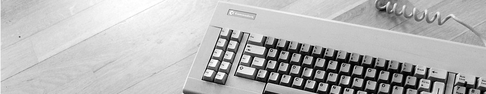
Uh oh...now were getting into dangerous realms... cross platform header optimization. Of course all headers have to be re-optimized for superior Apple specs. Got a retina header?
- Unbenannt.JPG (29.05 KiB) Viewed 5399 times
Posted: 13 Feb 2016, 14:23
by Muirium
I checked the file on my colour calibrated Dell 24" 4K display as well as my MacBook Pro. Some things are just down to taste! The original's a wee bit too murky for my liking. But as you guys prefer it, I'm open minded.
You know, when I can actually remove the already upped version… (whistles towards duck)
Posted: 13 Feb 2016, 14:29
by Madhias
High res image loading must be added everywhere! When I had a homepage I added this feature, and fast my web space was gone... I calculate about 300Kb-1MB depending on the picture for 2048px size with nice looking compression.
Muirium wrote: The original's a wee bit too murky for my liking. But as you guys prefer it, I'm open minded.
Both versions are totally fine, I prefer in this case the absolute blacks.
Posted: 13 Feb 2016, 14:50
by seebart
Slom's Cherry G80-0499:
- Cherry G80-0499.jpg (50.47 KiB) Viewed 5351 times
Posted: 13 Feb 2016, 14:51
by Muirium
Nicely done! Tell me when you're finished Seebarting and I'll take my picks…
Posted: 13 Feb 2016, 14:54
by seebart
It's good now. Sorry. A little low on contrast in the logo area. Seriously.
Posted: 13 Feb 2016, 14:58
by Muirium
Aligning the Y of the logo to the keyboard always wins points from me.
Posted: 13 Feb 2016, 15:00
by seebart
It has potential, don't use it yet though.
Posted: 13 Feb 2016, 15:06
by Madhias
It is great! But make a small gap next to the Y, would be good. Maybe.