Page 53 of 76
Posted: 28 Oct 2015, 22:18
by Muirium
(Seebarting is a full stack technology. He does it to his opinions as well as his posts!)
Posted: 28 Oct 2015, 22:26
by seebart
Muirium wrote: (Seebarting is a full stack technology. He does it to his opinions as well as his posts!)

Just give me a nice thread to work.
Posted: 07 Nov 2015, 21:16
by 7bit
Whenever I see this:

I must think of that:
 ------------------------------------------------------------------------------------------------------------------------------>
Posted: 07 Nov 2015, 22:04
by seebart
Well green 7bit, I can relate. But on the right hand side there are some "slightly" different objects! You of all people should be able to distinguish keycaps from corny nude 70s chicks.

Or are you trying to tell us you want that cheesy header back?
Posted: 07 Nov 2015, 22:09
by Muirium
The fake vegetation clone job is the bit I object to.
Posted: 07 Nov 2015, 22:11
by seebart
Right and not enough nudity. If we're gonna have that then with proper T&A!
Posted: 07 Nov 2015, 22:17
by Muirium
Posted: 07 Nov 2015, 22:19
by seebart
That's nice but that's NOT what I mean and you know it. You want me to post examples...

- 5326bca323ec42ad80422a8ae6a29681-800.png (2.15 KiB) Viewed 5749 times
Posted: 07 Nov 2015, 22:52
by seebart
Posted: 07 Nov 2015, 23:04
by Muirium
Not bad actually. I like this theme.
Posted: 07 Nov 2015, 23:20
by seebart
I shot a ton of ergo pro pics. That keyboard is quite photogenic.
Posted: 08 Nov 2015, 01:14
by mr_a500
seebart wrote: Right and not enough nudity. If we're gonna have that then with proper T&A!
You mean like this?
(how times change)
No, I think this would be a safer header:
3.jpg
Posted: 08 Nov 2015, 01:34
by Muirium
Each one of the three would be great, if given the same quality treatment as these gentlemen:


Posted: 08 Nov 2015, 01:41
by mr_a500
Well to use a British expression, "I couldn't be arsed."
OK, since we have blue and red, how about yellow?
4.jpg
Posted: 08 Nov 2015, 01:43
by Muirium
Nah, needs to be one header: one photo. Got links for the source photos so we can try coming up with something too?
Posted: 08 Nov 2015, 01:47
by mr_a500
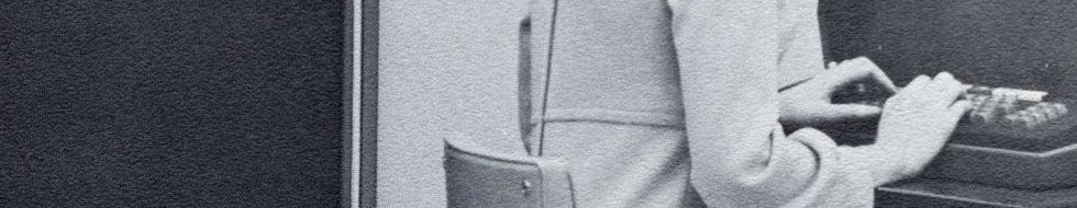
Source photos:
TEC terminal photo.jpg
CDC.jpg
102707317.023.01.lg.jpg
The problem is that they're all too vertical to crop a decent size without (..as you always bitch about..) being "too cropped".
Posted: 08 Nov 2015, 01:52
by Muirium
Great stuff! Nice resolutions to work with. Let's see who can make them header worthy…
Probably not me. I didn't have much luck with my own attempts at
Univac photos before.
Posted: 08 Nov 2015, 03:45
by mr_a500
Posted: 08 Nov 2015, 16:26
by seebart
I like this one with the overlay a lot mr_a500.
Posted: 08 Nov 2015, 16:33
by mr_a500
Which one? Original or seebarted version?
Posted: 08 Nov 2015, 16:35
by seebart
The first top one.
Actually, the second one works better in contrast against our logo. Might need a bit more contrast.
Posted: 08 Nov 2015, 16:48
by Prelim
Posted: 08 Nov 2015, 16:59
by snuci
How about a quick crop like this?
- TEC terminal header.jpg (88.17 KiB) Viewed 5549 times
Posted: 08 Nov 2015, 17:01
by Prelim
"no go", unless you take care of all that noise @@
Posted: 08 Nov 2015, 17:02
by Muirium
No way. Too blurry. We used to have more fuzzy headers in rotation, but I ruthlessly executed them. And I'll do it again!
Posted: 08 Nov 2015, 17:10
by Prelim
these are vintage photos, they will always have some noise and blur.
here's with less noise:

actually I like to see the old photos with the noise/artifacts, as it gives all the vintage looking which rules

Posted: 08 Nov 2015, 17:13
by Muirium
I've got to say I don't like the repetition. I'd much prefer an extension of the solid background colour instead. That can work great, when done well. And I don't know how to do it well myself. Know it when I see it though!
Posted: 08 Nov 2015, 17:20
by mr_a500
I like the sepia version. I normally hate repetition too, but I can't think of another way to fill that space. I did have this originally, but deleted it because I liked the closeup better.
f.jpg
Blank is just too plain.
Posted: 08 Nov 2015, 17:26
by Muirium
Works beautifully for the red and blue ones though. Maybe with a subtle texture. But no embedded secondary photography.
Posted: 08 Nov 2015, 17:30
by seebart
mr_a500 wrote: Blank is just too plain.
That's one hell of a large blank area then.


