Page 50 of 76
Posted: 28 Sep 2015, 21:37
by seebart
zuglufttier nice symmetry in your shot btw, I totally missed yours just now.
Posted: 28 Sep 2015, 21:43
by zslane
tigpha wrote: Dang! You saw right through me! It's that
Helvetica IBM thing again...
There, fixed it for ya.

Posted: 28 Sep 2015, 21:45
by Muirium
I do like a nice bit of pandering. I'll make my picks and up these to the roster soon, including the overdue ones I'd forgotten about!
Still want to do a good job of the Univac stuff though. But it can wait.
Posted: 18 Oct 2015, 18:02
by chzel
Just a test and a teaser! More pics to come later!
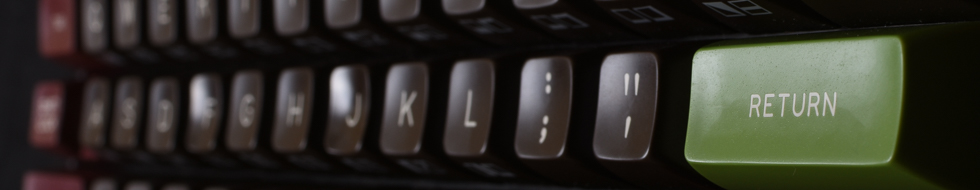
- D72_0730.jpg (90.8 KiB) Viewed 5515 times
And about a stop brighter
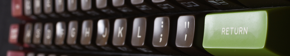
- D72_0730-2.jpg (106.32 KiB) Viewed 5514 times
A bit different
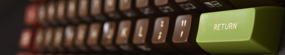
- D72_0737.jpg (89.35 KiB) Viewed 5511 times
Posted: 18 Oct 2015, 18:10
by seebart
Very nice chzel! The last one is my pick. Nicer colors in that one.
Posted: 18 Oct 2015, 18:13
by chzel
Thanks!

I had a bit of reflection from the flash setup in the first one and it messes with the colour a bit!
Posted: 18 Oct 2015, 18:38
by snuci
From my IBM 5100 beam spring keyboard:
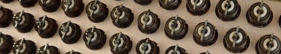
- Beam spring keyboard key switches
- IBM 5100 beamspring banner.jpg (92.68 KiB) Viewed 5491 times
Posted: 18 Oct 2015, 18:42
by seebart
With your collection you could post dozens of cool headers snuci! Nice one.
Posted: 27 Oct 2015, 13:06
by matt3o
the last two presented are fantastic!
Posted: 27 Oct 2015, 13:08
by 7bit
The warmer variant is better:


Posted: 27 Oct 2015, 14:20
by 002
Agreed
Great pics, chzel!
Posted: 27 Oct 2015, 15:01
by Muirium
Not bad. Added to the rotation.
Posted: 27 Oct 2015, 16:05
by seebart
Is it me or is that header of mine that's up right now (orange + red Micro Switch) slightly out of focus?
Posted: 27 Oct 2015, 16:22
by Muirium
Yes. Shoot it again and I'll replace it! Let me also suggest softer, more natural light. If you can find it!
Several
shots in rotation are imperfect in various ways. But if I was to be a true perfectionist, we'd hardly ever see a new pic. If the board, or composition, is interesting I will allow a bit of dodgy focus or iffy light. They aren't just selected for being the best technically shot photograph, or who would ever beat this?

Posted: 27 Oct 2015, 16:52
by mr_a500
7bit wrote: The warmer variant is better:
Nooooo! I hate "warm" (yellow) light. The second one was best.
Posted: 27 Oct 2015, 16:52
by chzel
Thanks everyone!
Muirium wrote: Several
shots in rotation are imperfect in various ways. But if I was to be a true perfectionist, we'd hardly ever see a new pic. If the board, or composition, is interesting I will allow a bit of dodgy focus or iffy light.
Could you point out which and in what way? Maybe some can be re-cropped or redone using another pic from a series.
For example I know the issue with the left side of my SSK pic, but I can't realistically reshoot it.
In the SA Retro case I don't really like the highlights on F and J, and I have a few different ones that might work better, or a bit of post processing might fix it.
I think most of us can handle a bit of constructive criticism!
Posted: 27 Oct 2015, 16:54
by chzel
mr_a500 wrote:
Nooooo! I hate "warm" light. The second one was best.
The two first are better colour-wise, I agree, but I don't like the way the Enter has caught the reflection from the umbrella.
I'll try a couple more iterations later tonight.
Posted: 27 Oct 2015, 16:55
by Muirium
I'll spend some hours sometime going through all 89 active pictures, applying pointers and critique! Man, that will take a while. I'll need to be good and foul tempered first…
mr_a500 wrote: Nooooo! I hate "warm" (yellow) light. The second one was best.
Should have objected sooner. It had 100% support when I upped it to the headers. I'm neutral on colour temperatures, personally, but I liked that composition best of the series, too.
Posted: 27 Oct 2015, 17:04
by mr_a500
Muirium wrote: I'll spend some hours sometime going through all 89 active pictures, applying pointers and critique! Man, that will take a while. I'll need to be good and foul tempered first…
No don't do that. You'll see all the awful flaws in my headers. (...if you haven't already)
Posted: 27 Oct 2015, 17:05
by Muirium
I see all flaws. Well, all flaws that I see…
One problem with updating images with improvements is that Webwit has no UI for actually deleting the old ones. Something… something… SSH? When I'm at a terminal, the site's not safe in my hands!

- Headers UI.png (1.77 MiB) Viewed 5364 times
Gimme a delete button, just like the Deactivate and Set as current buttons! Go on! It's a lot less dangerous than root access!
Posted: 27 Oct 2015, 17:10
by chzel
Muirium wrote: I see all flaws. Well, all flaws that I see…
That's deep man...
We can live with a few extra inactive headers. Just don't wipe everything...
Posted: 27 Oct 2015, 17:18
by seebart
Muirium wrote: One problem with updating images with improvements is that Webwit has no UI for actually deleting the old ones. Something… something… SSH? When I'm at a terminal, the site's not safe in my hands!
So replacing a header is easier than deleting? Because I've got plenty of shots on my DSLR.
Posted: 27 Oct 2015, 17:22
by chzel
No, he can only upload or set an existing as active/inactive. So the inactive become full of unwanted headers.
If he could delete it would be easier to manage and have an actual rotation between active and inactive.
Posted: 27 Oct 2015, 17:25
by seebart
Sounds like the eternal vortex of DT headers?!

Posted: 27 Oct 2015, 17:41
by Muirium
Exactly. Inactive should be full of good headers too, ready for reuse to keep things changing at a gentle rate. And it is. Until people offer updated versions of their pictures. Where do the originals have to go? Inactive. And how easy is it to pick out the right one again in future? Not. A500 caught one of those errors before. They're nigh on impossible to guard against, unless solved with a simple delete function. Boom! I just want it for that purpose. Weak headers don't make it into the system in the first place.
Posted: 27 Oct 2015, 17:50
by mr_a500
I suggest you remove my numpad header. The focus is... crapulent.
Posted: 27 Oct 2015, 18:03
by seebart
mr_a500 wrote: I suggest you remove my numpad header. The focus is... crapulent.
He won't do that, I've tried. You have to re-shoot. Once you're in the header business you can't opt out.

Posted: 27 Oct 2015, 18:25
by Muirium
Not true. But you should reshoot. I'd never use it myself, but it's a nice numpad, and a fair composition if not focus.
Posted: 27 Oct 2015, 18:32
by mr_a500
You'd "never use it"? What - are you anti-numpad or something? You want to fight about that?!
Actually, I don't use it much myself.
Posted: 27 Oct 2015, 20:06
by chzel
Nah..not really...Spacebar eats the logo and the top "ribbon" hides the top edges of the caps...
The bottom half is great though.
If only the header was ~30px taller..
Edit:....and I got seebarted???