Page 44 of 53
Posted: 21 Mar 2014, 22:02
by jdeblese
Muirium wrote:Well, it's better than SUPR. And shrinking them all for the benefit of a single legend in 1u is quite a sacrifice I think.
Indeed, I agree. I like them all like that, fully written out, even if it does mean that some are on two lines.
Posted: 21 Mar 2014, 22:11
by Halvar
I don't think that there's a capital FT ligature in any font. Maybe for "ft", but "FT"? . I'm sure that the font's kerning will do. Actually IMO it's fine on the current mockups.
Posted: 21 Mar 2014, 22:26
by 7bit
Can be easily made:
SHIF\hspace{-0.2ex}T or whatever is necessary.
This reminds me: I've got to tell Melissa to make them this way ...

Posted: 21 Mar 2014, 22:32
by Muirium
Go on, cram 'em in there nice and tight!
Posted: 22 Mar 2014, 00:07
by matt3o
there's little I can do about "SUPER".
Re SHIFT... actually the T is already a tad closer (let me check)
Posted: 22 Mar 2014, 10:33
by jacobolus
Definitely don’t smush a capital FT together. That would be terrible.
In general, I’d recommend trusting kerning tables made by Tobias Frere-Jones & al. (which isn’t to say there aren’t places that kerning could be improved on specific words used in a context like keycaps... but be careful about it).
Posted: 22 Mar 2014, 10:45
by Muirium
Indeed. I was kidding about 7bit's algorithmic approach. But it is worth a little look, just for curiosity's sake.
Posted: 22 Mar 2014, 10:46
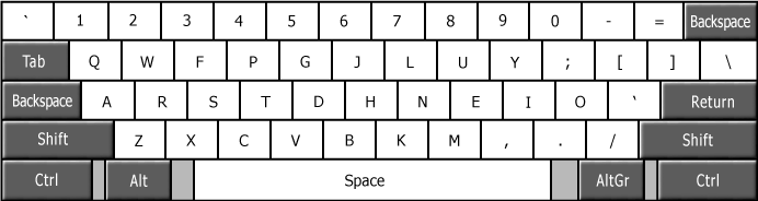
by matt3o
Posted: 22 Mar 2014, 10:58
by Kurk
Oh so nice! After round4 and DSA retro I thought I would never need more caps, but now...
Also, a late stage request: 1.75u FN key (text and/or symbol). How about it?

Posted: 22 Mar 2014, 11:01
by matt3o
Kurk wrote:Oh so nice! After round4 and DSA retro I thought I would never need more caps, but now...
Also, a late stage request: 1.75u FN key (text and/or symbol). How about it?
actually that's really a nice idea... shame on me I didn't think about it. I can't add it at this stage to the mods, but we have the lost+found that can be tweaked, removing the chevron control for example
Posted: 22 Mar 2014, 11:02
by Muirium
Good morning to you too, Matt…
1.75 Fn is a great idea though. I've gotten so used to using Caps Lock as a layer key I forget that's not what those words mean!
Posted: 22 Mar 2014, 11:04
by matt3o
actually... the 1.75u "enter" is really a niche key, I could better place that in the lost+found and replace it with FN (caps lock FN is simply genius)
Posted: 22 Mar 2014, 11:08
by Muirium
Colemak likes a 1.75u BACKSPACE.
I'm trying to learn it. Seems a good position, opposite RETURN.
Posted: 22 Mar 2014, 11:12
by matt3o
you really want those ^ controls to fly away

Posted: 22 Mar 2014, 11:13
by Muirium
Nah. But there are a few good things to do with 1.75u too.
Posted: 22 Mar 2014, 11:15
by matt3o
thanks god there are blanks
Posted: 22 Mar 2014, 14:41
by matt3o
bad news.
we can't dye sub on the sides of the key. So side legends would be pad printed (and I don't know if we can pad print in gotham). Suggestions?
Posted: 22 Mar 2014, 14:48
by Muirium
Drop the side legends.
Or is there popular demand for them? Even if compromised?
Posted: 22 Mar 2014, 14:52
by matt3o
you mean to remove all the third legends? or to place them bottom right instead?
Posted: 22 Mar 2014, 15:13
by Halvar
matt3o wrote:bad news.
we can't dye sub on the sides of the key. So side legends would be pad printed (and I don't know if we can pad print in gotham). Suggestions?
I think I missed that -- where did we have side legends planned? I thought tertiary legends were planned to be in the lower right corner in blue?
Posted: 22 Mar 2014, 15:18
by Muirium
Yeah, I'm confused about the plan for those too. It's been a while since we've seen the international mockups.
Posted: 22 Mar 2014, 15:32
by facetsesame
Darn, fonts could be limited on front pad printing? Does that mean SP couldn't do Westminster on the front of dirge orange SA?
Posted: 22 Mar 2014, 15:34
by Muirium
Argh!
Posted: 22 Mar 2014, 16:06
by matt3o
PBT sides can be pad printed but not sublimated. If I understand pad printing, you can actually pad print whatever you want but you need a stamp with your graphics. Making a stamp is probably cheaper than making the mold for a double-shot, but we have dozens of those side legends, so I'm going to simply put them on bottom-right.
Posted: 22 Mar 2014, 16:13
by jdeblese
So, like on the imgur images, including the blue color? I think we can live with that

Posted: 22 Mar 2014, 16:17
by imbattable
Well, since you seldom press the side of the key, I'd say pad printing does not suffer from the usual problems (different feel and wear over time). I'd rather have pad printed than bottom right, since it would mess with the overall centered look. The alternative would be to have the first legend top left aligned but that would throw all the work away you did so far, collide with the mono legend look and change the whole look of the set.
Posted: 22 Mar 2014, 16:41
by matt3o
holy international fucking legends

Posted: 22 Mar 2014, 16:44
by scottc
Looks great.
Posted: 22 Mar 2014, 16:48
by drrtyrokka
Yeah, nice!
Posted: 22 Mar 2014, 17:18
by facetsesame
matt3o wrote:PBT sides can be pad printed but not sublimated. If I understand pad printing, you can actually pad print whatever you want but you need a stamp with your graphics. Making a stamp is probably cheaper than making the mold for a double-shot, but we have dozens of those side legends, so I'm going to simply put them on bottom-right.
Ah I see, thanks matt3o!
Those international legends do look really good. I can feel myself getting sucked in...


