Page 41 of 53
Posted: 20 Mar 2014, 02:02
by jdeblese
I've been playing with a keyboard layout editor, trying to see what I can create with the sets we've built, and I'm really starting to like Murium's mono legends idea...

Damn, I'm looking forward to this

Posted: 20 Mar 2014, 07:54
by squarefrog
Hmmm. I thought monos would look strange with a few dual legend keys. But now I'm not sure. That looks lovely. Great now my wallet is sobbing

Posted: 20 Mar 2014, 09:27
by matt3o
I started working on the final templates. This is the real deal, legend text, size and position are actually the way they will be printed, so if you spot any error or have suggestions please report asap. I'll also post the SVG if you wanna play with it.
Maybe font size for the mods could be slightly smaller.

PS: I really don't like the @ sign
Posted: 20 Mar 2014, 09:51
by woody
So far, so good. The high-lighted (lit?) area is the allowed per SP template?
Posted: 20 Mar 2014, 09:55
by matt3o
woody wrote:So far, so good. The high-lighted (lit?) area is the allowed per SP template?
the highlighted area is the keytop. the printable area is slightly smaller than that. Actually if you print the SVG template you get a 1:1 replica of the keyboard
Posted: 20 Mar 2014, 10:24
by Muirium
Hmm… heard what just happened to Round 5? 7bit submitted his final order and SP put the price up enough he had to throw it back to taking new orders, hoping to hit a better tier. He's a smart man and I bet he had a good buffer in his model, but they shot through it anyway. Concerning!
SP are little guys too, so I sympathise with them also. Just beware we could be in for a rough ride.
Posted: 20 Mar 2014, 10:35
by matt3o
Muirium wrote:Hmm… heard what just happened to Round 5? 7bit submitted his final order and SP put the price up enough he had to throw it back to taking new orders, hoping to hit a better tier. He's a smart man and I bet he had a good buffer in his model, but they shot through it anyway. Concerning!
Muir, that is due to the complex 7bit system, the same happened to round 4. The prices you see here are exactly what you are going to pay. We have a less flexible system, but what you see is what you get.
Posted: 20 Mar 2014, 10:41
by Muirium
<Breathes sigh of relief>
Posted: 20 Mar 2014, 10:59
by Kurk
matt3o wrote:I started working on the final templates. This is the real deal, legend text, size and position are actually the way they will be printed, so if you spot any error or have suggestions please report asap. I'll also post the SVG if you wanna play with it.
Maybe font size for the mods could be slightly smaller.
<image>
PS: I really don't like the @ sign
Looking good.
- The @ is indeed a bit fat round its belly.
- Tilde looks a bit small.
- Single and double quotation mark should not be italic.
- Further: the font size of the mods looks OK to me. Is it the same font size as the rest of the non-alpha keys? CAPS LOCK looks a bit larger but maybe that's the nature of the beast.
Posted: 20 Mar 2014, 11:03
by Muirium
Caps is the same size. The quotes are Gotham's slanted "dumb quotes" rather than italic. Vertical ones should exist in there too. (Just watch out for "primes" which are larger characters.) Tilde is fine to me, as fiddling with it could wreck the aesthetic.
Meanwhile, I actually like a nice round @. Which is ironic, given the connotations…
Posted: 20 Mar 2014, 11:17
by matt3o
Thanks for your feedback, that's exactly what I was looking for.
Kurk wrote:Looking good.
- The @ is indeed a bit fat round its belly.
- Tilde looks a bit small.
- Single and double quotation mark should not be italic.
- Further: the font size of the mods looks OK to me. Is it the same font size as the rest of the non-alpha keys? CAPS LOCK looks a bit larger but maybe that's the nature of the beast.
The problem with @ is that it is uneven, the "a" is bold, the circle is very thin. I don't like it.
I'll try to make the tilde slightly bigger (but I don't want to make it too bold).
Single and double quote are not italic

that's how gotham makes them. I'll try to check if there are not italicized versions (like Muir suggests).
The mods font is smaller than alpha. All mods have the same font size (caps lock included).
Posted: 20 Mar 2014, 11:17
by imbattable
Muirium wrote:
Meanwhile, I actually like a nice round @. Which is ironic, given the connotations…
Posted: 20 Mar 2014, 11:23
by matt3o
hey look, MTV when they were actually airing music videos.
Posted: 20 Mar 2014, 12:46
by 7bit
squarefrog wrote:Muirium wrote:The key to getting anything in here without getting robbed lies in a little misdirection…
Misdirection through a nice EU country with low import tax?

Lëtzebuerg: 15%.
Or:
Ukrainia and wait until another part has been annexed, by a EU country this time.

Posted: 20 Mar 2014, 12:53
by Muirium
I'd love to see Scotland join the EU with a 10 or 0% import tax rate, but the Spanish already don't like us and I honestly don't see the referendum saying yes anyway.
A bit odd that the EU even has variable import taxes – this is just the kind of thing that should be standardised first – but here we are. The stinger in Britain is all the extra rules which multiply what you pay in practice.
Posted: 20 Mar 2014, 15:33
by matt3o
Some corrections (it really takes a lot of time)

and some fun


Posted: 20 Mar 2014, 15:39
by Muirium
Show us some single legend sweetness, you know you want to! Let's see dat @ in all its glory!
Posted: 20 Mar 2014, 15:46
by Ichigo87
Taxes are painful but it is the rule when you buy stuff abroad , sometimes you get lucky and sometimes you lose... I am ready to play instead of adding an extra step with a proxy which will add time and risk.
I love this kit and this group buy, i am sure that i am gonna try to buy 90% of the kits. The only thing, i don't like, is the yellow win keycap. Is there a chance to get them like others modifiers ?
Posted: 20 Mar 2014, 15:53
by matt3o
Ichigo87 wrote:I love this kit and this group buy, i am sure that i am gonna try to buy 90% of the kits. The only thing, i don't like, is the yellow win keycap. Is there a chance to get them like others modifiers ?
you mean "super" instead of "win"?
Posted: 20 Mar 2014, 16:35
by Ichigo87
In the Lost + Found kit, there is yellow "win" keycaps in the last version, or i didn't look at the good version.
Posted: 20 Mar 2014, 16:36
by matt3o
yeah those should be "win"... I dunno, will think about it
Posted: 20 Mar 2014, 17:46
by drrtyrokka
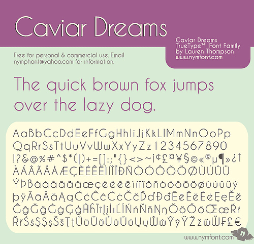
I really like this font here, what do you say?
http://www.dafont.com/caviar-dreams.font
There is a nice '@' logo too

And it's free for personal and commercial use...
If you could give me the svg file, i could edit it and you wouldn't have work to do..
Of course only if anyone likes it...

Posted: 20 Mar 2014, 17:59
by imbattable
The ugliest of Qs...
Do we really want to start talking about the font again? (inb4 µ demands Helvetica again).
Posted: 20 Mar 2014, 18:04
by drrtyrokka
just something i wanted to share. i like it though.
Nevertheless it would be fun for me editing the .svg file, just because i want to know how it will look like.
Posted: 20 Mar 2014, 18:24
by Broadmonkey
matt3o wrote:Broadmonkey wrote:oh yeah, I love the the Zoidberg! How come you changed the Amiga A to black?
1 black 1 outlined (like the original
Amiga), no?
Late reply here.
But the Amiga 500 was the low end model, the high end came with red A's

Posted: 20 Mar 2014, 18:37
by matt3o
oh you mean the color? I don't know, you need to use a very dark red on the dark gray, and I prefer to simply go black.
Re: IC/Discussion on beige set
Posted: 20 Mar 2014, 19:19
by Broadmonkey
Fair enough, if it is a problem of using red on dark grey.
Posted: 20 Mar 2014, 20:06
by Muirium
drrtyrokka wrote:I really like this font here, what do you say?
http://www.dafont.com/caviar-dreams.font
There is a nice '@' logo too

And it's free for personal and commercial use...
If you could give me the svg file, i could edit it and you wouldn't have work to do..
Of course only if anyone likes it...

Hmm…

Eye of the beholder, I suppose. It does have an art deco retro look about it.
imbattable wrote:Do we really want to start talking about the font again? (inb4 µ demands Helvetica again).
There is in fact a shirt for that…
 http://fuckyeahhelvetica.spreadshirt.com
drrtyrokka wrote:just something i wanted to share. i like it though.
Nevertheless it would be fun for me editing the .svg file, just because i want to know how it will look like.
Yes, me too. Ready to share with us, Matt?
Posted: 20 Mar 2014, 20:18
by matt3o
Really?! Do we want to change font at this stage?
Anyway, attached you'll find the SVGs, enjoy!

(you need Gotham rounded installed!)
If you print the SVG you get a 1:1 representation of the keyboard, that may help spotting errors.
These are the kits so far. As always please report any error.
This is exactly how they will be printed, if we put a typo or something we will have to live with it forever after!


Any idea for a better pause/break icon? (that is not a mug)
Posted: 20 Mar 2014, 20:24
by scottc
matt3o wrote:Really?! Do we want to change font at this stage?
Nooooooooooooooooo!


