Page 1 of 1
Keycapize me (aka the MonaKey)
Posted: 28 Dec 2013, 20:09
by matt3o
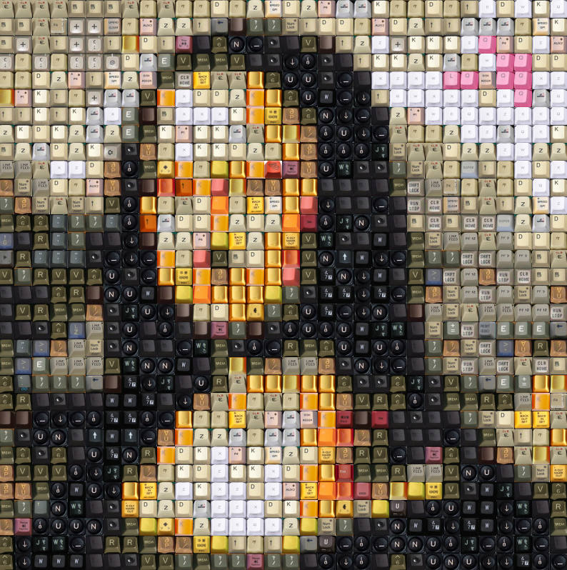
Okay I'm building a database of keycaps to be used as a reference to obtain this kind of images thanks to a software I'm writing

- monakey.jpg (147.41 KiB) Viewed 3462 times
It's a very long process, I have just 140 keycaps so far to test the algorithm but the end result is very nice already, so I'll keep grabbing keycaps around to achieve better results. I believe the sweet spot is around 400-500 keycaps. I especially miss the light not-saturated colors (light blues, light greens, light yellows, skin tones, ...).
If you find pictures of keycaps taken from above please post them (the higher the resolution, the better). If there's interest in such a tool I'll put it online and release under open source license.
Cheerio!
Posted: 28 Dec 2013, 20:42
by Muirium
Those yellow blanks look familiar. The low angle of light / high shadow look especially. Never thought they'd wind up in a da Vinci!
Posted: 28 Dec 2013, 20:50
by matt3o
not easy to source yellow keycaps

if you don't want me use them for my project just let me know
Posted: 28 Dec 2013, 20:51
by Muirium
Don't worry. Everything I upload is free for all to use as they like, too. I just like the irony!
Posted: 29 Dec 2013, 11:10
by matt3o
same picture with 225 reference images (getting better)
Posted: 29 Dec 2013, 11:42
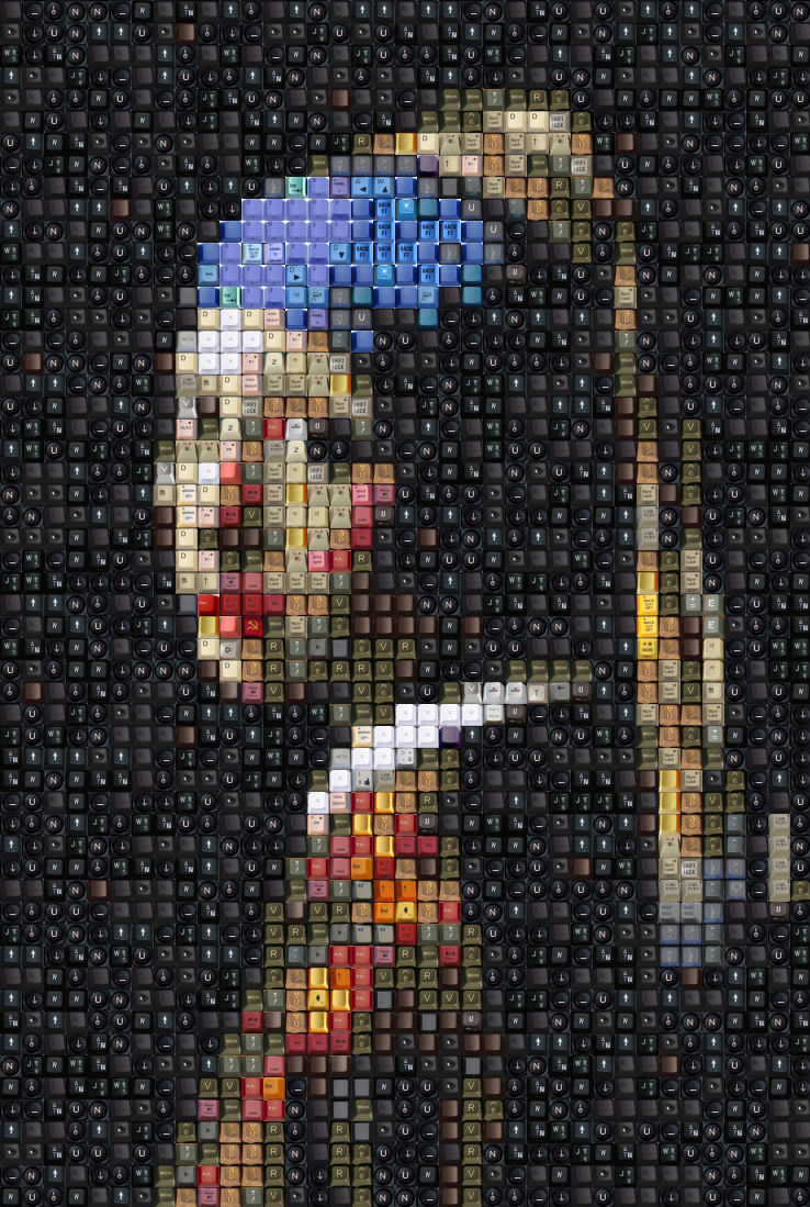
by matt3o
more fun
Posted: 29 Dec 2013, 11:42
by 002
Do I spy some EDIUS keys in there?

If you want some better pics of those caps I can get them, but not sure how much it would improve the pic really.
Posted: 29 Dec 2013, 11:46
by matt3o
002 wrote:Do I spy some EDIUS keys in there?
If you want some better pics of those caps I can get them, but not sure how much it would improve the pic really.
they literally saved my ass for some color shades
the image quality of the pictures in the wiki is just fine for screen resolution. it would be nice to be able to make large posters, in that case we would need really high resolution scans... but I don't think that's viable.
some keys (not from wiki) are actually very low res. I'll sort them out as soon as I get in the 500 keycaps range.
Also, I don't think blank keycaps are very meaningful in this context. I think I'll remove them. I'll add some old typewriters keys instead
Posted: 29 Dec 2013, 11:47
by Muirium
More samples are always better.
Especially when you go to the next step: no repetition!
Posted: 29 Dec 2013, 11:50
by matt3o
Muirium wrote:More samples are always better.
Especially when you go to the next step: no repetition!
that would be something... but very hard to archive, unless people start sending me ready to use cap images like crazy
Posted: 29 Dec 2013, 15:04
by Muirium
I can contribute a few. Straight down, naturally lit, squarely cropped. What dimensions would you like?
Posted: 29 Dec 2013, 15:07
by matt3o
the minimum would be 100x100. No need to go over 800x800 (unless we want to print...)
edit: I checked the images I already have. I'd say 256x256 is more than enough
Posted: 29 Dec 2013, 15:14
by Muirium
Good stuff. Some nice easy work for my macro. I'll clear my desk and see if the sunshine comes. I've got Honeywells (obviously), Round 4 SPH, a few blank PBT and backlit Ducky cylindricals, Tipro relegendables, a load of dye sub Helvetica IBMs…
Perhaps the best way to achieve no repetition would be to sample several of each kind of cap. So more than just a single Honeywell, etc.
Also, how do you feel about including larger caps? I've a neat few space bars. It'd test your programming chops a little more than the pure unitary mosaic you've got so far. Make everything based on quarter units and we should see some intriguing patterns with ISO Enters in the mix!
Posted: 29 Dec 2013, 15:19
by matt3o
please no blanks. I feel they don't fit the purpose (I'm going to remove the ones I already have). The legends build a very interesting texture on the final image.
Having more caps from the same keyboard is totally acceptable, though (to reduce repetition).
Re larger caps. It would be totally feasible but it would make the algorithm way more complex. I still have to optimize what I already have... Even though 2u modifiers would be easy to add.
Posted: 29 Dec 2013, 15:24
by Muirium
Fair enough. The space bar I want to add most, though, isn't blank!

Posted: 29 Dec 2013, 15:29
by matt3o
you really hate me, don't you?
Posted: 29 Dec 2013, 15:33
by Muirium
Square mosaics are nice, but they've been done plenty before. I want art as complex as my layout diagrams! Gotta squeeze 'em all…
Posted: 29 Dec 2013, 15:38
by mr_a500
These mosaics always remind me of this video:
Posted: 29 Dec 2013, 15:40
by matt3o
Muirium wrote:Square mosaics are nice, but they've been done plenty before. I want art as complex as my layout diagrams! Gotta squeeze 'em all…
considering that we have fixed keycap sizes (1u, 1.25, 1.5, 2, ...) it would be feasible to build a more complex texture. but again this is just a toy project, I can keep working on it and add features as long as there's enough interest/feedback/help.
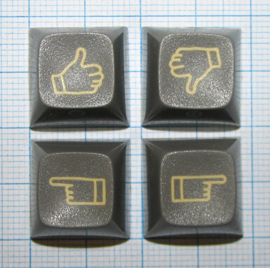
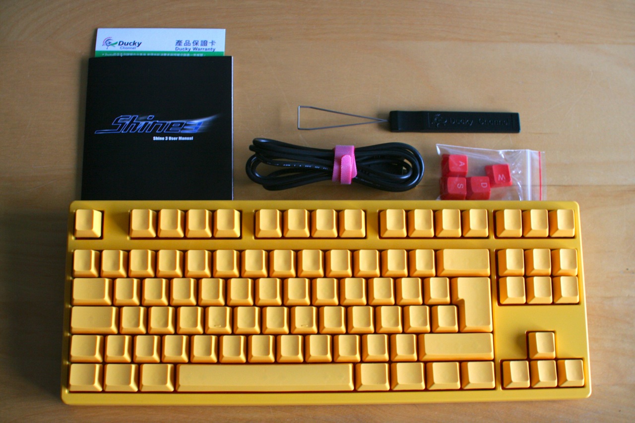
Posted: 29 Dec 2013, 22:09
by webwit
Oooh, I love this stuff.
For your keycap database:
PS: Mona has a Hitler mustache.
Posted: 29 Dec 2013, 23:25
by matt3o
lovely caps webwit! I hope to remove the mustache as soon as we get more reference caps
Posted: 29 Dec 2013, 23:30
by Muirium
Those would make a fine cursor cluster. Paging 7bit…
Posted: 30 Dec 2013, 01:26
by Dubsgalore
Cool stuff Matt3o