Finally Tried the HHKB Pro 2 -- A Reluctant Convert Review
Posted: 21 Sep 2013, 00:48
BACKGROUND AND RATIONALE
Until a few months ago, my main keyboard was a full-sized IBM Model M with buckling spring switches. I have three workstations, each with three computers running Mac OS X, Linux, and Windows 7. I do not do any gaming, but I do a considerable amount of writing along with molecular modeling, biostatistics, and scientific graphics. A right shoulder injury prompted a search for TKL boards in order to position the mouse more ergonomically toward the center of the desk.
After trying Filco, Ducky, and CM TKLs, I was able to find a NIB IBM SSK as my new daily driver. However, during my search for smaller boards, I became obsessed with the notion of reproducing all the functionality of a full-sized keyboard within a 60 to 75% form factor. Most of the boards I tried had Cherry switches (brown, blue, black, white, and green), but I also tested the Matias Mini Tactile Pro with Alps-inspired Matias tactile/clicky switches. Along the way, I encountered the Leopold FC660C, which has 45-gram Topre switches, and I decided that I preferred Topre over all other switches with the possible exception of IBM buckling springs. The only drawbacks to the Leopold FC660C were its lack of high-quality dye-sublimated PBT keycaps and the asymmetry introduced into its layout by the arrow cluster and Insert/Delete keys.
Throughout my search, I kept getting suggestions to try the HHKB Pro 2. I was attracted to its 60% form factor, elegant design, and Topre switches, but I was skeptical because of its alien layout and lack of dedicated arrow keys. Nevertheless, because I had been thinking so much about the HHKB Pro 2 during my extensive search for the perfect keyboard, I knew my mind could never be at peace until trying it. Therefore, after trying many other keyboards of various sizes and switch types, I finally placed the order, and today it arrived.
I got the black version, which has black legends on dark charcoal gray keycaps. This color scheme renders the keys virtually unreadable, but it gives the board an agreeable stealthy look. There was also a method to my madness. At the time I ordered the keyboard, EliteKeyboards (EK) did not have the white model in stock, and I figured that if I liked the board, I would get a set of white and light gray keycaps. From videos I have seen posted on YouTube, the contrast between the black case and light-colored keycaps provides an agreeable juxtaposition of modern and retro styles.
FIRST IMPRESSION
When I first unpacked the box, I instantly liked what I saw. It was the most right-looking keyboard I had ever seen. It seemed exactly the right size, and it was laid out with a beautiful and functional symmetry. Upon lifting the keyboard out of the box, I noticed that the board felt solid despite being lightweight. There was no detectable flex in the case, and no wobble when placed on the desk, either with no extension of the feet, or with the feet in the low or high position.
SETUP AND TEST RUN
Being primarily a Mac user, I set the DIP switches to Mac mode, and I downloaded and installed the Mac driver. The driver is not necessary, but it presumably adds some niceties, such as Mac-centric media controls. I also set the DIP switch that converts the Delete key to a Backspace. Forward delete is available via Fn+Del. It was initially a bit disconcerting to see the on-screen instructions for the Mac driver installation only in Japanese, but this added to the exotic aura of the board and the installation went just fine.
RAPID ADJUSTMENTS TO PRESUMED STRANGENESS
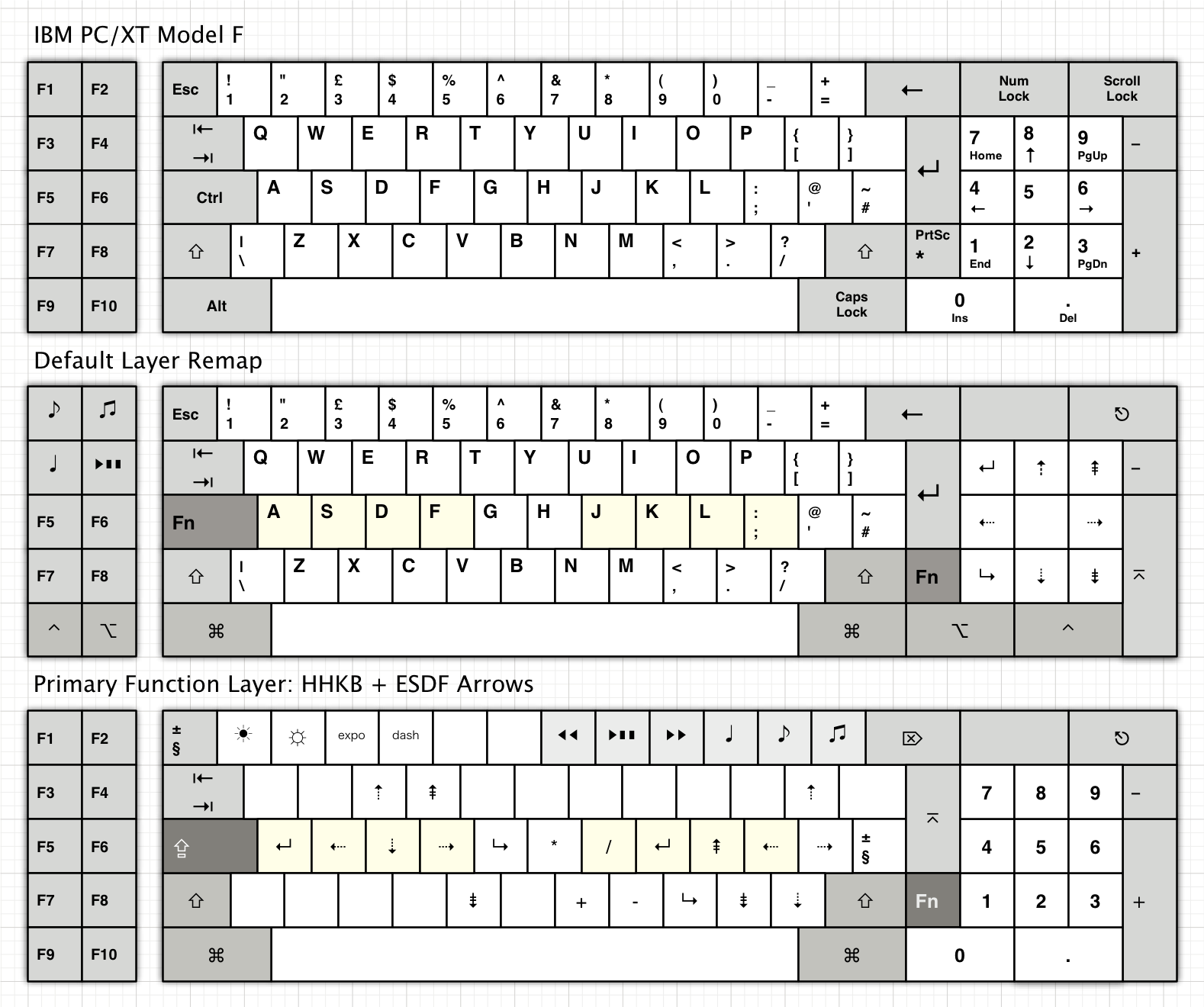
After typing for only a few minutes, I adjusted quickly to all the things that I thought might cause me to put the keyboard up for sale on eBay almost as soon as I got it. For example, I adapted to Control being where Caps Lock is usually located. Alt and Command (with Mac symbols!) are exactly where they are supposed to be on either side of the spacebar. Moreover, the Backspace located directly above the Return key now seems to be where it should have been all along. The arrow keys are Fn+[;'/ -- I thought this would be the hardest adjustment of all, but this also seems quite natural. I really like the Fn key to the right of the Right Shift, and the cursor diamond formed by [;'/ is easy to reach. Already I find a cursor diamond more natural than an inverted-T. Overall, my fingers adapted quickly and intuitively to what I thought would be an alien layout. It seems that the extensive research on the part of Prof. E. Wada that went into the design of the HHKB Pro 2 has paid off handsomely.
THAT SOUND; THAT FEEL
When typing, the famous "thock" has a hypnotic effect; I wanted to keep typing in order to continue hearing the sound. Thus, I would rate the thockness or thocknicity factor very high –- nothing new here for those already addicted to Topre switches. Moreover, the fact that the Topre switches are not mounted to a metal plate does not seem to matter at all. If anything, I like the sound and feel of the case-mounted Topres in the HHKB Pro 2 better than those in my metal-plate-mounted Leopold FC660C.
NO MAJOR CHANGES NEEDED
Before actually trying the HHKB Pro 2, I thought I would want to change it in various ways. For example, I thought I would prefer it to have a completely standard layout like that of the Poker II, dedicated arrow keys and/or plate-mounted switches like the Leopold FC660C, or beefed-up switches like the 55-gram RF 87u. However, the keyboard is nearly perfect as it is. I think the only thing I might change is the weight of the switches to 55 grams –- this is something that could be done while preserving the integrity of its true 60% design.
It is interesting that I am inclined to continue using the HHKB Pro 2, whereas I quickly gave up on my Poker II, which has a completely standard layout and only lacks dedicated arrow keys. I think the main difference is the superiority of Topre switches over Cherry mx blue switches, helping to give the HHKB Pro 2 a mellow fluidic quality as opposed to the raspy brittleness of the Cherry-blue Poker II.
Thus far, I have not noticed any deal-breaking negatives. However, I have noticed some of the relatively minor issues that others have commented on, such as the lack of rubberized feet. Indeed, if you stop typing and push on the case, you can scoot the keyboard along the desk, although the keyboard tends to sit firmly wherever you put it while typing. Nevertheless, the poor design of the feet is a glaring discrepancy in light of the otherwise excellent design of the keyboard and ought to be addressed in future revisions.
CONCLUSION: A THING OF BEAUTY IS A JOY FOREVER
In summary, after finally trying the HHKB Pro 2 for myself, I have been pleasantly surprised to experience firsthand the reasons behind the many rave reviews. The HHKB Pro 2 is so good to look at, it wins converts by appearance alone. However, this keyboard transcends a mere objet d'art –- it is a marvelous example of the interdependence of form and function -- superb design yielding a machine as useful as it is beautiful.
UPDATE: A FEW CHANGES
Although the HHKB Pro 2 is fine as it is (Fig. 1 below), after a while I decided to make a few changes.
Fig. 1. Standard HHKB Pro 2.
First, I prefer a dark case, and so I purchased the dark gray version. The dye-sublimated PBT keycaps on the original white/gray version are beautiful, but I prefer black or charcoal gray modifiers. In addition, the legends on the white/gray caps are a bit busy, and so I replaced the alpha keys with those from a blue Topre set and added some red accent keys (Fig. 2 below).
Fig. 2. Dark Gray HHKB with Blue Topre Alphas and Red Accents.
Later, I added Silencing Rings, lubed the stabilizers and switch guide rails with Superlube 51010 oil, replaced the ABS spacebar with a PBT one, and added additional foam to the spacebar shock absorbers. This resulted in quieting the return-stroke clack while preserving the down-stroke thock.
After purchasing an additional dark gray model for work, this time non-printed, I replaced the 45 g domes with 55 g domes from a RF87U. At first, I preferred the heavier switches, but after some time, I decided that I prefer 45 g domes in the HHKB. The heavier domes seem more appropriate for the larger RF keyboard with its plate-mounted switches.
It has been over three years since purchasing my first HHKB Pro 2. During that time, I have tried many different keyboards representing various form factors, layouts, and switch types, and I have added some of these to my active keyboard rotation (including an IBM XT, RF87UB55, KBP V60MTS-C, Leading Edge DC-3014 with blue Alps, and Northgate Omnipro 101 with white Alps). However, thus far, the HHKB Pro 2 remains my favorite keyboard. Moreover, I like the HHKB layout so much that I have remapped all my other keyboards as closely as possible to a HHKB configuration.
Until a few months ago, my main keyboard was a full-sized IBM Model M with buckling spring switches. I have three workstations, each with three computers running Mac OS X, Linux, and Windows 7. I do not do any gaming, but I do a considerable amount of writing along with molecular modeling, biostatistics, and scientific graphics. A right shoulder injury prompted a search for TKL boards in order to position the mouse more ergonomically toward the center of the desk.
After trying Filco, Ducky, and CM TKLs, I was able to find a NIB IBM SSK as my new daily driver. However, during my search for smaller boards, I became obsessed with the notion of reproducing all the functionality of a full-sized keyboard within a 60 to 75% form factor. Most of the boards I tried had Cherry switches (brown, blue, black, white, and green), but I also tested the Matias Mini Tactile Pro with Alps-inspired Matias tactile/clicky switches. Along the way, I encountered the Leopold FC660C, which has 45-gram Topre switches, and I decided that I preferred Topre over all other switches with the possible exception of IBM buckling springs. The only drawbacks to the Leopold FC660C were its lack of high-quality dye-sublimated PBT keycaps and the asymmetry introduced into its layout by the arrow cluster and Insert/Delete keys.
Throughout my search, I kept getting suggestions to try the HHKB Pro 2. I was attracted to its 60% form factor, elegant design, and Topre switches, but I was skeptical because of its alien layout and lack of dedicated arrow keys. Nevertheless, because I had been thinking so much about the HHKB Pro 2 during my extensive search for the perfect keyboard, I knew my mind could never be at peace until trying it. Therefore, after trying many other keyboards of various sizes and switch types, I finally placed the order, and today it arrived.
I got the black version, which has black legends on dark charcoal gray keycaps. This color scheme renders the keys virtually unreadable, but it gives the board an agreeable stealthy look. There was also a method to my madness. At the time I ordered the keyboard, EliteKeyboards (EK) did not have the white model in stock, and I figured that if I liked the board, I would get a set of white and light gray keycaps. From videos I have seen posted on YouTube, the contrast between the black case and light-colored keycaps provides an agreeable juxtaposition of modern and retro styles.
FIRST IMPRESSION
When I first unpacked the box, I instantly liked what I saw. It was the most right-looking keyboard I had ever seen. It seemed exactly the right size, and it was laid out with a beautiful and functional symmetry. Upon lifting the keyboard out of the box, I noticed that the board felt solid despite being lightweight. There was no detectable flex in the case, and no wobble when placed on the desk, either with no extension of the feet, or with the feet in the low or high position.
SETUP AND TEST RUN
Being primarily a Mac user, I set the DIP switches to Mac mode, and I downloaded and installed the Mac driver. The driver is not necessary, but it presumably adds some niceties, such as Mac-centric media controls. I also set the DIP switch that converts the Delete key to a Backspace. Forward delete is available via Fn+Del. It was initially a bit disconcerting to see the on-screen instructions for the Mac driver installation only in Japanese, but this added to the exotic aura of the board and the installation went just fine.
RAPID ADJUSTMENTS TO PRESUMED STRANGENESS
After typing for only a few minutes, I adjusted quickly to all the things that I thought might cause me to put the keyboard up for sale on eBay almost as soon as I got it. For example, I adapted to Control being where Caps Lock is usually located. Alt and Command (with Mac symbols!) are exactly where they are supposed to be on either side of the spacebar. Moreover, the Backspace located directly above the Return key now seems to be where it should have been all along. The arrow keys are Fn+[;'/ -- I thought this would be the hardest adjustment of all, but this also seems quite natural. I really like the Fn key to the right of the Right Shift, and the cursor diamond formed by [;'/ is easy to reach. Already I find a cursor diamond more natural than an inverted-T. Overall, my fingers adapted quickly and intuitively to what I thought would be an alien layout. It seems that the extensive research on the part of Prof. E. Wada that went into the design of the HHKB Pro 2 has paid off handsomely.
THAT SOUND; THAT FEEL
When typing, the famous "thock" has a hypnotic effect; I wanted to keep typing in order to continue hearing the sound. Thus, I would rate the thockness or thocknicity factor very high –- nothing new here for those already addicted to Topre switches. Moreover, the fact that the Topre switches are not mounted to a metal plate does not seem to matter at all. If anything, I like the sound and feel of the case-mounted Topres in the HHKB Pro 2 better than those in my metal-plate-mounted Leopold FC660C.
NO MAJOR CHANGES NEEDED
Before actually trying the HHKB Pro 2, I thought I would want to change it in various ways. For example, I thought I would prefer it to have a completely standard layout like that of the Poker II, dedicated arrow keys and/or plate-mounted switches like the Leopold FC660C, or beefed-up switches like the 55-gram RF 87u. However, the keyboard is nearly perfect as it is. I think the only thing I might change is the weight of the switches to 55 grams –- this is something that could be done while preserving the integrity of its true 60% design.
It is interesting that I am inclined to continue using the HHKB Pro 2, whereas I quickly gave up on my Poker II, which has a completely standard layout and only lacks dedicated arrow keys. I think the main difference is the superiority of Topre switches over Cherry mx blue switches, helping to give the HHKB Pro 2 a mellow fluidic quality as opposed to the raspy brittleness of the Cherry-blue Poker II.
Thus far, I have not noticed any deal-breaking negatives. However, I have noticed some of the relatively minor issues that others have commented on, such as the lack of rubberized feet. Indeed, if you stop typing and push on the case, you can scoot the keyboard along the desk, although the keyboard tends to sit firmly wherever you put it while typing. Nevertheless, the poor design of the feet is a glaring discrepancy in light of the otherwise excellent design of the keyboard and ought to be addressed in future revisions.
CONCLUSION: A THING OF BEAUTY IS A JOY FOREVER
In summary, after finally trying the HHKB Pro 2 for myself, I have been pleasantly surprised to experience firsthand the reasons behind the many rave reviews. The HHKB Pro 2 is so good to look at, it wins converts by appearance alone. However, this keyboard transcends a mere objet d'art –- it is a marvelous example of the interdependence of form and function -- superb design yielding a machine as useful as it is beautiful.
UPDATE: A FEW CHANGES
Although the HHKB Pro 2 is fine as it is (Fig. 1 below), after a while I decided to make a few changes.
- hhkb-pro2a.jpg (43.89 KiB) Viewed 17056 times
First, I prefer a dark case, and so I purchased the dark gray version. The dye-sublimated PBT keycaps on the original white/gray version are beautiful, but I prefer black or charcoal gray modifiers. In addition, the legends on the white/gray caps are a bit busy, and so I replaced the alpha keys with those from a blue Topre set and added some red accent keys (Fig. 2 below).
- HHKB_Blue2.jpg (85.82 KiB) Viewed 17056 times
Later, I added Silencing Rings, lubed the stabilizers and switch guide rails with Superlube 51010 oil, replaced the ABS spacebar with a PBT one, and added additional foam to the spacebar shock absorbers. This resulted in quieting the return-stroke clack while preserving the down-stroke thock.
After purchasing an additional dark gray model for work, this time non-printed, I replaced the 45 g domes with 55 g domes from a RF87U. At first, I preferred the heavier switches, but after some time, I decided that I prefer 45 g domes in the HHKB. The heavier domes seem more appropriate for the larger RF keyboard with its plate-mounted switches.
It has been over three years since purchasing my first HHKB Pro 2. During that time, I have tried many different keyboards representing various form factors, layouts, and switch types, and I have added some of these to my active keyboard rotation (including an IBM XT, RF87UB55, KBP V60MTS-C, Leading Edge DC-3014 with blue Alps, and Northgate Omnipro 101 with white Alps). However, thus far, the HHKB Pro 2 remains my favorite keyboard. Moreover, I like the HHKB layout so much that I have remapped all my other keyboards as closely as possible to a HHKB configuration.