Page 4 of 6
Posted: 08 Feb 2016, 01:21
by jacobolus
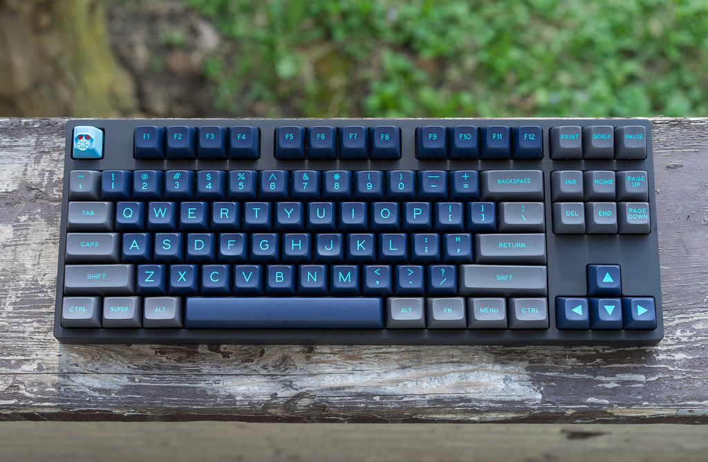
Here are some awesome old spherical-ish Alps caps:


Posted: 11 Feb 2016, 20:00
by zzyjayfree
Please tell me that we will still have the classic colors like purple, blue, black and such.
Posted: 11 Feb 2016, 23:02
by daybreak365
Is there any chance we can bring back Calm Depths?
Posted: 12 Feb 2016, 16:14
by ReleaseCandidate
I'm fine with them, as long as there are colors (not just shades of dirty white), no icons on the mods or novelties and no extra legends on the alphas ...
Oh!

Posted: 29 Feb 2016, 17:05
by andysun
So, what now? Who won?
Re: [IC] Round 7 / The Vote!
Posted: 01 Mar 2016, 09:25
by miguelbazil
I WIN! Oh wait...
Would like to know too
Posted: 01 Mar 2016, 19:28
by zslane
The poll results are at the top of the page.
However, I think 7bit might have missed the true winner. "Strawberries and Cream" and "Cream&Biege" are actually the same colorway. The latter is merely a 3D render of the former. The votes for them should be combined for a total of 61, more than any other entry.
Now, you could make a case that there is some overlap there; many who voted for Strawberries and Cream probably also voted for Cream&Biege, and so the two counts probably shouldn't be added together without some sort of adjustment. Even so, unless we assume there is 100% overlap, that colorway has more votes than any other (unless you count the Lite and Dark versions of Codemaster as a single colorway, but even there I bet there is considerable voter overlap between them as well).
Posted: 01 Mar 2016, 20:00
by 7bit
Calm Depths: Ask the guy who ran it, or run the group buy yourself.
Also, guess which will be the color scheme for Round 7:

Posted: 01 Mar 2016, 20:02
by Halvar
7bit wrote: Calm Depths: Ask the guy who ran it, ...
Not a good idea!

Posted: 01 Mar 2016, 20:07
by Khers
zslane wrote: [...]However, I think 7bit might have missed the true winner. "Strawberries and Cream" and "Cream&Biege" are actually
the same colorway. The latter is merely a 3D render of the former. The votes for them should be combined for a total of 61, more than any other entry.[...]
I very much doubt that these would be 61 unique voters, and I'd say that the number of unique votes for these two combined is close to 40.
Posted: 01 Mar 2016, 20:11
by zslane
Cream&Biege got 40 by itself. Adding none of the votes from Strawberries and Cream to that number only makes sense if you assume 100% overlap between the votes for both entries.
Regardless, 7bit is going with his own colorway, as I suspect he always intended to do. The poll seems to have served little to no purpose, really.
Posted: 01 Mar 2016, 20:15
by Khers
What I'm saying is simply that the overlap is pretty damn certain to be larger than 0 and quite significant. As you point out, they are, in fact, the same and the main reason that one got more votes than the other is because one is a pretty render whereas the other isn't.
I'd guess that those who voted for the S&C also voted for C&B, but that C&B drew a larger number of votes due to your pretty render.
Posted: 01 Mar 2016, 20:16
by Muirium
Crappy, chaos ridden, inconclusive vote. But what else would you expect?
(We need a
single transferable vote module. None of this block voting pish. When Webwit suggests I go write one again, I can offer my own highly preferential and proportional services as a jury of one instead. That works too!)
Posted: 01 Mar 2016, 20:19
by 7bit
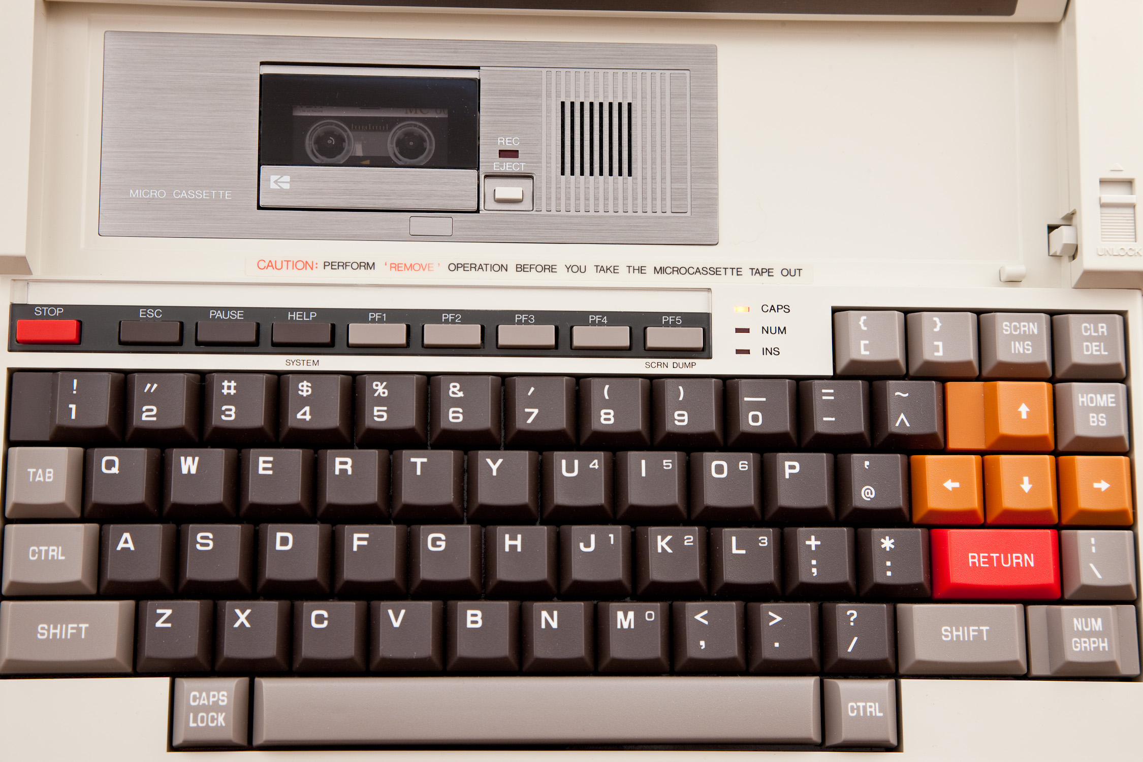
Both variations got enough votes. Strawberries&Cream/Cream Beige is too normal (like standard Cherry keys), Codemaster Dark is not that different and the Microcassette thing isn't my cup of tea and it has been disqualified because the link is broken:
 https://aliennerd.files.wordpress.com/2 ... 7392-5.jpg
Posted: 01 Mar 2016, 20:24
by zslane
I made a pretty render for 7bit's colorway (an early version of it, anyway) and it still only hit the mid-20s. Pretty renders alone do not a successful colorway pitch make.
Posted: 01 Mar 2016, 20:30
by Khers
That's not what I'm saying either.
What I'm getting at is that a pretty render adds a multiplicative factor to the number of votes. In this example it could very well be a factor of ~2. The other colorway that you mention would maybe only have gotten somewhere in the low teens if it were not for the render.
Posted: 02 Mar 2016, 00:05
by andysun
Well, this is disappointing... Not a fan of RGB at all
edit: zslane, would it be too much asking for a render of this colorway?

Posted: 02 Mar 2016, 00:52
by zslane
a. I don't know which colorway you are referring to.
b. What would be the point? 7bit has already made his decision.
Posted: 02 Mar 2016, 02:45
by smart3877
I do not know how to vote.
Best keycaps is
5: Strawberries and Cream (RAS, WW, WAR|Ail)
11: Cream&Beige (cream,beige|zslane)
12: Skull Squadron (yellow row 1 keys, Round 5/6 supplement|zslane)
15: Zeigen (OAS/lightgrey, black/white|last edited by Seebart)
22: Handarbeit (out of competition|Sayso)
25: Acorn (poison green function keys|andrewjoy)
11. Cream&Beige keycaps is best of best
Wait for good news.!
Posted: 02 Mar 2016, 09:47
by andysun
@zslane, I meant 7bits colorway

@smart3877, the vote has ended already, the winning colorway was 7bits beige and grey rgb
Posted: 02 Mar 2016, 13:00
by 7bit
Not quite.
Winners are Micro Cassette and Cream&Beige with 40 votes each, but Round 7 will come in my own color scheme (I already have a name for it, but it's still secret

).
Round 7 will start when SP at least finished the first half of Round 6 ...

Posted: 02 Mar 2016, 13:18
by t!ng
It's like in a fight between superman und batman chuck norris wins.
Posted: 02 Mar 2016, 13:20
by Muirium
Of course he does.
Ooh… that
Eurostiley font. Make them revive it! So much better than Gorton Dickedaboutwith.
Posted: 03 Mar 2016, 23:39
by niomosy
Muirium wrote: Of course he does.
Ooh… that
Eurostiley font. Make them revive it! So much better than Gorton Dickedaboutwith.
Well, there's
Space Extended that's being worked on.
Posted: 03 Mar 2016, 23:59
by zslane
Well, I voted for that colorway, but I did not vote for its typeface. Bleh.
Posted: 04 Mar 2016, 12:01
by skaloola
zslane wrote: Well, I voted for that colorway, but I did not vote for its typeface. Bleh.
The eurostiley font or space extended whatever?
Not a huge fan of either, but like eurostiley much more than the space font from that geekhack thread. seems to have some traction though, hope it looks better in person if it gets made.
Posted: 04 Mar 2016, 13:07
by Muirium
Hmm. They're doing it wrong. If they want my advice, they can try opening a thread on the project here. But I suspect they're already set on their mistakes.
Just look at the alignment on these:

Bad! Bad! Whatever they're aping does not come across. It just looks like error.
Posted: 04 Mar 2016, 13:27
by Halvar
It's a "preliminary render", whatever that means. I'm pretty sure they can see that these still look crappy.
I like Gorton Dingsbums better by the way.
Posted: 04 Mar 2016, 13:49
by Muirium
Then you're spoiled for choice. Gorton Putting-the-O-in-Ouack is oozing out of SP in everything they do nowadays. Nice enough doubleshots, pity about the font.
If the GH renderer didn't do that alignment on purpose, consider me amazed. It's not just a little off. It's all the way!
Posted: 05 Mar 2016, 01:35
by Ail
No matter the winner, I am happy people liked the suggestion. Thanks Zslane for the clean 3d render.