Page 17 of 76
Posted: 13 Oct 2013, 16:46
by Muirium
Game Theory wrote:The caps would be fine if you rock them forward and backward. Never left to right because it will bend the connection since its a vertical slit.
Noted! Beam spring = back and forth. Thanks.
Posted: 13 Oct 2013, 17:47
by 7bit
Posted: 13 Oct 2013, 17:57
by ne0phyte
See here:
http://deskthority.net/deskthority-rela ... tml#p86251
Please don't even reply if you are using Internet Explorer or any ridiculously outdated browser. I'm sure there is a plugin like Stylebot for Firefox if that's your thing.
Posted: 13 Oct 2013, 18:13
by 7bit
Thanks, but it is gone already!

Also: I'm using Netscape Navigator!

Posted: 13 Oct 2013, 22:12
by webwit
7bit wrote:
How can I block that revolver-skull-header image?

Seriously, this is not a Wild-West-Cowboy forum, or is it?

I was planning to make the site play this tune in the background while this header is visible:
P.S. This will be our official club song.
Posted: 14 Oct 2013, 00:24
by mr_a500
7bit wrote:Seriously, this is not a Wild-West-Cowboy forum, or is it?
It ain't?! Well gall darnit! Pitooey! [spits tobacco juice] I was fixin' on puttin' on my 6-guns and shootin' some vermin.
Posted: 14 Oct 2013, 11:17
by Ducky Nordic
mr_a500 wrote:7bit wrote:Seriously, this is not a Wild-West-Cowboy forum, or is it?
It ain't?! Well gall darnit! Pitooey! [spits tobacco juice] I was fixin' on puttin' on my 6-guns and shootin' some vermin.
Had couple a bags of Red man chew early this year. Mmmm, nice stuff

Posted: 14 Oct 2013, 12:29
by Muirium
Baccy, not to be confused with snus!
7bit wrote:Also: I'm using Netscape Navigator!
Oh, which version? Got the very latest* 7.02 here:

- Picture 3.png (79.24 KiB) Viewed 5445 times
Has a few issues.

- Picture 2.png (367.84 KiB) Viewed 5445 times
*for Mac OS 9.
Posted: 16 Oct 2013, 17:36
by Dubsgalore
3700 PCB
Posted: 16 Oct 2013, 18:20
by Halvar
Nice! Yes, I endorse.
Posted: 16 Oct 2013, 21:31
by wDanielsson
First try
Posted: 16 Oct 2013, 21:48
by Daniel Beardsmore
Muirium wrote:Oh, which version? Got the very latest* 7.02 here…
Mind, blown.
There are people who remained using Mac OS 9
after me? Seriously? I thought I went down with the ship.
(I do remember playing with Mozilla in Mac OS 9 and, while the XUL UI was extremely slow, Gecko was a lot faster than any other Mac browser — this was on my Motorola StarMax 4000/200 PPC 604e 200 MHz. In particular, it was orders of magnitude ahead of iCab 3.)
Posted: 16 Oct 2013, 22:16
by Muirium
No, your last-man-drowning cred remains, Daniel. I'm just trying it out in Classic as 7bit reminded me I still had Netscape kicking around on my old PowerBook. The result of my test: DT's not entirely usable. No surprise there!
Although I am posting this from OmniWeb on another old PowerPC Mac (the 10 year old swivel iMac I use for music) and the whole site's perfect. Well, except those YouTube embeds, but…
Posted: 16 Oct 2013, 22:19
by 7bit
Dubsgalore wrote:3700 PCB
Cherry logo is covered by the top-right links. A bit down and it should fit.
wDanielsson wrote:First try
Perfect photo. Now turn the space bar around and take the same photo again.
Posted: 16 Oct 2013, 22:39
by wDanielsson
7bit wrote:
Perfect photo. Now turn the space bar around and take the same photo again.
I'll fix it tomorrow when the sun is up again
Posted: 16 Oct 2013, 23:00
by Halvar
7bit wrote:Dubsgalore wrote:3700 PCB
Cherry logo is covered by the top-right links. A bit down and it should fit.
Nooooooo! The most important part is this, and it must not be cut:

- goonsquad.jpg (40.17 KiB) Viewed 5371 times
Posted: 16 Oct 2013, 23:47
by 7bit
wDanielsson wrote:I'll fix it tomorrow when the sun is up again
You shout down your Sun each day?
Posted: 17 Oct 2013, 00:57
by mr_a500
Muirium wrote:
7bit wrote:Also: I'm using Netscape Navigator!
Oh, which version? Got the very latest* 7.02 here:
I'm thinking of getting Netscape Navigator 3.04 .... to run in the
Mac emulator on my Amiga 500. I've already posted here using an Amiga browser, but I think posting in a Mac emulation on the A500 is the next step.

wDanielsson wrote:First try
Very nice. Maybe it should be shifted a bit to the right. (but then again, maybe not)
Posted: 17 Oct 2013, 01:31
by photekq
7bit, I cropped dubs' photo for him. I tried it a little bit down.. It looks nicer as is I think.
If you want to experiment yourself then :
http://www.flickr.com/photos/99760972@N03/10235506683/
Posted: 17 Oct 2013, 07:12
by Dubsgalore
I think moving the photo down a little bit to fit the cherry logo in would be a good idea...tomorrow
http://www.flickr.com/photos/99760972@N03/10233273845/
I thought that photo might make for a good header as well
Posted: 17 Oct 2013, 14:05
by BimboBB
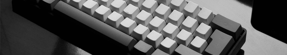
wDanielsson wrote:First try
Like this! As said...board more to the right and spacebar properly placed it would look perfect.
Posted: 17 Oct 2013, 16:38
by wDanielsson
BimboBB wrote:
Like this! As said...board more to the right and spacebar properly placed it would look perfect.
Here you go, I placed the spacebar as it should be and I moved the keyboard a little bit to the right
edit* I'm not 100% sure about the quality on this one.
Posted: 17 Oct 2013, 16:48
by 7bit
The first one was perfect, except for the space bar!
Posted: 17 Oct 2013, 16:49
by BimboBB
yep, the other one looked more crispy somehow. did you changed camera?
Posted: 17 Oct 2013, 16:58
by Muirium
The first shot was a bit closer (see how many keys fit in each of them) and had the shiny desktop in front as well as behind the keyboard. I like them both, but the extra desk reflection really makes the original.
Posted: 17 Oct 2013, 17:21
by wDanielsson
Muirium wrote:The first shot was a bit closer (see how many keys fit in each of them) and had the shiny desktop in front as well as behind the keyboard. I like them both, but the extra desk reflection really makes the original.
7bit wrote:The first one was perfect, except for the space bar!
I guess this is what we're looking for then?
Posted: 17 Oct 2013, 17:23
by Muirium
That's it!
Posted: 17 Oct 2013, 17:24
by 7bit
Perfect!
Thank you very much, thread closed.
Posted: 17 Oct 2013, 23:19
by Daniel Beardsmore
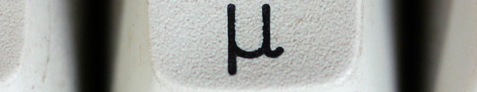
Considering that SP do every known and unknown shade of grey keycap, you could actually put that look off ...
Posted: 18 Oct 2013, 15:08
by mr_a500
7bit wrote:
I must say... this header sucks. When I saw it in the rotation, I wanted to scrub salt into my eyes.
(normally, I'd say that a little more tactfully, but I decided to be blunt like 7bit

)