Page 15 of 76
Posted: 11 Sep 2013, 00:19
by Halvar
Great one! Classic keyboard porn, the artsy way.
Posted: 11 Sep 2013, 02:44
by Acanthophis
7bit wrote:Here is one of the best header images ever:
Jack_in_the_switch.jpg
It is perfect because the main subject is between the DESKTHORITY-text and the links on top-right.
Perfect! You heard it, folks

Posted: 12 Sep 2013, 14:45
by jesterjunk

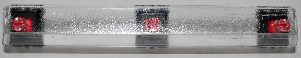
- Cherry MX Bottom Half + Spring.jpg (63.33 KiB) Viewed 5607 times
Posted: 12 Sep 2013, 15:29
by 7bit
Removed a bit of junk (EXIF, thumbnail and XMP data, whatever that is), converted to sRGB and moved the switch a bit to the right:

ps: Mine shows more artifacts, but this is only because Adobe RGB has flatter colors when viewed on a monitor. Adobe RGB is good for print, but only if the printer is capable of that format.

Posted: 12 Sep 2013, 18:37
by photekq
I'm terrible at photography but I quite like how these turned out, I just found it hard to make them fit into the 980x190 canvas. Originals can be found here :
https://www.dropbox.com/sh/jafsou4sjppl4c4/F3cX9Ff50F
Also, the yellow tinge is the keyswitch, not the photos.
Posted: 12 Sep 2013, 19:10
by 7bit
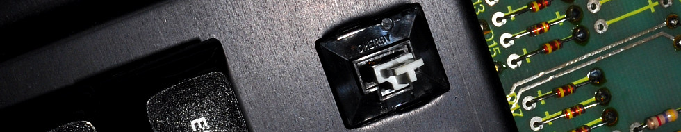
Please more the switch a bit to the left (see my post above), so it is between
DESKTHORITY and
Spy IRC ....

ps: You are much better than that canonjunk guy!

I think I've perfectionised this:

Posted: 12 Sep 2013, 20:29
by photekq
I'll see what I can do about getting it further to the left
Although, the sun's gone down now so lighting is poor.
Posted: 12 Sep 2013, 20:33
by 7bit
Just try out 'my' version and you see it fits perfectly!
Posted: 12 Sep 2013, 20:40
by photekq
7bit wrote:Just try out 'my' version and you see it fits perfectly!
Ah I hadn't seen that. It does look much better. I think it'd be even nicer if the stem was dead in the center of DT and Spy. I'll take another photo tomorrow when the sun's up
Posted: 12 Sep 2013, 20:50
by 7bit
photekq wrote:7bit wrote:Just try out 'my' version and you see it fits perfectly!
Ah I hadn't seen that. It does look much better. I think it'd be even nicer if the stem was dead in the center of DT and Spy. I'll take another photo tomorrow when the sun's up
Yes, but I moved the switch a bit to the left (easy task in GIMP), so the switch is not obstructed with the text above and below.
But carry on! Please take more header pictures!
Posted: 13 Sep 2013, 18:55
by photekq
How are these? I'm having a lot of trouble getting it to 50kb without making it look like shit though.. Anyone got any tips? Original can be found in the same dropbox folder I posted before..
I personally like 3.jpg the best
Posted: 13 Sep 2013, 18:57
by tinnie
Tips: clear the exif.
Posted: 13 Sep 2013, 19:46
by 7bit
This is the best:

Hint: switch on JavaScript, then reload the page, then click on any 980x190 pixel image within this thread and you can see how it looks like as DT header.
Please don't forget to switch JavaScript off again.
Posted: 13 Sep 2013, 21:20
by wheybags

- banner.png (237.34 KiB) Viewed 5487 times
hmmm, covered up by the logo too much
EDIT:

- banner2.png (164.14 KiB) Viewed 5481 times
Posted: 13 Sep 2013, 21:30
by 7bit
Boring and too much data. Please use TIFF to take up even more space!
edit: It still sucks!

Posted: 13 Sep 2013, 21:32
by wheybags
It's 2013 who cares

Posted: 13 Sep 2013, 22:29
by photekq
7bit wrote:This is the best:
Hint: switch on JavaScript, then reload the page, then click on any 980x190 pixel image within this thread and you can see how it looks like as DT header.
Please don't forget to switch JavaScript off again.
Yeah, I do agree. I still think that's the best one
Posted: 15 Sep 2013, 13:24
by Josh
litster wrote:Cherry double shot red Control and blue Alt 1.5x modifiers
Cherry Double Shot Ctrl and Alt-banner-1.jpg
where are these come from? the blue color is different from the A profile DS RGB I have..
Posted: 15 Sep 2013, 17:39
by Muirium
The hard part of making good banners is trying to guess where the Deskthority logo and other text will lie. Anyone got a good mask for that so we can live preview in our image editor while we work? I tried making my own and it kinda sorta works, but not quite.
Posted: 17 Sep 2013, 10:15
by 7bit
.
Posted: 17 Sep 2013, 11:10
by tinnie
Posted: 17 Sep 2013, 13:10
by bpiphany
Huh, I thought none of the pictures with the clear top MX fit at all. And now the by-night picture explains why. The spy label is more to the left in my browser than 7bit's. And it of course depends on how long your username is.. *doh*.
Posted: 17 Sep 2013, 15:40
by 7bit
I demand it looks great on
my machines with
my browser settings (Netscape Navigator FTW!).
I don't care how it looks for the others!
Posted: 21 Sep 2013, 13:35
by 7bit
Posted: 05 Oct 2013, 14:57
by matt3o
Duckmini v2 PCB
Posted: 05 Oct 2013, 20:01
by Ducky Nordic
Silver torso & Black horse briefs & limited production Ducky mini...priceless

Posted: 05 Oct 2013, 20:06
by Muirium
I think a macro (extreme close up!) of your skulls would be more likely!
Posted: 05 Oct 2013, 20:23
by 7bit
Posted: 05 Oct 2013, 20:41
by matt3o
mine is the best. all that red looks so good
Posted: 05 Oct 2013, 20:49
by Ducky Nordic
Especially for all the haters