Page 12 of 34
Posted: 20 Mar 2014, 12:08
by imbattable
Cookie is complicated like Alps SKCL

Posted: 20 Mar 2014, 13:27
by cookie
you guys know how I mean it

All this is the beaty about this place and the different preferences people have!
Almost every keyboard will get some love for it's unique design/layout/whatever... beside of g81s, rubber domes, razer switches and so on!
Posted: 20 Mar 2014, 18:19
by tmacg55
So, what is the expected release date of the Novatouch? I'm very curious about the switchtype and if it will be superior over cherry mx switches..
Posted: 20 Mar 2014, 18:56
by Muirium
Look up Topre. That's what the Novatouch aims to be, but with MX cap compatibility. Release date is this summer, I think.
Posted: 20 Mar 2014, 19:38
by jamaicanpi
Maybe Bram can shed some additional light, but it sounds like the Novatouch TKL will use a switch that is some hybrid between a standard 45g topre switch and a 45g silent topre switch.
CM Carter:
The purple stem is related to CM (Our now exclusive switch color) but also has characteristics of the silenced topre version.
http://geekhack.org/index.php?topic=503 ... msg1247508
I don't own a topre board, but the wiki describes that silent boards have a foam o-ring to dampen the upstroke, and can have a longer stem to account for the o-ring's reduction in travel.
http://deskthority.net/wiki/Topre_switches
Posted: 20 Mar 2014, 20:12
by matt3o
no, it's not silent, CM asked for purple color because they liked it, but it has nothing to do with the silent topre slider (that is actually shorter)
Posted: 20 Mar 2014, 21:12
by jamaicanpi
That's too bad. I would've preferred a dampened upstroke. I wonder if when CM Carter made that comment they were looking into the silent topre switch. Thanks for the clarification.
Posted: 21 Mar 2014, 10:05
by Bramster
The purple is indeed like Carter mentioned on GeekHack not because of the Topre Silent Switches but our exclusive switch color to differentiate our switch from the rest of the Topre switches..
Small update, how about this font style:

Posted: 21 Mar 2014, 10:12
by 002
matt3o wrote:...the silent topre slider (that is actually shorter)
Hmm? Are you saying that the slider on the silenced switch is shorter? Do you mean overall height of the total piece, or are you talking about the travel being shorter as a result of the base of the slider + foam ring being thicker than the base of a standard slider?
Ref pic:
http://deskthority.net/w/images/4/4d/Si ... arison.jpg
Posted: 21 Mar 2014, 10:15
by matt3o
002 wrote:matt3o wrote:...the silent topre slider (that is actually shorter)
Hmm? Are you saying that the slider on the silenced switch is shorter? Do you mean overall height of the total piece, or are you talking about the travel being shorter as a result of the base of the slider + foam ring being thicker than the base of a standard slider?
Ref pic:
http://deskthority.net/w/images/4/4d/Si ... arison.jpg
yeah sorry I wasn't clear. to compensate the buffer height, the feet are shorter (as you can clearly see from your picture)
Posted: 21 Mar 2014, 10:15
by matt3o
CM Bram wrote:The purple is indeed like Carter mentioned on GeekHack not because of the Topre Silent Switches but our exclusive switch color to differentiate our switch from the rest of the Topre switches..
Small update, how about this font style:
getting closer, Bram. (fix the ALT positioning though

)
Posted: 21 Mar 2014, 10:20
by scottc
CM Bram wrote:The purple is indeed like Carter mentioned on GeekHack not because of the Topre Silent Switches but our exclusive switch color to differentiate our switch from the rest of the Topre switches..
Small update, how about this font style:
"CAPSLK" is a bit ugly, why not Caps Lock or CAPS LOCK? It looks like there's plenty of space for it.
Posted: 21 Mar 2014, 10:21
by 002
New font looks better. Is it Futura? It looks like a non-italicised Filco. Agree with others that the mods still need work.
Posted: 21 Mar 2014, 10:23
by Muirium
That's more like it! It is Futura. The alphas are the best looking legends on a new keyboard that I've seen this year!
Scott's right about CAPS LOCK though. And ESC ought to be the same text size as the other mods too. But you guys are really getting there this time.
Posted: 21 Mar 2014, 10:47
by combataran
CM Bram wrote:The purple is indeed like Carter mentioned on GeekHack not because of the Topre Silent Switches but our exclusive switch color to differentiate our switch from the rest of the Topre switches..
Small update, how about this font style:
I noticed that the Capslock LED is gone from this pic:
http://imgur.com/a/FpMJz.
Can't wait for this to launch!
Posted: 21 Mar 2014, 12:11
by Broadmonkey
It's a good font compared to anything else being used these days, but I don't know if I prefer the top centered placement of the legends seen in the picture combataran linked to.
Posted: 21 Mar 2014, 13:25
by Muirium
Top left is classic. Top centre is backlit. Better not to pretend!
Posted: 21 Mar 2014, 13:31
by Kurk
edit: as Muirium said.
I hope this is not the final design. Why are the legends of most part of the number row arranged in a fit-for-backlight fashion? It just looks plainly wrong, especially because other keys (tilde and grave) are arranged in the normal way, i.e. shifted character on top.
Posted: 21 Mar 2014, 13:37
by Muirium
I suspect the alphas are a later generation than the mods and numeric keys. And a notable improvement.
Posted: 21 Mar 2014, 13:48
by matt3o
Muirium wrote:Top left is classic. Top centre is backlit. Better not to pretend!
abs center: the only way to go

Posted: 21 Mar 2014, 13:58
by Muirium
True, I like dead centre the best of all. But I like spherical caps, too. Probably a bit too retro for most tastes.
But top left legends on cylindricals is positively modern. IBM only introduced it during my lifetime!
Another example of what we like:
Dolch.

Posted: 21 Mar 2014, 14:37
by Broadmonkey
Which is to say, Cherry's font, right?
Posted: 21 Mar 2014, 14:41
by Muirium
Yeah, yeah. Laugh it up, fuzzball! (I'd rather Dolch was real Helvetica, but it's almost there.)
Posted: 21 Mar 2014, 16:02
by cookie
I must admit that I like the font on the novatouch, it is modern, modest and the letters are not too big.
The letters reminds me a little bit of those on filco keyboards. The only thing I dislike is "CAPSLK" I would spell it out completely, there is enough space for it. Which material are the caps?
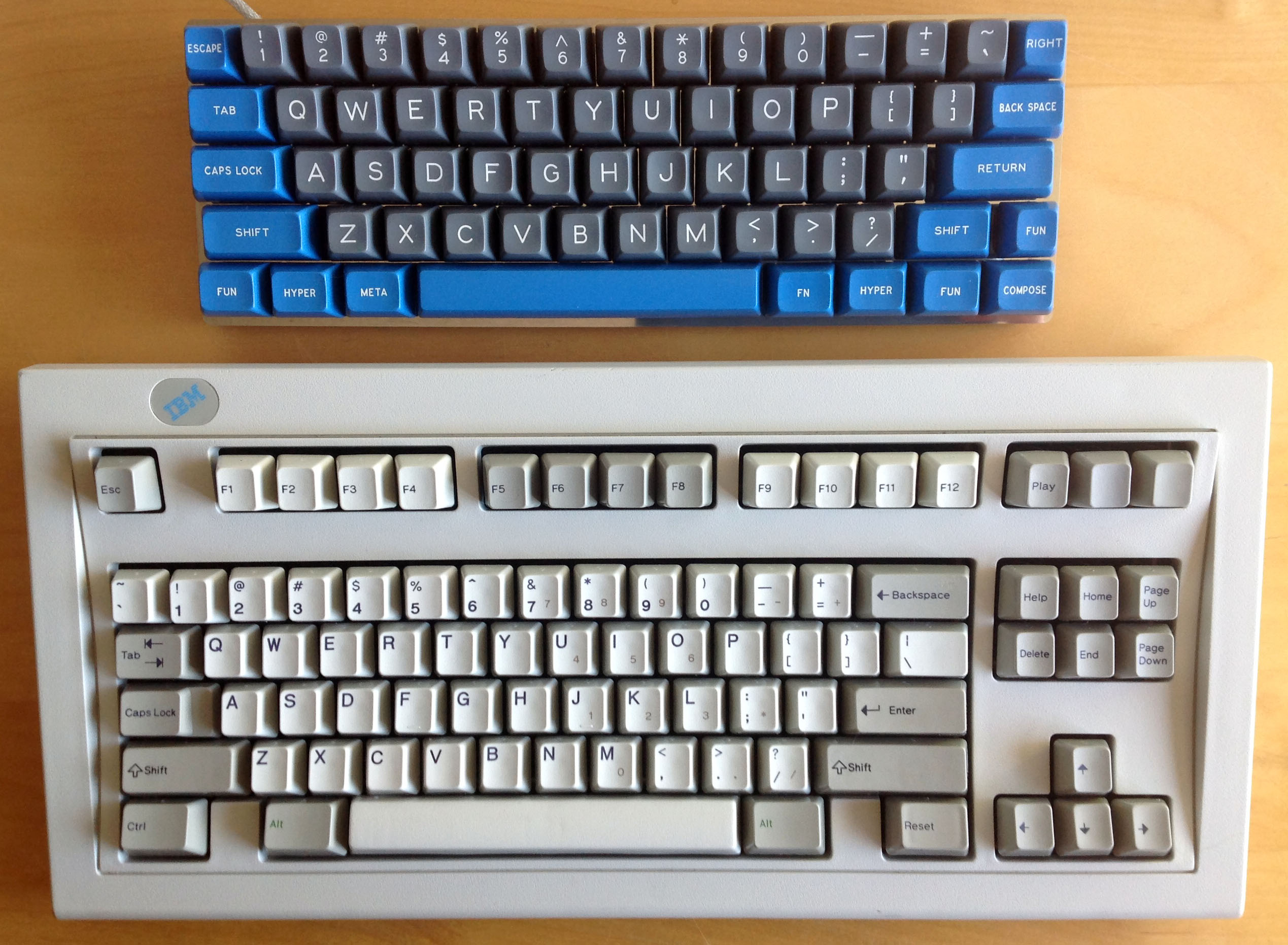
I envy Mu's 60% board, really nice caps, really nice color!
Posted: 21 Mar 2014, 16:18
by Muirium
Round 4 SPH must return again someday. Everyone wants it!
Posted: 21 Mar 2014, 16:47
by cookie
It must have HHKB modifyers, plus I need sliders to mount them
Posted: 21 Mar 2014, 17:01
by Muirium
The hard part is the space bar. HHKB is 6.0 unit. I think only ABS DSA can do that size right now.
Posted: 21 Mar 2014, 17:03
by matt3o
Muirium wrote:The hard part is the space bar. HHKB is 6.0 unit. I think only ABS DSA can do that size right now.
and DCS.
Posted: 21 Mar 2014, 17:07
by Muirium
ABS only again, I presume.
PBT space bars are where the action is at. Pity that Topres have a strange size, and will be late to the party in any case.
Posted: 21 Mar 2014, 17:14
by matt3o
if we can pull together an order large enough I bet SP would make it.