Space Cadet
-
daybreak365
- Favorite switch: Cherry MX Brown
- DT Pro Member: -
The Space Cadet has one of the most beautiful sets of keycaps I've ever seen.Muirium wrote:Then enjoy the site's banner for the next half hour! Round 4 Sphericals: the Space Cadet homage set.
I propose that Round 5 GB be a tribute to our favorite -- and/or the most (in)famous -- vintage keyboards:
- Space Cadet (same as R4 SPH set)
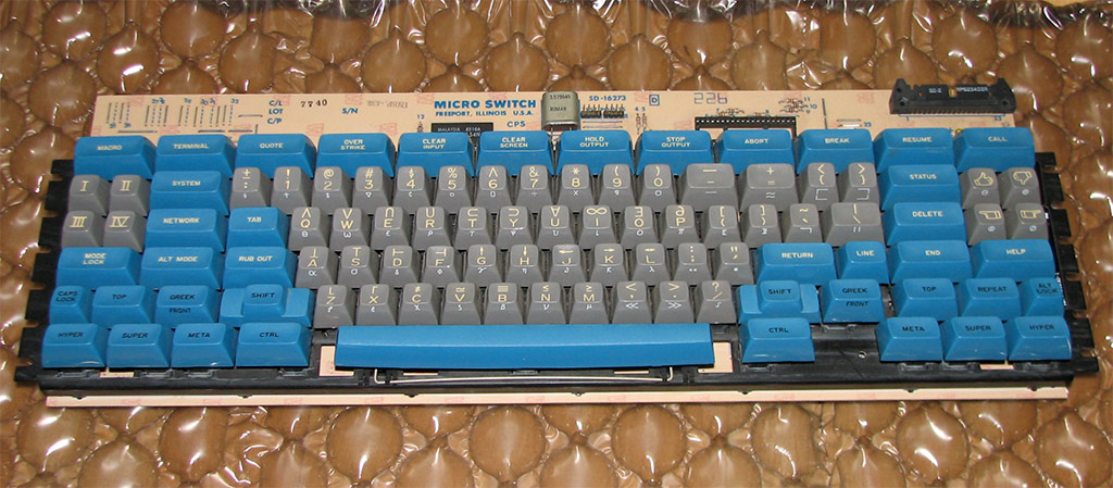
- Symbolics 3600
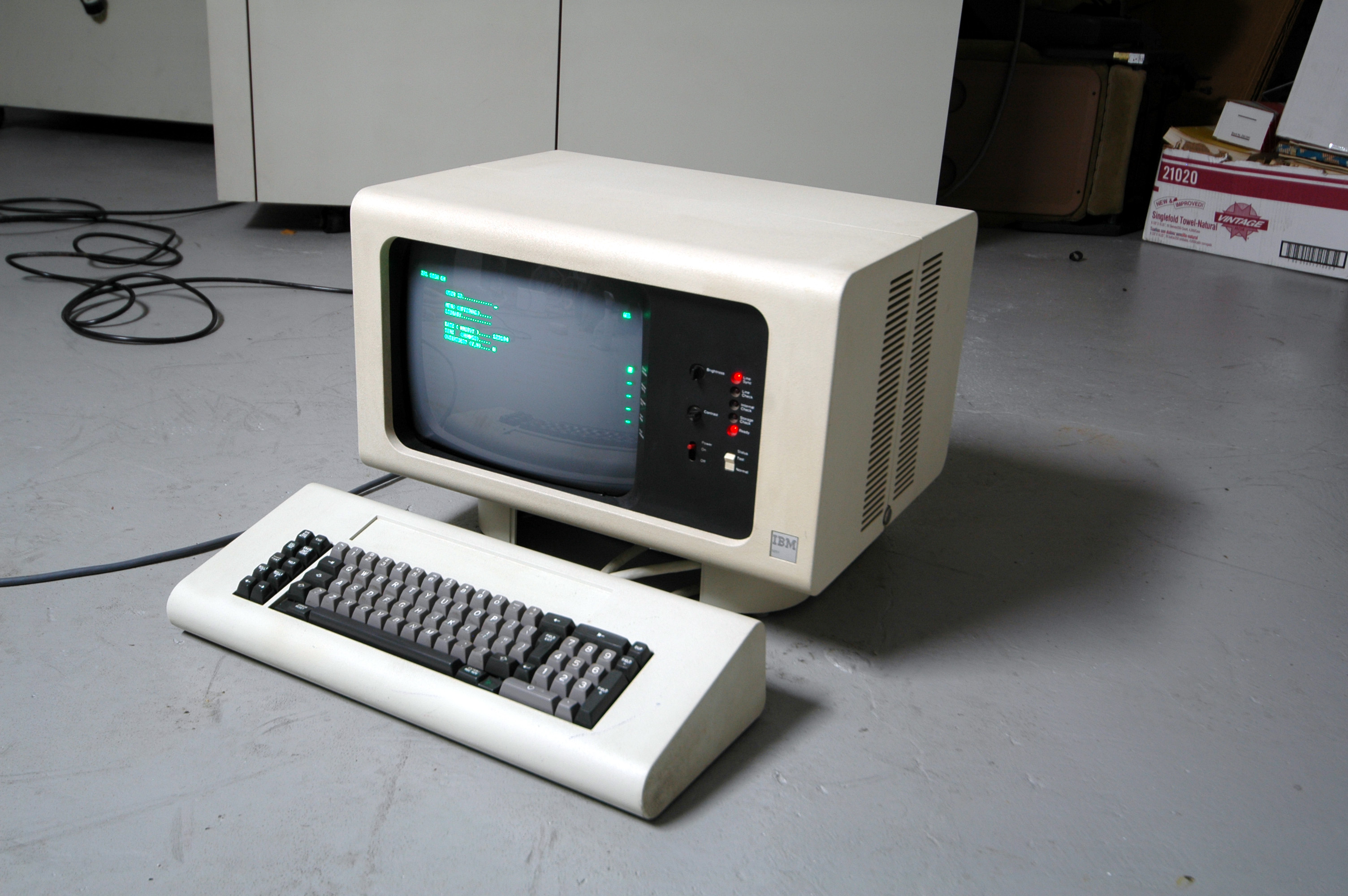
- Honeywell Terminal
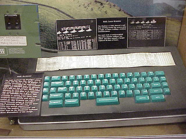
- SAIL keyboard? The Space Cadet's West Coast cousin hasn't gotten much attention.

- One of the IBM beam spring sets such as the IBM 5251
-
Muirium

- µ
- Location: Edinburgh, Scotland
- Main keyboard: HHKB Type-S with Bluetooth by Hasu
- Main mouse: Apple Magic Mouse
- Favorite switch: Gotta Try 'Em All
- DT Pro Member: µ
I'm ready to check it against colour samples whenever 7bit asks! Definitely my favourite set for a next round of tall sphericals too.
-
Dubsgalore

- Location: USA
- Main keyboard: ESA-3000-HASRO
- Main mouse: Deathadder 2013
- Favorite switch: MX Blacks
- DT Pro Member: -
not as big a fan for the Honeywell theme..
The SAIL keyboard's theme is pretty sick
as is the Symbolics one
The SAIL keyboard's theme is pretty sick
as is the Symbolics one

-
Daniel Beardsmore

- Location: Hertfordshire, England
- Main keyboard: Filco Majestouch 1 (home)/Poker II backlit (work)
- Main mouse: MS IMO 1.1
- Favorite switch: Probably not whatever I wrote here
- DT Pro Member: -
- Contact:
The former.Halvar wrote:Is "sick" meaning something good or something bad with those hip young folks at the moment? :o
-
bhtooefr

- Location: Newark, OH, USA
- Main keyboard: TEX Shinobi
- Main mouse: TrackPoint IV
- Favorite switch: IBM Selectric (not a switch, I know)
- DT Pro Member: 0056
- Contact:
The problem with the 5251 being in a GB is, DSA profile is an insult to the memory of beam spring keycaps. Hell, the DSA deep profile used on F and J isn't even as good as the 5251 on normal keys, and the 5251 uses a truncated pyramidal profile for F and J.
-
Muirium
- µ
- Location: Edinburgh, Scotland
- Main keyboard: HHKB Type-S with Bluetooth by Hasu
- Main mouse: Apple Magic Mouse
- Favorite switch: Gotta Try 'Em All
- DT Pro Member: µ
The Space Cadet style Round 4 Spherical set is SA profile, not DSA. Deliciously tall (not even bad compared to Honeywell Hall Effect caps), and nice and thick besides. My only gripe with them is the differing row profiles mean I can't put them on my custom 60%. So close, too.
-
bhtooefr
- Location: Newark, OH, USA
- Main keyboard: TEX Shinobi
- Main mouse: TrackPoint IV
- Favorite switch: IBM Selectric (not a switch, I know)
- DT Pro Member: 0056
- Contact:
Actually, my bad. It was SA that I had gotten samples of, and was completely underwhelmed by.
-
daybreak365
- Favorite switch: Cherry MX Brown
- DT Pro Member: -
My only (and slight) gripe with the R4 SA set that I have is that the key textures are basically glossy rather than the matte texture of the Honeywell keycaps. Does SP make SA keys with matte surface texture? If so, we should go with matte texture for the SA keys for R5.
-
Kurk

- Location: Sauce Hollondaise (=The Netherlands)
- Main keyboard: Kinesis Advantage // Filco MJ2 + HID liberation
- Main mouse: ITAC Mousetrak Professional
- DT Pro Member: 0027
I find the SA caps unusable in combination with tactile switches due to the high profile of the top rows (number row, F-row). Maybe it's my way of typing but apparently I apply too much of a forward-directed force on those top row keys. The result is a rough, scratchy feeling while pressing down these keys.
With linear switches, however, the SA caps are absolutely fine.
With linear switches, however, the SA caps are absolutely fine.
-
Dubsgalore
- Location: USA
- Main keyboard: ESA-3000-HASRO
- Main mouse: Deathadder 2013
- Favorite switch: MX Blacks
- DT Pro Member: -
sick meant good thereHalvar wrote:Is "sick" meaning something good or something bad with those hip young folks at the moment?
Gotta say I like them all.
-
Daniel Beardsmore
- Location: Hertfordshire, England
- Main keyboard: Filco Majestouch 1 (home)/Poker II backlit (work)
- Main mouse: MS IMO 1.1
- Favorite switch: Probably not whatever I wrote here
- DT Pro Member: -
- Contact:
That's a lot of those mysterious carrot chunks …
-
Dubsgalore
- Location: USA
- Main keyboard: ESA-3000-HASRO
- Main mouse: Deathadder 2013
- Favorite switch: MX Blacks
- DT Pro Member: -
the more i look at the symbolics one the more i like it
-
daybreak365
- Favorite switch: Cherry MX Brown
- DT Pro Member: -
Yes! I forgot about the Hubble console. It definitely is a pretty sick set, and I'm awfully curious about what kind of switch it uses. My guess is that it's also a Hall Effect board looking at the case and how reliable HE is. 
Anyone know what kind of switch the SAIL board uses?
Anyone know what kind of switch the SAIL board uses?
-
Muirium
- µ
- Location: Edinburgh, Scotland
- Main keyboard: HHKB Type-S with Bluetooth by Hasu
- Main mouse: Apple Magic Mouse
- Favorite switch: Gotta Try 'Em All
- DT Pro Member: µ
The NASA keyboard does indeed look like a Honeywell Hall Effect to me. The layout is in the same family as the Honeywell Terminal I shot. When asking around for an ID of the board, I saw a few of its relatives. Besides the Space Cadet, they typically had the same layout as the Honeywell with less islands of the same keys. The NASA one lacks the function row and the arrow block. I could be wrong, but it looks quite familiar.
The SAIL* looks a bit different though. Its aesthetics are in the school of style as the Space Cadet, and the caps are just as huge, but the spherical surface looks different to the Honeywells I'm used to. A sharper lip. So I wouldn't be nearly as sure about this one. Absolutely guaranteed it's linear though!
*SAIL, RAIL? The filename says the latter, but the keyboard's description card is a touch too small to read in the shot.
-
Muirium
- µ
- Location: Edinburgh, Scotland
- Main keyboard: HHKB Type-S with Bluetooth by Hasu
- Main mouse: Apple Magic Mouse
- Favorite switch: Gotta Try 'Em All
- DT Pro Member: µ
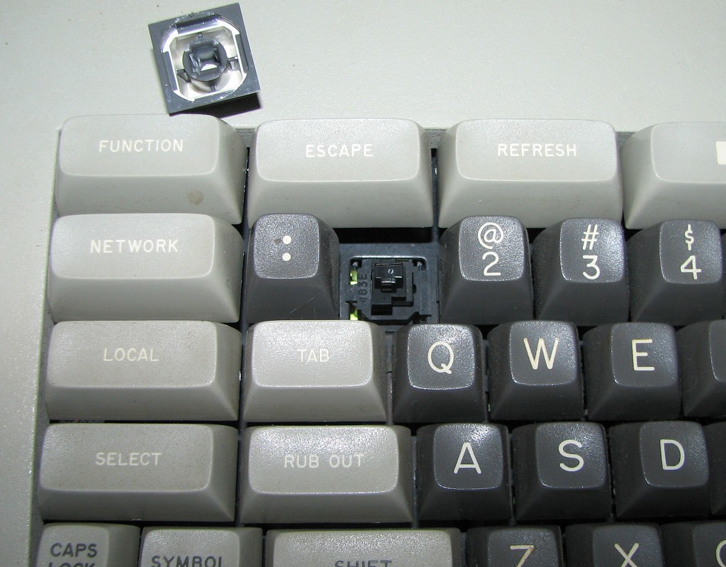
Here's a side by side of the SA profile Round 4 Sphericals with the authentic article: Honeywell terminal caps.
The blue Backspace and the grey tilde are SA. The rest are Honeywell Hall effect caps.
I think the original font is less old timey looking than the modern replicas.
Overall they're similar but with two notable differences. First is the cup depth, or whatever the technical name is for the depth of the spherical indent. SA isn't as spherical as the old guys.
Second is of course weight and thickness. These SA caps are easily the best feeling modern ABS caps I've tried, with solid construction and weight. But the Honeywells are twice as heavy and a real joy to turn upside down. Also: their old mount is so much easier to pull off than MX, still without a hint of looseness once they're on.
The Honeywells are all the same profile. Their switches have angled stems (or sliders, sorry Daniel) which give them a different geometry again from flat DSA or curved backplate IBMs. SA probably has the advantage here. And row 1 SA wins on overall height… on this keyboard. But not so with the number row on the Space Cadet:
- image.jpg (342.18 KiB) Viewed 7521 times
- image.jpg (233.81 KiB) Viewed 7521 times
- image.jpg (176.31 KiB) Viewed 7521 times
- image.jpg (276.06 KiB) Viewed 7521 times
- image.jpg (292.26 KiB) Viewed 7521 times