Real, grown up type, rather than goofy round edged stuff just to suit molding.
It's a bloody shame Granite didn't end up with a grown up typeface...
I tried. Believe me, I tried. Gotham is a fine typeface but surely not my own style. I like geometic fonts, with perfect, idealised lines. Matteo, meanwhile, leans much more to vintage. Which is in Gotham's DNA.
He well knows what I want! Clean, modernist, something more elegant than doubleshot can dream to handle:
Spoiler:
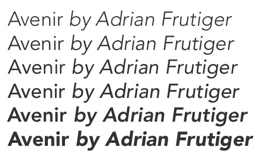
Helvetica Neue
Eurostile Next
Avenir Next
Posted: 26 May 2016, 06:30
by niomosy
Though I wouldn't suggest this as a primary use font, MICR Extended could be fun.
Posted: 26 May 2016, 06:53
by photekq
Any idea which specific font was used on the beamsprings? Or was it perhaps slightly modified by IBM? I seem to remember hearing it was Helvetica, but I can't find a perfect match for it among any Helvetica fonts.
Posted: 26 May 2016, 07:11
by matt3o
Muirium wrote:
zslane wrote: It's a bloody shame Granite didn't end up with a grown up typeface...
I tried. Believe me, I tried.
you guys have absolutely no clue what you are talking about. Gotham was simply perfect for granite and I don't regret it for a moment (and the success of the set it is quite a confirmation of that).
As per hi-pro I haven't found it yet. I'd like a more edgy "architect" font with a pinch of nostalgia to it...
Posted: 26 May 2016, 07:13
by jacobolus
The beamspring legends have absolutely nothing to do with Helvetica or any other printers’ typeface.
They’re some ad-hoc thing made with an engraving machine, just like the doubleshot legends used by everyone else in the 50s–70s.
Also, anyone who isn’t making a corporate logo for a boring 60-year-old company with >10000 employees should never use Helvetica, which is probably the most misused typeface in existence. Helvetica screams “I’m lazy and have no taste, and proud of it.”
you guys have absolutely no clue what you are talking about. Gotham was simply perfect for granite and I don't regret it for a moment (and the success of the set it is quite a confirmation of that).
Or they just have different preferences than yours...
Posted: 26 May 2016, 12:54
by Muirium
Is it possible to politely disagree on details on the Internet?
Granite is glorious, and Gotham is among my favourite pseudo vintage retro fonts.
But that doesn't mean it's perfect, and that vintage is the only right way to go.
You yourself tire of everyone wanting Granite over and over again, Matteo. Let's do something different! Something modernist. Which itself is now quite retro! Just not the one already in such rich supply in caps.
@Photekq: Jacob's right. Much as I love Beamsprings, the font has as much similarity with Helvetica as my backside. Worlds apart. They don't come from the same realm at all.
You're confusing the origin with IBM's subsequent buckling spring dyesub font. Which is indeed Helvetica derived, although slightly bastardised.
Posted: 26 May 2016, 13:20
by matt3o
you know I'm kidding, Muirium. I value everyone's opinion and ultimately make my own choice. I believe it went well with Granite I hope this one will be even better.
we are talking something extremely subjective here but I believe we are on the same page: something a bit more sophisticated than the classic double-shot curves.
Posted: 26 May 2016, 13:51
by Muirium
Oh, it better be!
The trouble that I'm fending off here is that a lot of people do seem to really like those chubby, goofy, unsophisticated curves sprawled all over doubleshots by the necessity of their mold making process. I really don't want them to get their way at the cost of mine. Right now, the only remotely "modern" looking type on any of my boards is the Helvetica on my IBMs, HHKB and Realforce, and the San Francisco on my Mac. I'm positively bombarded by dumb old Gorton and his gormless pals everywhere I look!
Let's be bold. And not by taking it too literally and going with time honoured dumb, fat and rounded!
Posted: 26 May 2016, 17:10
by Muirium
Here's a thought: the 1890s modernist font that kicked it all off in the first place. The fabulously futuristic Akzidenz Grotesk.
Is it Helvetica? Is it Arial!? No, dummies, it's their momma!
Posted: 26 May 2016, 17:48
by andrewjoy
Don't get me started whit Grotesk
This is the crap we have to use in work for external stuff
Screen Shot 2016-05-26 at 16.47.03.png (154.14 KiB) Viewed 6199 times
Uhhhh its horrible
Posted: 26 May 2016, 17:52
by Muirium
That's not Akzidenz. That's just a shitty third rate Grotesque font. A term Akzidenz coined for an entire realm of typefaces.
matt3o wrote: I believe what Mu is saying is that often the boldness and roundness of double-shot legends are due to the intrinsic limitation of the technology more than an artistic choice. what we could do with dye-sub is much more diverse and intricate.
Got it. I still like big and bold. Is diverse/intricate and big/bold mutually exclusive? I don't think so.
Optima.gif (48.88 KiB) Viewed 6177 times
Posted: 26 May 2016, 20:46
by lot_lizard
I'm not voting for anything one way or another, but have we thought about just making the Selectric/Beamspring font file ourselves? It seems to continually come up that we can't match it for all these cap projects... so why not just make it... call it "Selectric" or "Beamspring" for that matter. I highly doubt IBM has maintained those trademarks since they are the kings of cost reduction.
And most allow you to use an image (even your handwriting) as a template. Seems like it would be a fun project for someone to Photoshop/Gimp the exact font in from some actual images. I would be happy to take crisp photos for someone if they wanted to take it on. Also, unless you are REALLY bored, you wouldn't need to worry about lowercase (just dupe the upper case version to make it a valid font). Then it is reusable for everyone going forward.
I like the idea of something brand new as much as anything, but this always seems to come up... Just thoughts
Posted: 26 May 2016, 20:47
by zslane
That's Optima, which I suggested upthread. I love Optima, but some people will tell you rather loudly that they are sick to death of it, or that it has associations for them they don't want inherited by their keyboards.
I like retro double-shot typefaces precisely because they are retro and look vintage. There was no finer time in keyboard history than the pre-1980 golden age of spherical keycaps with double-shot legends. The thing I like about this project is the prospect of high-profile PBT sphericals shaped like Beamspring caps. The thing I won't get excited about is a "modern" typeface or the dye-sub process. But I will probably mostly like the end result anyway.
Oh, and for the record, I love the Gothic Rounded typeface on Granite. I was just trying to get a rise out of Mu earlier...
Posted: 26 May 2016, 21:07
by lot_lizard
zslane wrote: That's Optima, which I suggested upthread
Do you have an example? The font Optima (at least attached as Optima.gif by stuplarosa a bit ago, which seems to match what I see online at first glance)... I can confidently say is not a match for the font I am typing on right now . There could be variations of it though. I didn't spend much time looking
I would like to bookmark whatever font is a match for myself though... just personal knowledge
Posted: 26 May 2016, 21:32
by Muirium
For what it's worth, I really dislike Optima. It's the tired Old Man Products font.
Posted: 26 May 2016, 21:40
by lot_lizard
Muirium wrote: For what it's worth, I really dislike Optima. It's the tired Old Man Products font.
Yeah... that is a spot on match for Optima compared to the font files I looked at... and that is DEFINITELY not the Selectric/Beamspring font. And I'm certainly not advocating it for this project (zero opinion at least for now), but I would like the font to be available for future use (not worth a new thread... or maybe it is). It always seems to come up, and I am curious why we haven't just made made it
Posted: 26 May 2016, 21:48
by Muirium
Because it's ghastly.
Oh right, you mean the Selectric / Beamspring font? Well, because doubleshot molds cost a lot of money for a whole alphabet. And frankly, Gorton Gumbo isn't so far off.
Posted: 26 May 2016, 22:29
by stuplarosa
Muirium wrote: For what it's worth, I really dislike Optima. It's the tired Old Man Products font.
I guess I'm just a tired old man.
Posted: 27 May 2016, 08:39
by jacobolus
Optima looks great when used carefully, especially the original metal letterpress version, but isn’t going to work for keycaps. It has a bunch of very subtle variations in stroke width which make it totally unsuitable for any kind of printing process which isn’t extremely sharp and precise. I don’t think dyesub is going to cut it.
All three of Mu’s examples are really shitty design, irrespective of typeface. But most uses of Optima these days are shitty, branding and bottle labels for cosmetics products, etc. It’s ridiculously overused, and has become a symbol of overpriced soft-luxury products aimed at a mass middle-class audience.
Posted: 27 May 2016, 08:50
by matt3o
I must confess that I like Akzidenz Grotesk
Posted: 27 May 2016, 08:55
by jacobolus
Akzidenz is the typeface of 18 year old designer hipsters who just fell in love with the Bauhaus and mid-century Swiss posters.
Not sure it makes any sense for keycaps, but knock yourself out.
Posted: 27 May 2016, 08:56
by matt3o
jacobolus wrote: Akzidenz is the typeface of 18 year old designer hipsters who fell in love with the Bauhaus and mid-century Swiss posters.
ohmy! are you watching me through security cameras?!
Posted: 27 May 2016, 12:00
by Muirium
Akzidenz was hip fifty years before even hip was cool. Chill, Victorian gentlemen!
Posted: 27 May 2016, 15:41
by stuplarosa
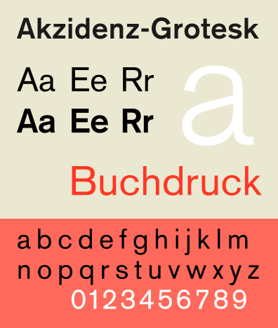
Just so everyone knows what Akzidenz is...
Not so bad if it's big.
I do *love* the numbers.
AkzidenzGrotesk.gif (46.77 KiB) Viewed 6030 times
Posted: 27 May 2016, 15:51
by Muirium
The numbers are indeed a turn of the century sight to behold!
My niggles with it are the Q and R, which I think Helvetica does better. But Akzidenz has a weight of history behind it that's just mind blowing. It came out 30 years BEFORE this!!
Cue the sound of "Erm, so, why aren't we considering serifs anyhow?" The answer to that question, sirs, is because we are not horse buggy riding imbeciles!
Posted: 27 May 2016, 16:08
by stuplarosa
Muirium wrote: My niggles with it are the Q and R, which I think Helvetica does better.
A agree about the Helvetica Q, but I've never liked the Helvetica R. The squiggly leg seems to me to be out of character with the rest of the font. There are no squiggly elements in the entire font except that one.
Posted: 27 May 2016, 16:13
by Muirium
Yeah, I know where you're coming from. I like Helvetica's curly R as the tight little Swiss whimsy that's the exception to prove the rule. I certainly prefer Akzidenz' R to its Q. And unlike wretched Arial, it got G right on the first asking.
All of which is to say I'd be delighted with an Akzidenz set. The Q isn't horrible (it suits the rest of the font quite nicely) I just have a thing for clearly stemmed Qs that I've come to value all the higher whenever I pop a set of Gorton doubleshots on a board and have to doublecheck with O!