Page 8 of 43
Posted: 13 May 2016, 08:14
by niomosy
Apparently my questions seem to cause all kinds of trouble. Sorry to cause a fuss. I realize there are massive reductions in complexity with dyesub in comparison to doubleshot. It was no surprise that dyesub was first as it's an easier route and, as you've said, more flexible in what it allows. I was more wondering if it was a future possibility.
Posted: 13 May 2016, 08:35
by matt3o
as soon as I see that it is remotely possible (technically, logistically and economically) I'll do it in a heartbeat
Posted: 13 May 2016, 11:00
by Muirium
Dare I say the perfect time for colours (beige) and fonts I don't like (goofy old school) is when that magical PBT doubleshot day comes along? Because I honestly prefer dyesub, period. You wouldn't have to worry about pleasing me / bearing my lobbying for a change!
matt3o wrote: The quality, definition and flexibility of dye-sub legends widely outweigh the vanity of having light on dark legends of double-shot.
With dye-sub we can have:
- as many languages we want
- change/update font and legends at any time at no additional cost (we did that with granite a lot)
- novelty keys aplenty
- higher definition legends and complete design freedom
- weird key sizes support (need 1u return? you got it)
- 1/2 the production cost, 1/100 the development cost
Do you have any idea how much would cost to manufacture the molds for each legend? Do you want 1.75u right shift? Sure, pay for a new mold and one mold (even in China) is hundreds of dollars.
The development phase is also incredibly complex. For the Topre PBT spacebar I believe I have at least 20 iterations, and it's 1 keys. This is in part due to the cultural and language barrier we have with China and in part with their low average skill level. Each and every key has to be checked, if something goes wrong it takes 2-4 weeks to make a change, wait for shipment, check again and repeat. It is a very frustrating process.
It is humanly impossible to make a complex high quality set from scratch in double-shot PBT (let alone thriple-shot). And even if you could make it, nobody would buy it because it would cost an arm and both legs.
Collaboration with Vortex is a possibility, but: 1) they require incredibly high quantities, 2) quality is so-so, 3) we would lose all the flexibility we want (ANSI+ISO UK and that's it)
Hope I made things clear now, I probably never talked about these things, I would do double shot PBT in a heart beat if I could, but it's not really an option. (please also consider that this is not my job, people might thing that I'm getting rich on these things but it's still an hobby)
This! All of it!
And the fact that dyesub does better fonts better than doubleshot even at its finest. Molds can't handle anything like the expressive bandwidth that dye can. Legends are the most important thing of all to me in fancy custom caps. So dyesub is where I'm at.
Posted: 13 May 2016, 11:30
by derzemel
just noticed this header
I think that the combination of black on white alphas + black on gray modifiers would look fantastic...
with Eurostile fonts
Posted: 13 May 2016, 11:35
by photekq
^this + 5100 font/legends

(not sure if side printing can be done)
Posted: 13 May 2016, 11:48
by Muirium
Doubleshots, fellas. Stick to your own!
Posted: 13 May 2016, 11:55
by photekq
Muirium wrote: Doubleshots, fellas. Stick to your own!
derzemel wrote: I think that the combination of black on white alphas +
black on gray modifiers would look fantastic...
with Eurostile fonts

Posted: 13 May 2016, 12:58
by snuci
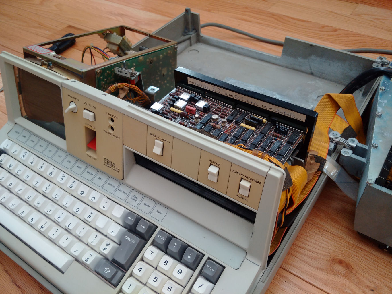
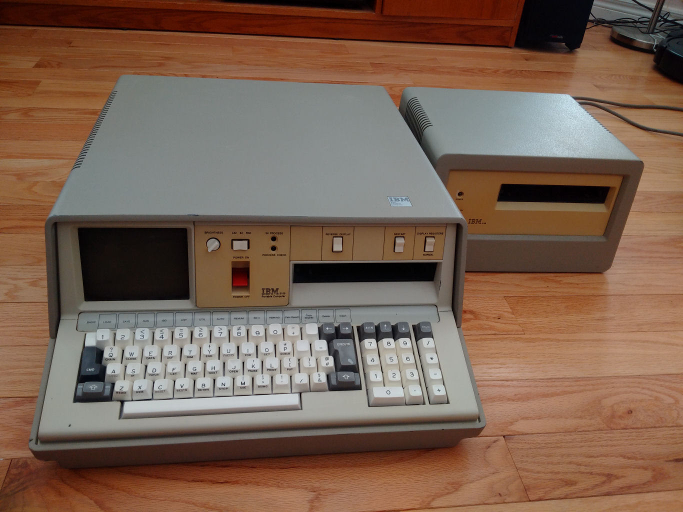
Hrmm, was wondering where you got that pic of the IBM 5100

The IBM 5100 is the perfect example and why I said we should honour the keyboard that the caps came from. The side keys almost look black in the pic but they are actually a dark grey that looks very nice and these would be perfect but if white on dark grey non-alpha numerics cannot be done because of dye sub on PBT, I would go lighter grey with black legends. I do love this font.
Note: This pictures shows the grey better:
This key cap set could then be referred to as "classic IBM" or something like some other keysets refer to a computer brand.
Posted: 13 May 2016, 13:02
by matt3o
Totally love that typeface. Look at that "6" or that "Q". Does anyone know what font is that?
Posted: 13 May 2016, 13:12
by Muirium
Looks too much like Gorton Bastardised to me. Different in detail though, especially the numbers on the numpad.
Fonts are what I'm grumbling about by the way. I know you two meant a dyesub recreation earlier, but dyesub works best when it's not wearing a fake moustache and glasses, trying to be all suave and shit like Groucho Marx.
Posted: 13 May 2016, 13:14
by matt3o
I hear you Muirium, worry not we will make a couple (or more than a couple) of font tests.
Posted: 13 May 2016, 13:22
by Muirium
Ah, reassurance gladly accepted! Knowing you're the man calling the shots on this means we can expect something epic. Let's show Topre what they're missing!
Posted: 13 May 2016, 13:39
by snuci
For comparison:
IBM 5100 Q:
IBM 5100 6:
Posted: 13 May 2016, 13:48
by Muirium
Spot the engraving. It makes for smooth, wide radius, curves just like doubleshot's molds. Not a sharp turn to be found.
A needless limitation we have no reason to ape with dyesub!
Posted: 13 May 2016, 13:49
by matt3o
wonderfully retro
Posted: 13 May 2016, 14:04
by snuci
Helvetica Rounded Bold is close but the IBM font is a little slimmer. Example:
https://www.myfonts.com/fonts/adobe/hel ... nded-bold/
Posted: 13 May 2016, 14:09
by matt3o
This is sexy
look at "REPRODUKTIONEN"
Posted: 13 May 2016, 14:17
by matt3o
This is another vaguely retro font which I like
this other one is an Eurostyle kind of font
Posted: 13 May 2016, 14:38
by derzemel
that last phrase...

Posted: 13 May 2016, 16:00
by stuplarosa
matt3o wrote: This is sexy
look at "REPRODUKTIONEN"
That's very nice!
Posted: 13 May 2016, 16:20
by Muirium
The Q in the last font is troublesome. Mind, so is authentic Eurostile's:

But
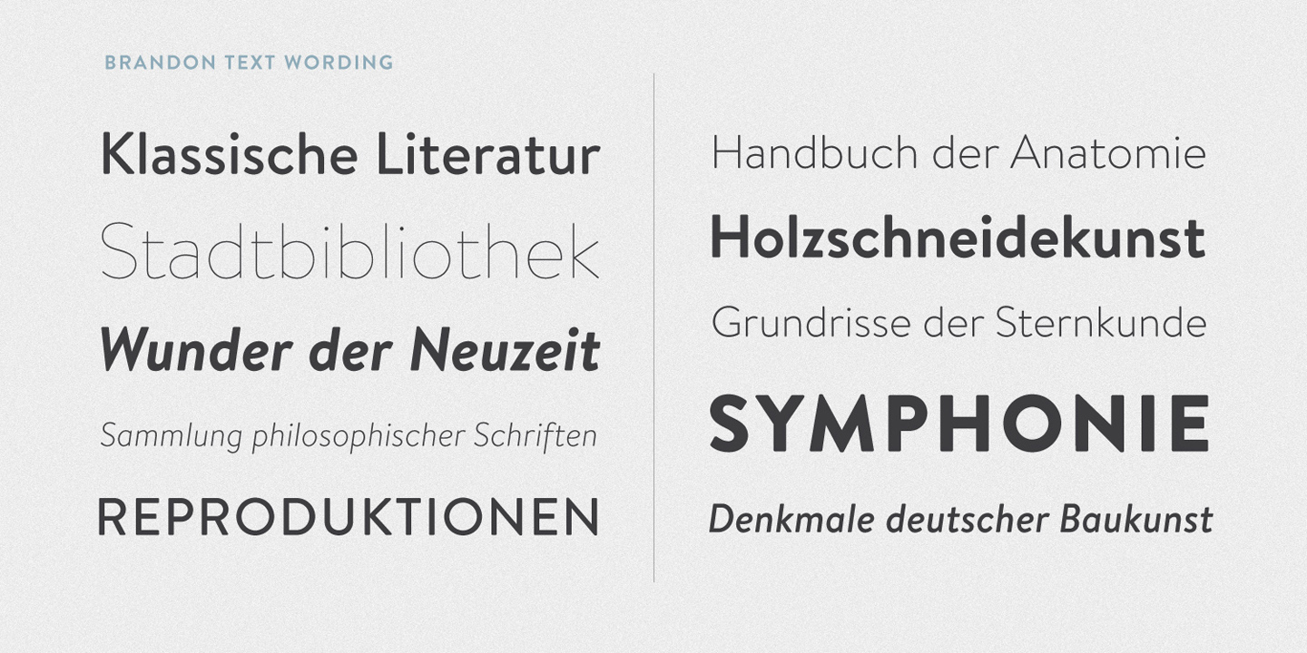
Brandon Text is definitely one to watch:

I also like its big brother,
Brandon Grotesque:

- Screen Shot 2016-05-13 at 3.31.35 pm.png (36.71 KiB) Viewed 5876 times
Posted: 13 May 2016, 19:24
by niomosy
Muirium wrote: Doubleshots, fellas. Stick to your own!
Hey, this might be about our only shot (heh) at tall spherical caps from other than SP and given the lineage of this profile, I'd love to see it as doubleshot at some point in the future even if ABS.
Though, like I said, the profile alone will likely entice me into buying a set. For me, dyesub really isn't a plus but a limitation. I admit I'm more a color guy than a font guy.
Posted: 13 May 2016, 20:54
by zslane
Different typefaces are only noticeable when you are just staring at the keyboard, rather than typing on it. I don't look at my keyboard when I type, so the legend font is of far less consequence to me (or anyone who touch types). Talk about "vanity legends". Novelty legends and "artisanal fonts" are the very definition of vanity. A crisp legend (and you can't really get any crisper than machine-cut plastic) that never fades or bleeds and isn't color-limited isn't a vanity legend, it is simply a better legend.
About the only advantages that dye sub offers that are of any consequence, IMO, are cost and international legend flexibility. Of course, as an American with funds to spare for the right kind of product, neither of those factors hold much sway with me. But for a community largely based in Europe, where everything seems to cost more, I can see why double-shot PBT is less attractive.
However, even Matt3o admits that if cost and quality were not an issue, he'd do double-shot PBT in a heartbeat. I think that speaks volumes as to its objective merit. The thing is, we'll never get cost and quality where we want if we don't make an effort to find a manufacturer who will work with the mech keyboard community to reach those goals. Resorting to dye sub is an easy way to get your keycap fix, but that energy might be better spent on longer term objectives?
Anyway, I'll step away from the pulpit now and let this thread continue without my philosophical ranting.
Posted: 13 May 2016, 20:59
by Muirium
Having read your opening sentence, I know we'd wind up in a bare knuckle fight if we met face to face…
Posted: 13 May 2016, 21:05
by zslane
Losing a bare knuckle fight to you, Muirium, would be an honor...
But I'd still be right about this.

Posted: 13 May 2016, 21:07
by Muirium
Quit making things worse for yourself. I have no remorse for doubters of typographical purity!
I don't need to be looking at caps to feel their shitty legends. Hell, I don't even have to own them. I'm quite capable of getting upset about entirely hypothetical shitty legends!
Posted: 13 May 2016, 22:31
by snuci
Please note the title of this thread.
If you prefer to talk about manufacturing another type of key switch, please create a new thread. This thread is for "PBT Dye-sub " as stated in the title.
Can we move on talking about how matt3o thinks the "Monopoly game" font is sexy and how Mu likes these thin-ass fonts that will require reading glasses to see the fonts (I know, nobody looks at their keyboards but some of us don't touch type)?

Posted: 13 May 2016, 23:35
by matt3o
wow.
I mean.
just, wow.
Posted: 13 May 2016, 23:39
by seebart
Too much offtopicthority for you snuci? Take a chill pill.
Posted: 13 May 2016, 23:43
by niomosy
I see dyesub as a good start and I have no problem with that. Starting with a new profile, PBT, and doubleshot is rather difficult as has been noted.
As to fonts, I'll let you guys duke it out. Though since we're talking dyesub, I'm hoping for blue legends at some point. Actually, I'm kind of wondering how well a Skeletor type set would do under dyesub given a good cyan cap and a purple legend. You'd need to either go uniform or go with a lighter purple for the mods and a darker blue to handle the legends but that could work as a fun set that's still dyesub, possibly.