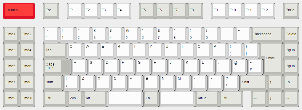
I’m a 60%er, so I’m biased, but for whatever it’s worth I’d go for symmetry, including in spacing. Matteo’s spaced function row is sound. But I do really like Nuum’s concept from the linked thread, if you chop off the left two columns!:

That symmetry is appealing. Especially the split in the spacebar. My instinct is that a split spacebar really must be proportioned 50:50. (That’s actually my main complaint about Matt’s three examples.) Then there’s that Fn key in the middle of the spacebars. Another key in the split seems right, somehow. Though I can’t explain it.
How do people feel about a space to the left of the Left arrow key, to make it faster to find? Again, I’m a 60%er so it’s not intended for me. What about adding something similar on the bottom left of the layout, for complete symmetry? A step too far?


